Our Museum - Process Book
A 48 page book documenting the journey of creating a brand identity for the Our Museum Project.
← Back to Our Museum
The Challenge
The aim of this project was to put together a book which effectively documented the process of creating the 'Our Museum' brand identity whilst taking inspiration from the brand guidelines we created for the project.
The Journey
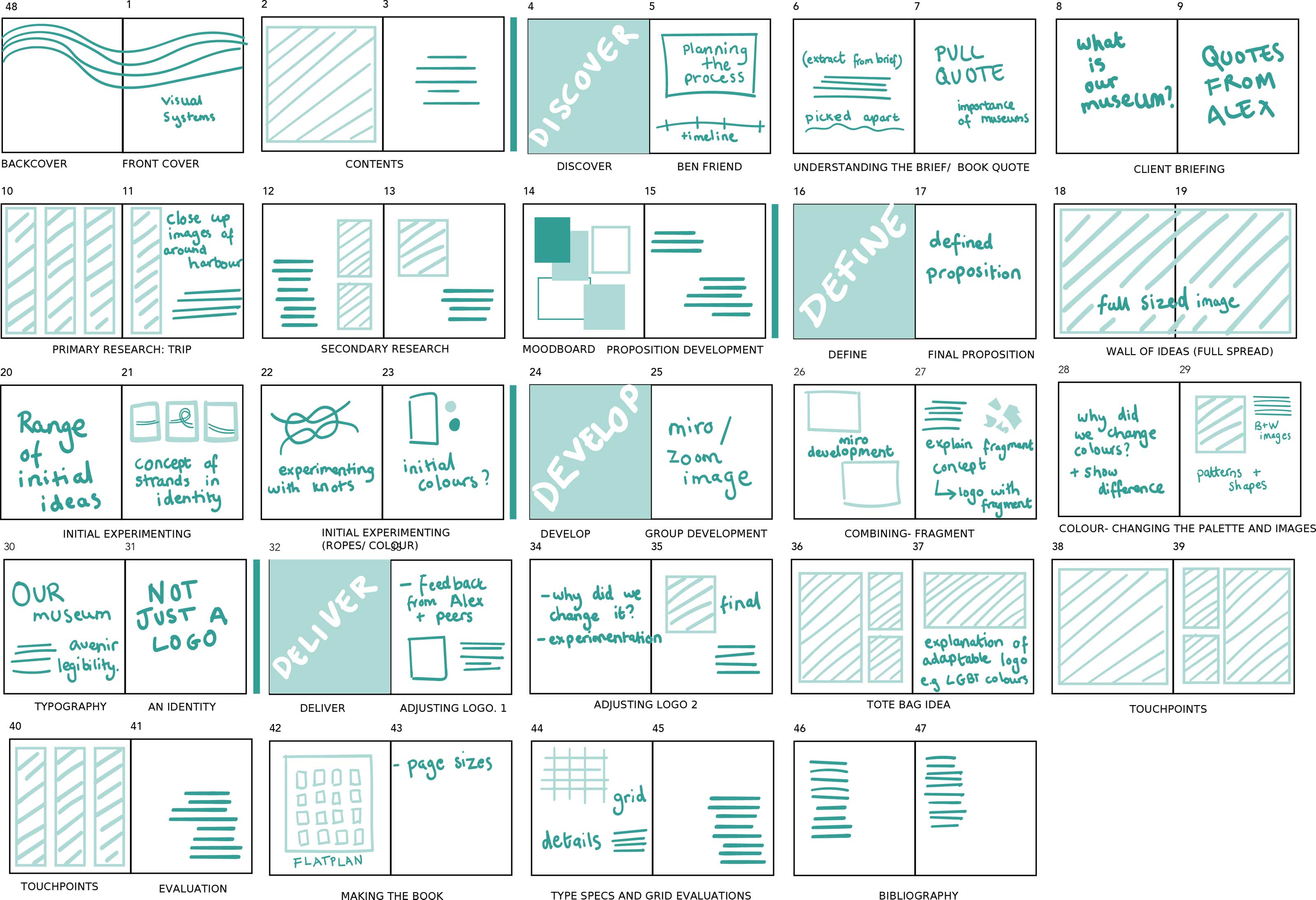
Creating a Flatplan
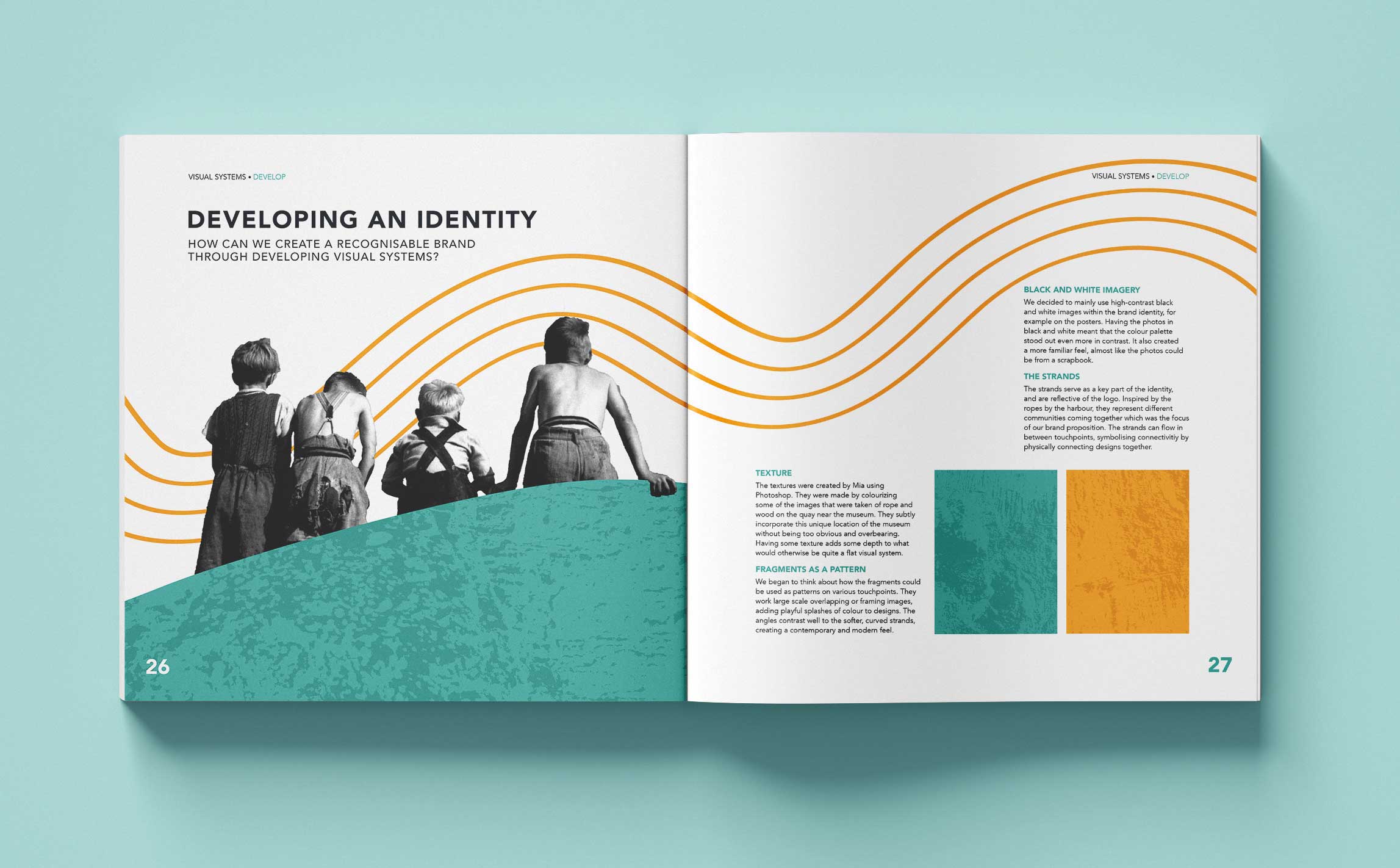
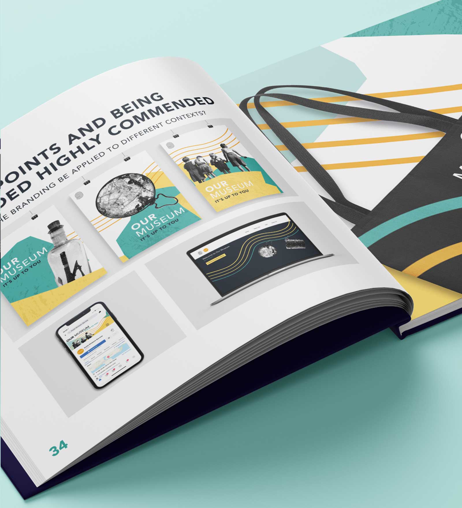
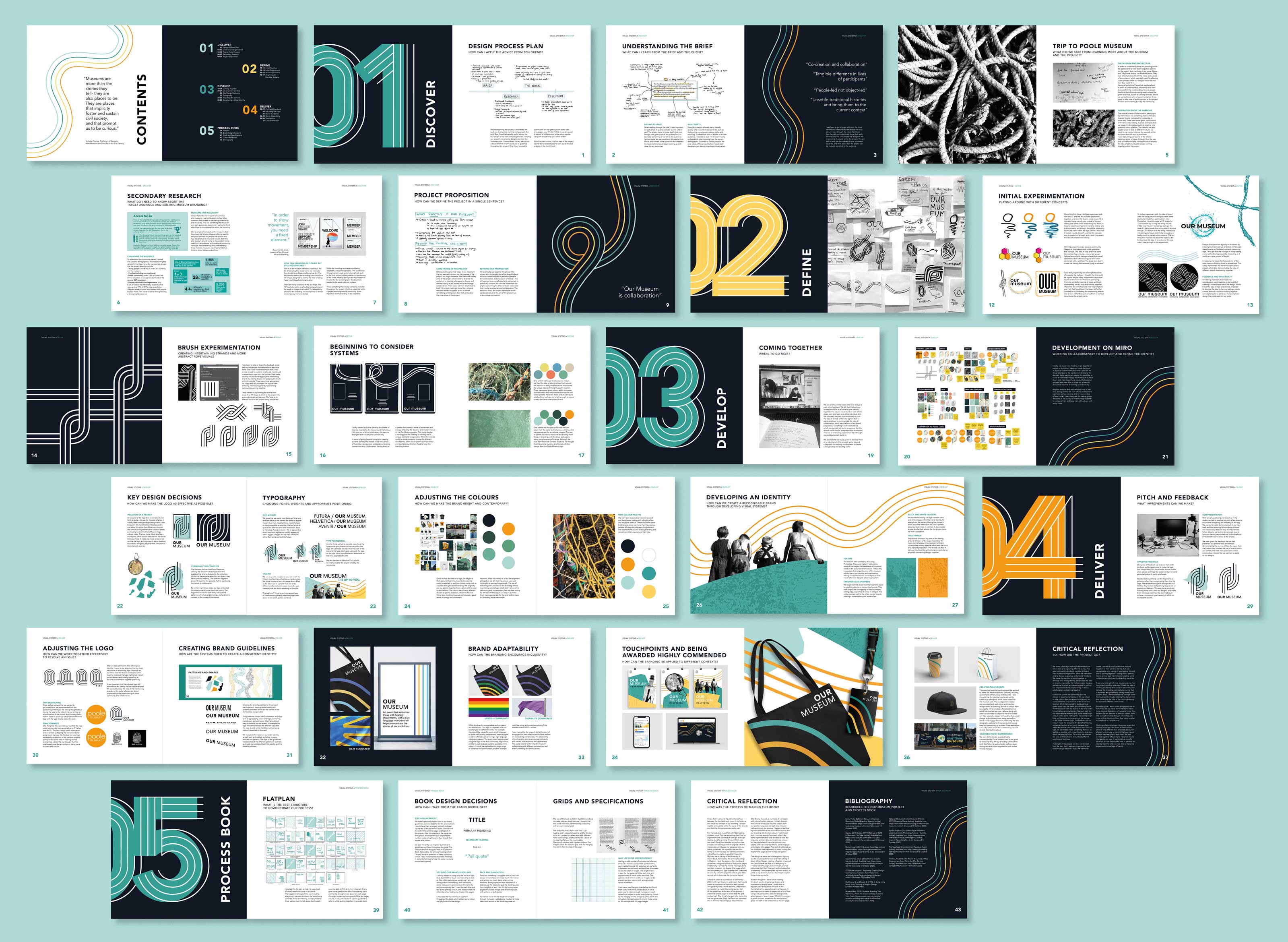
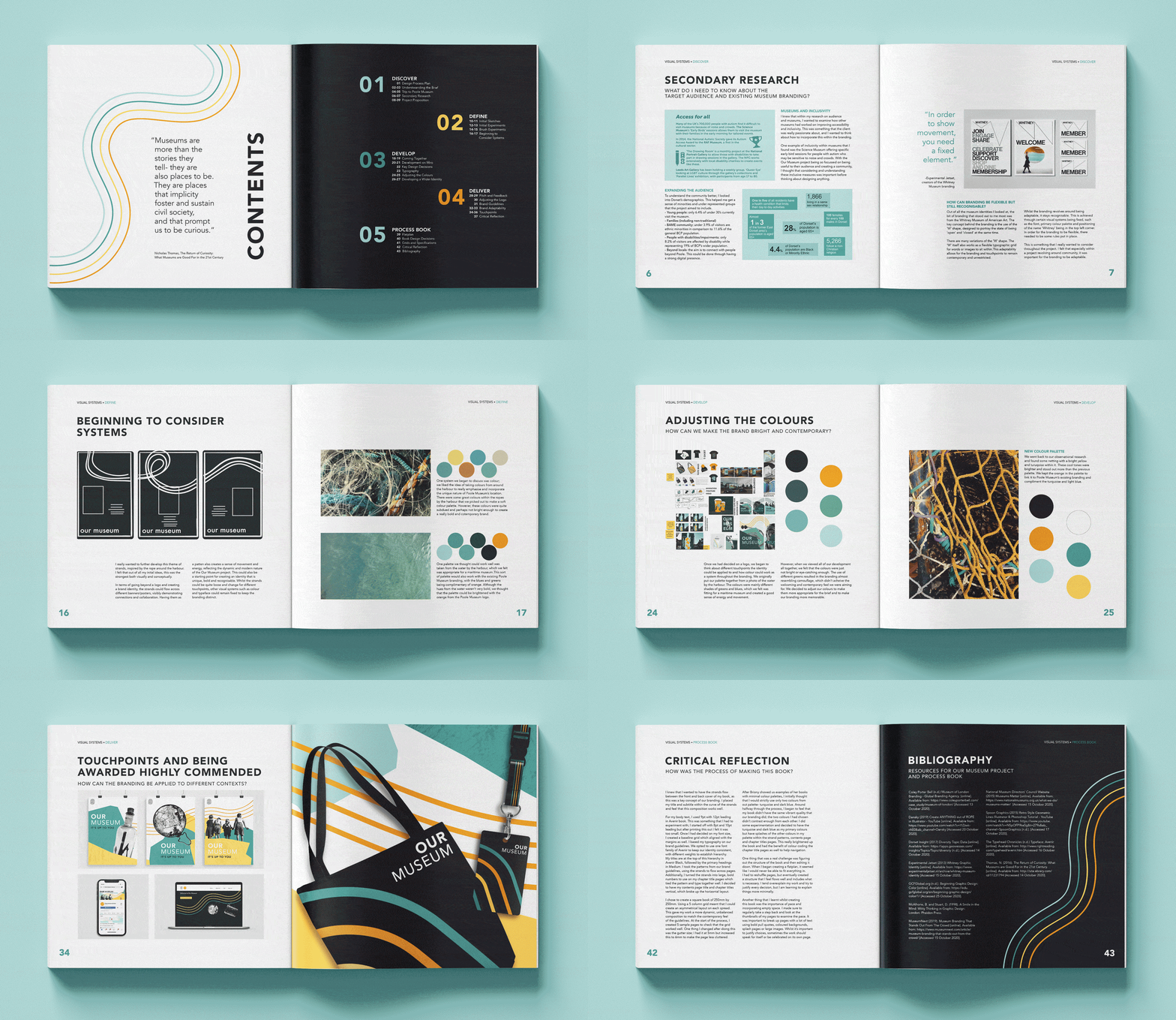
My main aim was to create a book that was visually appealing whilst also being easy to follow and navigate. To do this, I kept my layouts very clean and colour-coded each of the 5 sections within the book. I wanted to consider pace and challenged myself to incorporate empty space. I made sure to regularly take a step back and look at the thumbnails of my pages; it was important to break up pages with a lot of text using bold pull quotes, coloured backgrounds, splash pages or large images.
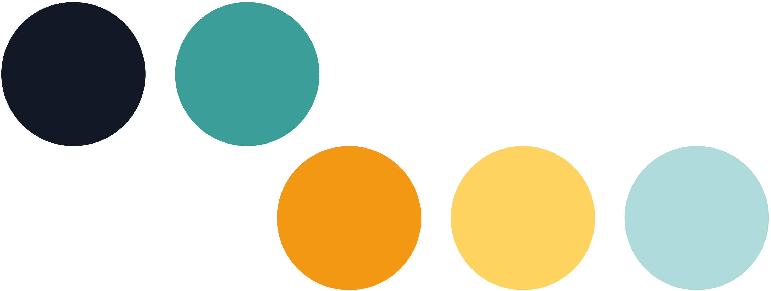

Colours and Style
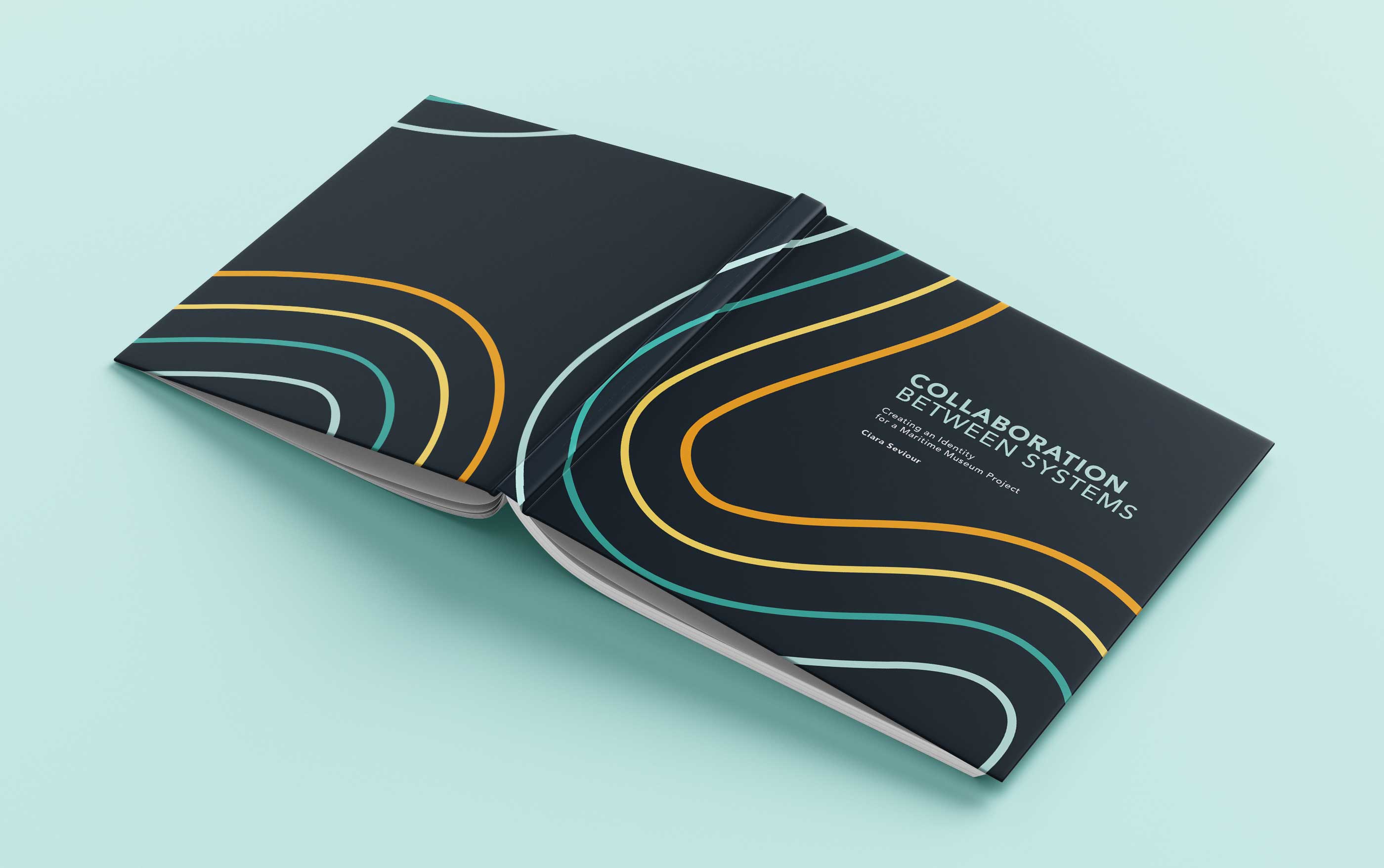
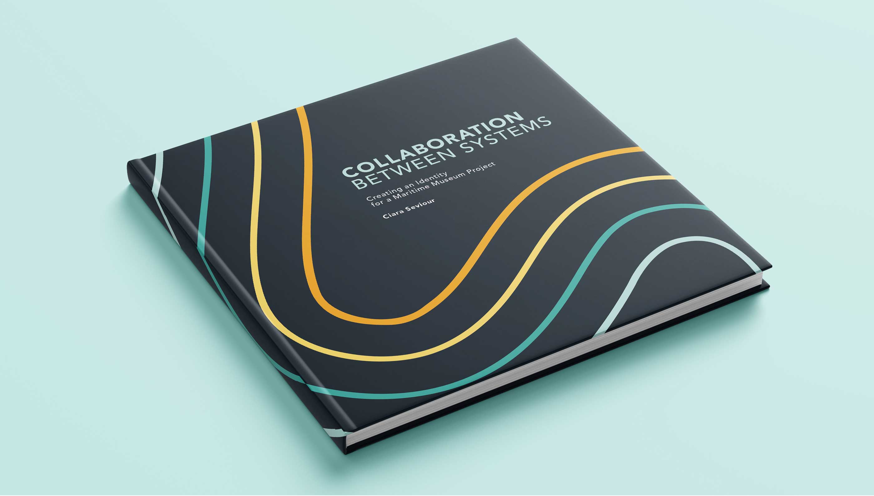
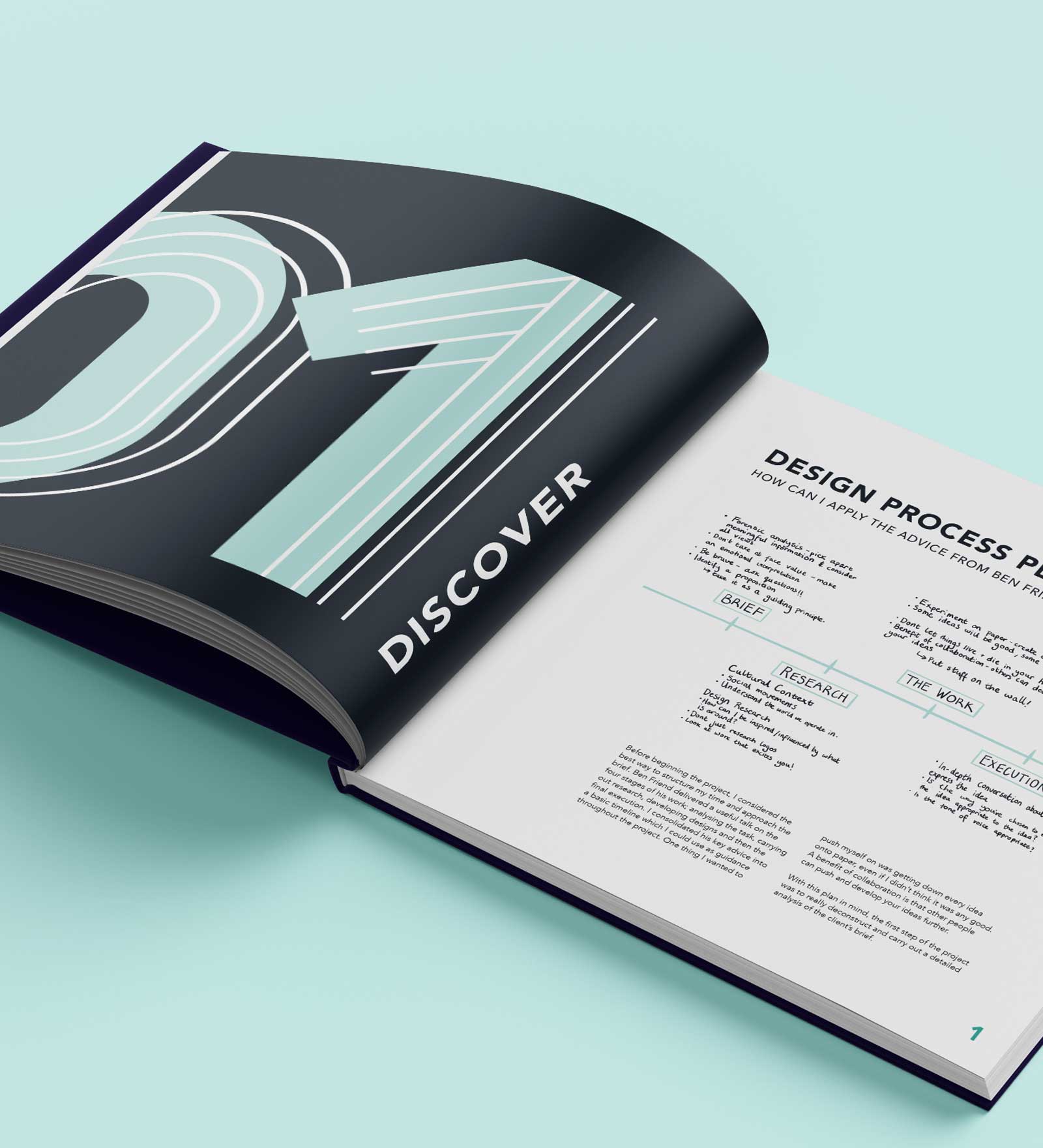
I initially started by using only the teal and light blue, but I felt that it just wasn’t exciting to look at. Our colour palette was something I felt was strong within our branding, and I wanted to utilise it to give my process book the same fun and contemporary feel. I used the dark blue and teal as my primary colours, and incorporated the others by colour coding my chapter title pages. I also used the four strands as a pattern throughout the book, which added some colour and playfulness to the design.
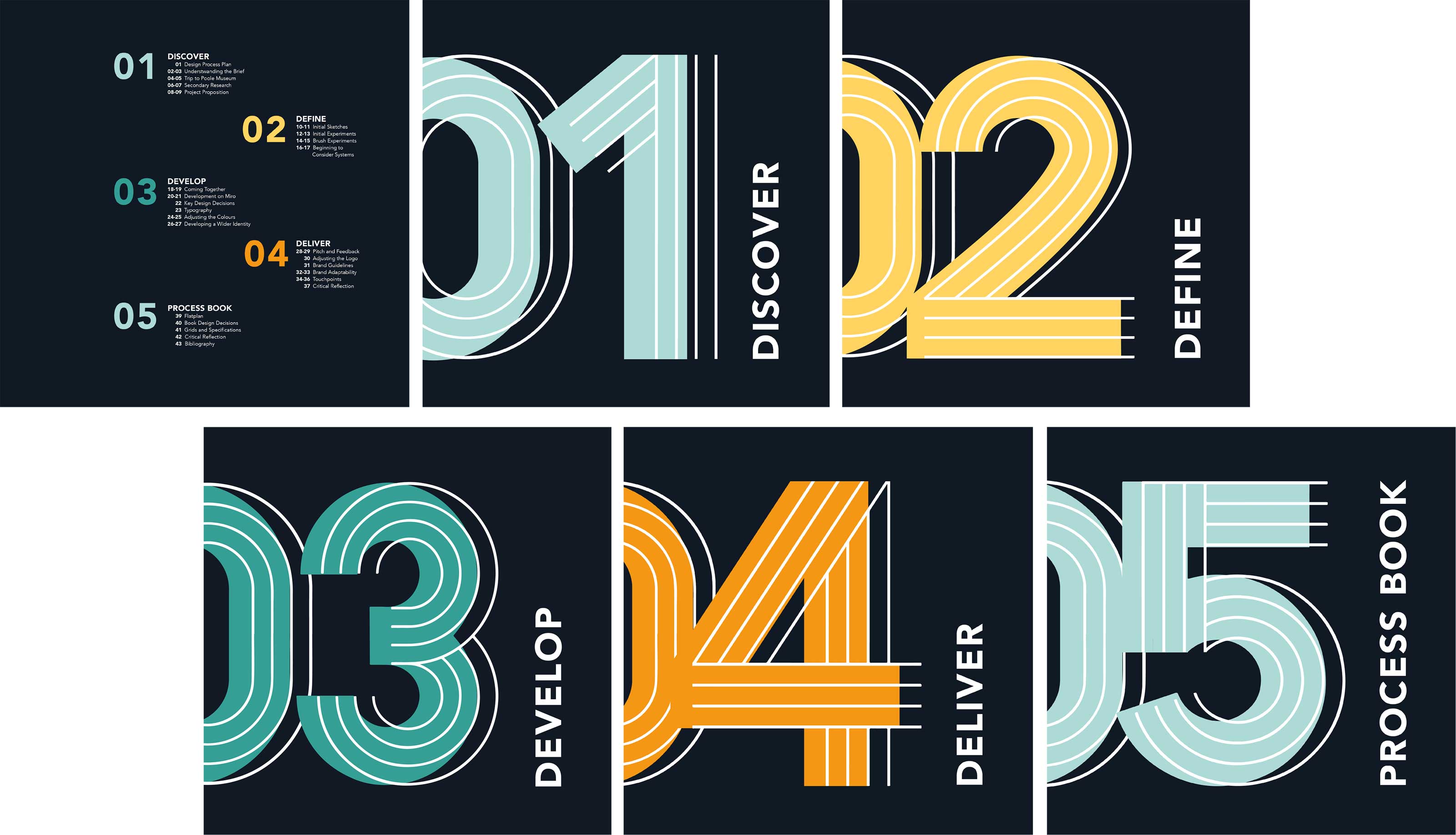
Contents and Chapter Number Pages
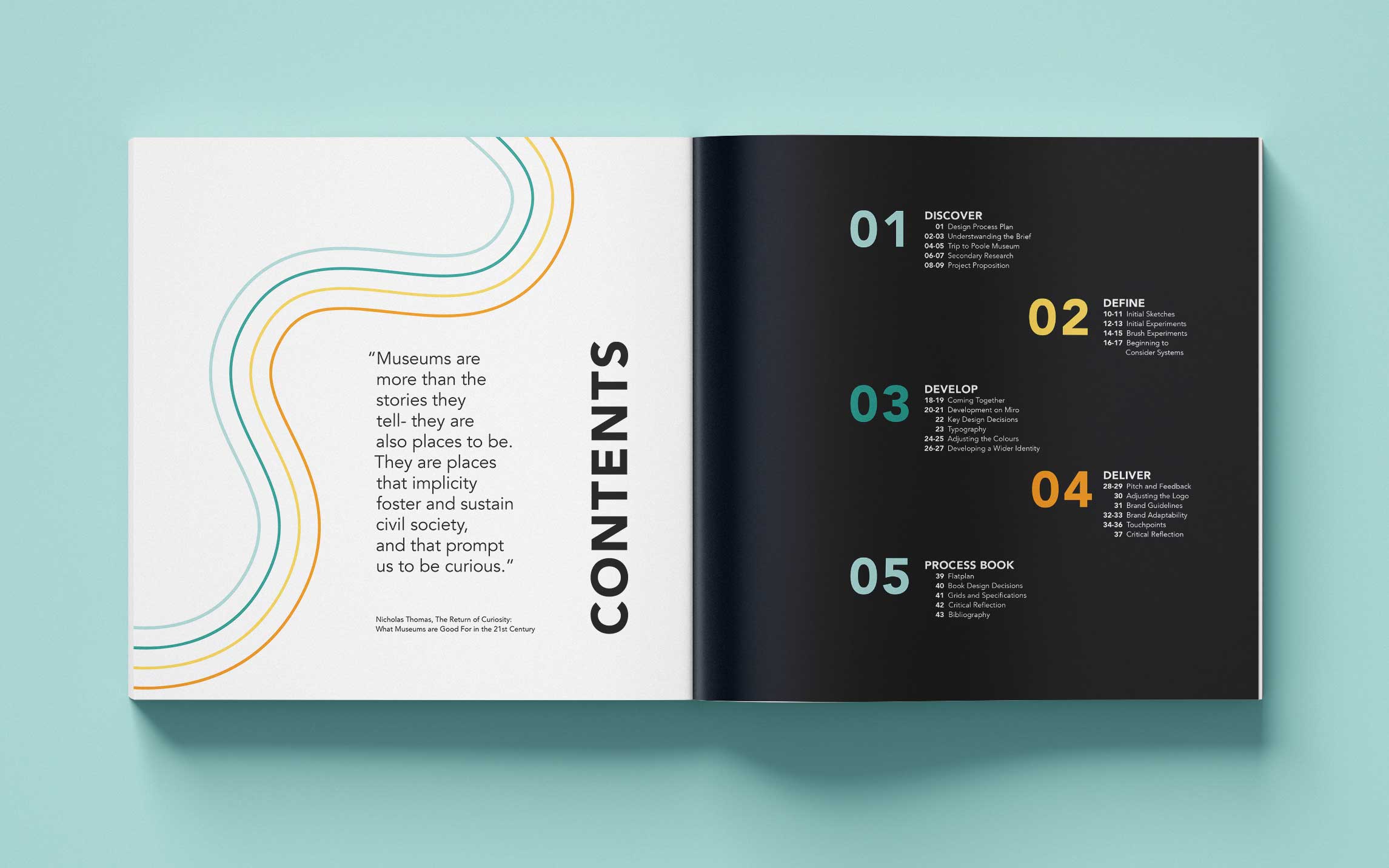
We hadn’t specified chapter titles in our brand guidelines, so I decided that for this process book I would have them arranged vertically to break up the rest of the horizontal layout. I introduced this within the contents page, and kept all of the chapter titles consistent and the same size throughout, accompanied by a large chapter number made using the same four strands that appear as a pattern.
