Our Museum - Brand Identity
Live brief with Poole Museum to create a refreshing brand identity for a maritime museum project.
Collaboration with Grace Reeves, Toby Rivett and Mia Erwig.
← Back to Our Museum
The Challenge
The focus of this brief was to create a memorable and contemporary brand identity for Poole Museum's Our Museum Project. The identity needed to include a logo and examples of how the branding could be applied to physical and digital touchpoints. We also needed to produce a coherent set of brand guidelines to demonstrate how our developed visual systems should be used.
Our approach was to create a comprehensive identity that embodied the core principle of the 'Our Museum Project' being people-led. We were very pleased to be highly commended by Poole Museum, and were amongst the top three teams.
The Journey
Project Proposition
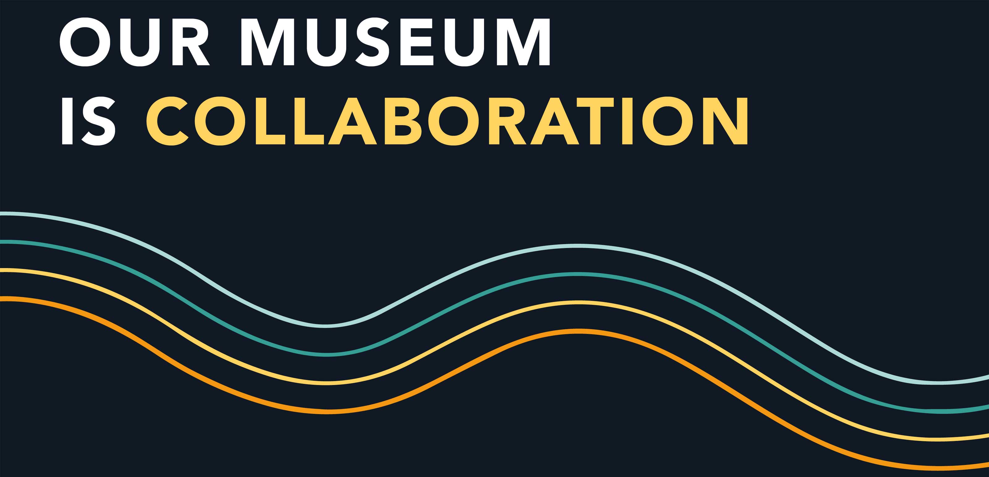
Before creating any initial ideas, it was important that we were able to sum up the purpose of the project in a single sentence. We identified the key aims of the project, which were to diversify the audience, to create a safe space to discuss and debate history, to tell stories and to encourage co-creation. We concluded that the core focus of the project was collaboration; the aim of the project was to encourage partnership. With the project proposition in mind, we began to think about ways to visualise collaboration.
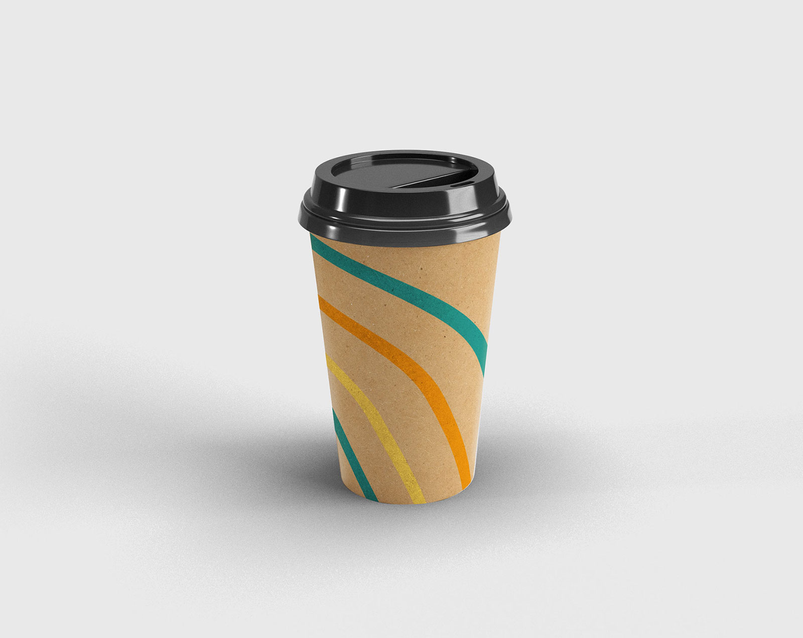
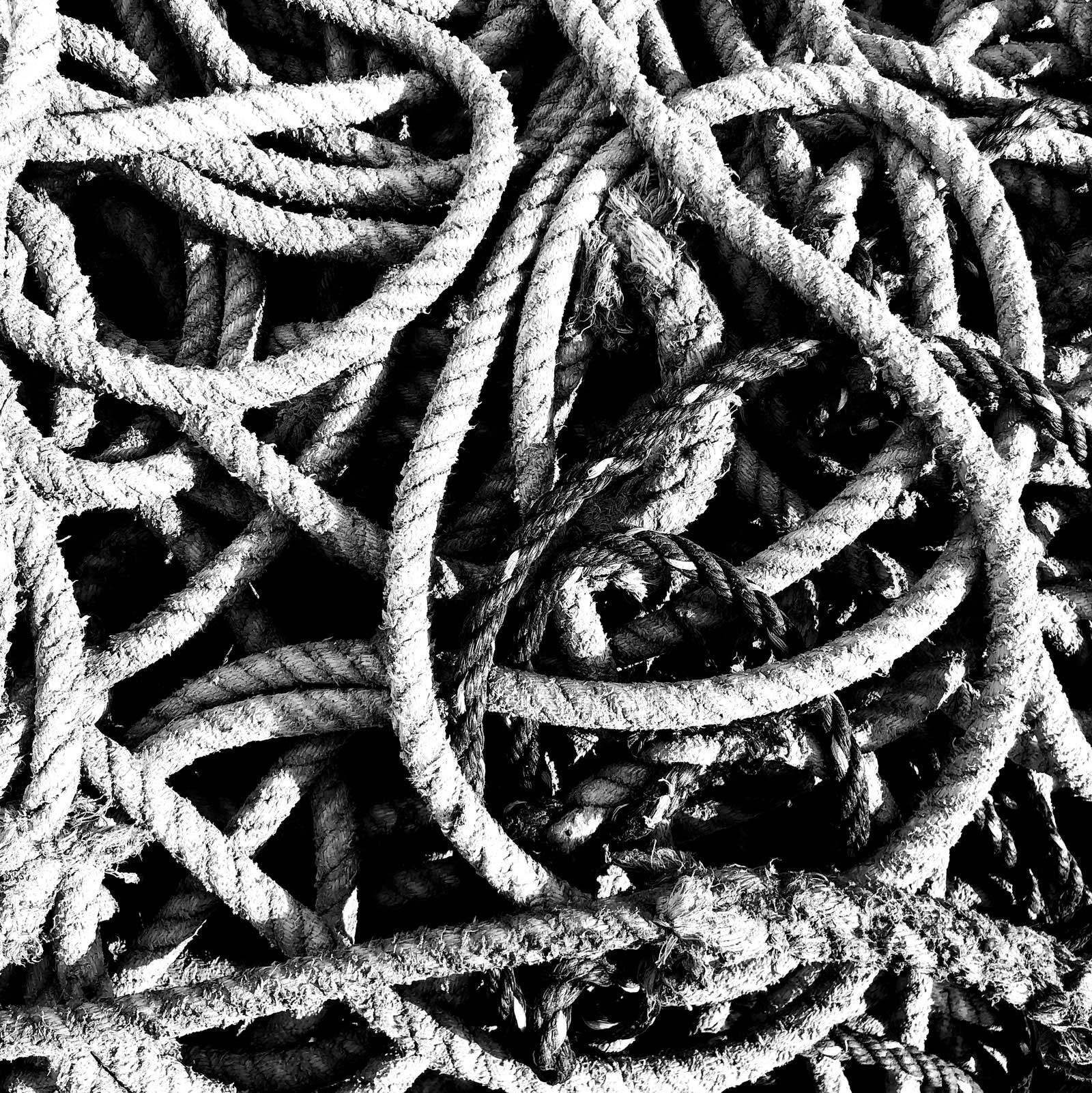
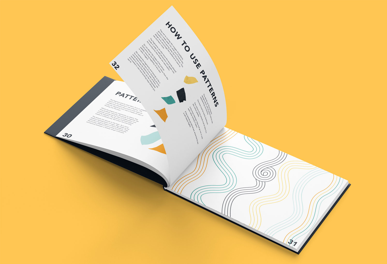
I was really inspired by one of the photos taken of ropes by the harbour. I thought that this could be a great way to subtly incorporate the nautical aspect of the museum whilst also portraying the more symbolic meaning of ropes and knots representing bonds, unity and coming together. In terms of going beyond a logo and creating a brand identity, the strands could flow across different banners or posters, visibly demonstrating connections and collaboration. Having them as a patten also creates a sense of movement and energy, reflecting the dynamic and modern nature of the Our Museum project.
Colours
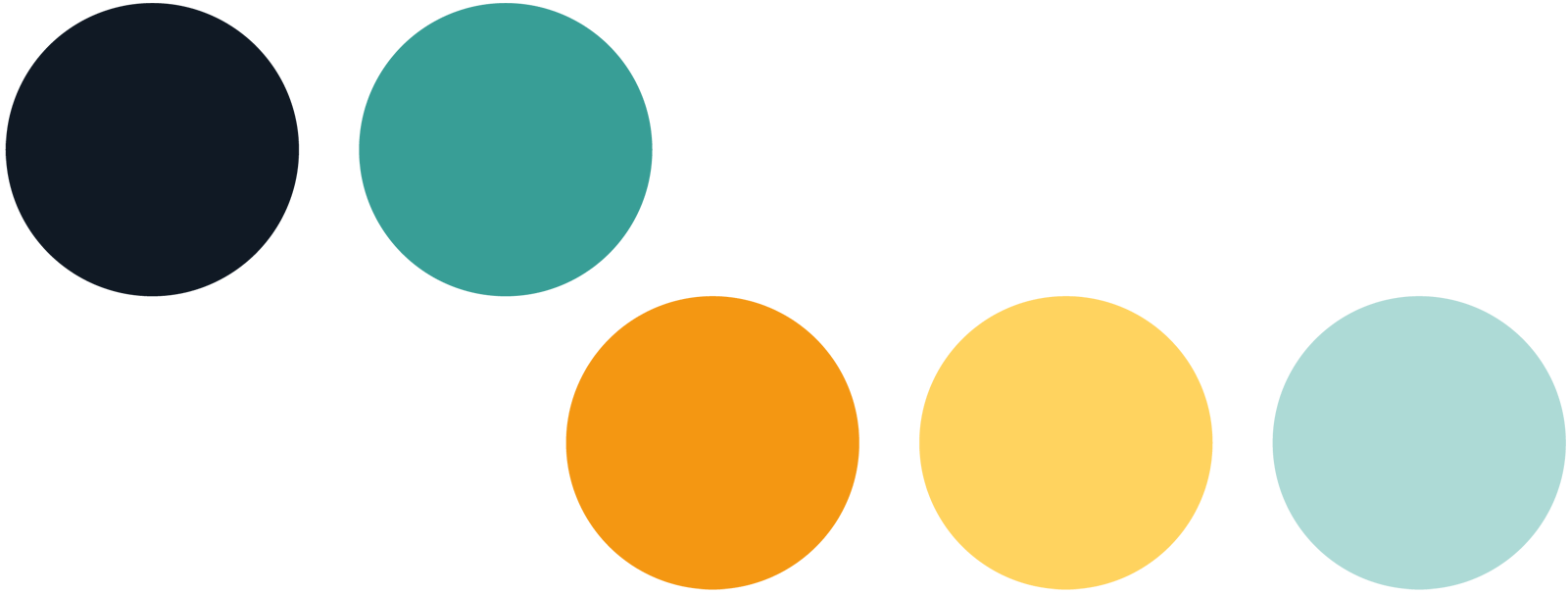
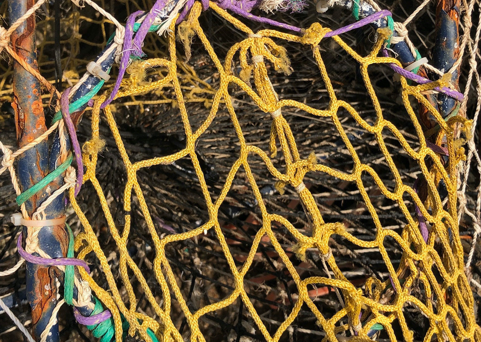
We experimented with many colour options inspired by observational research images taken of the space around the museum. We originally put our palette together from a photo of the water by the harbour, which was mainly different shades of blues, but when we viewed all of our development all together, the colours were just not bright enough. We went back to our observational research and found some netting with a bright yellow and turquoise within it. These cool tones stood out more than the previous palette. We incorporated an orange into the palette to link it to Poole Museum’s existing branding and to compliment the turquoise and light blue.
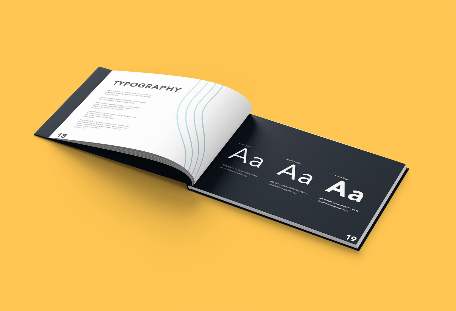
Typography
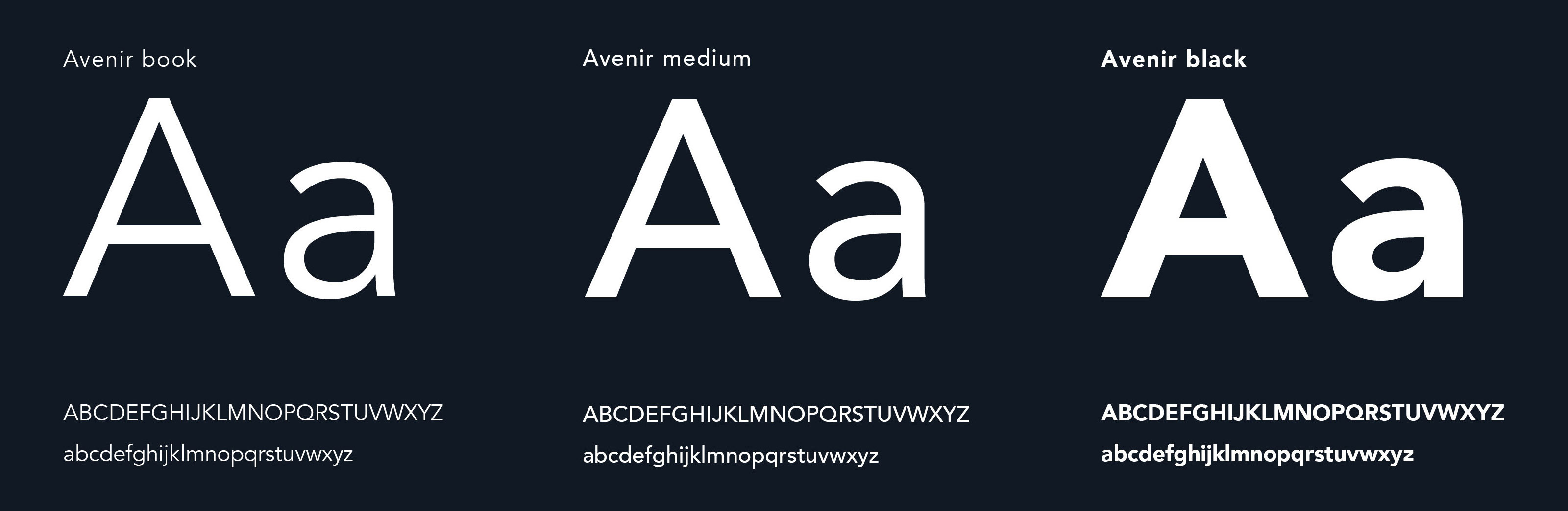
We opted for a sans serif font because we wanted the brand to appear modern and needed the type to be as accessible as possible. We had a look few different options and narrowed it down to Helvetica, Futura or Avenir. It was agreed that Avenir was both legible and visually appealing, with a bigger X-height and squared off shapes rather than being pointed like Futura.
The Outcomes
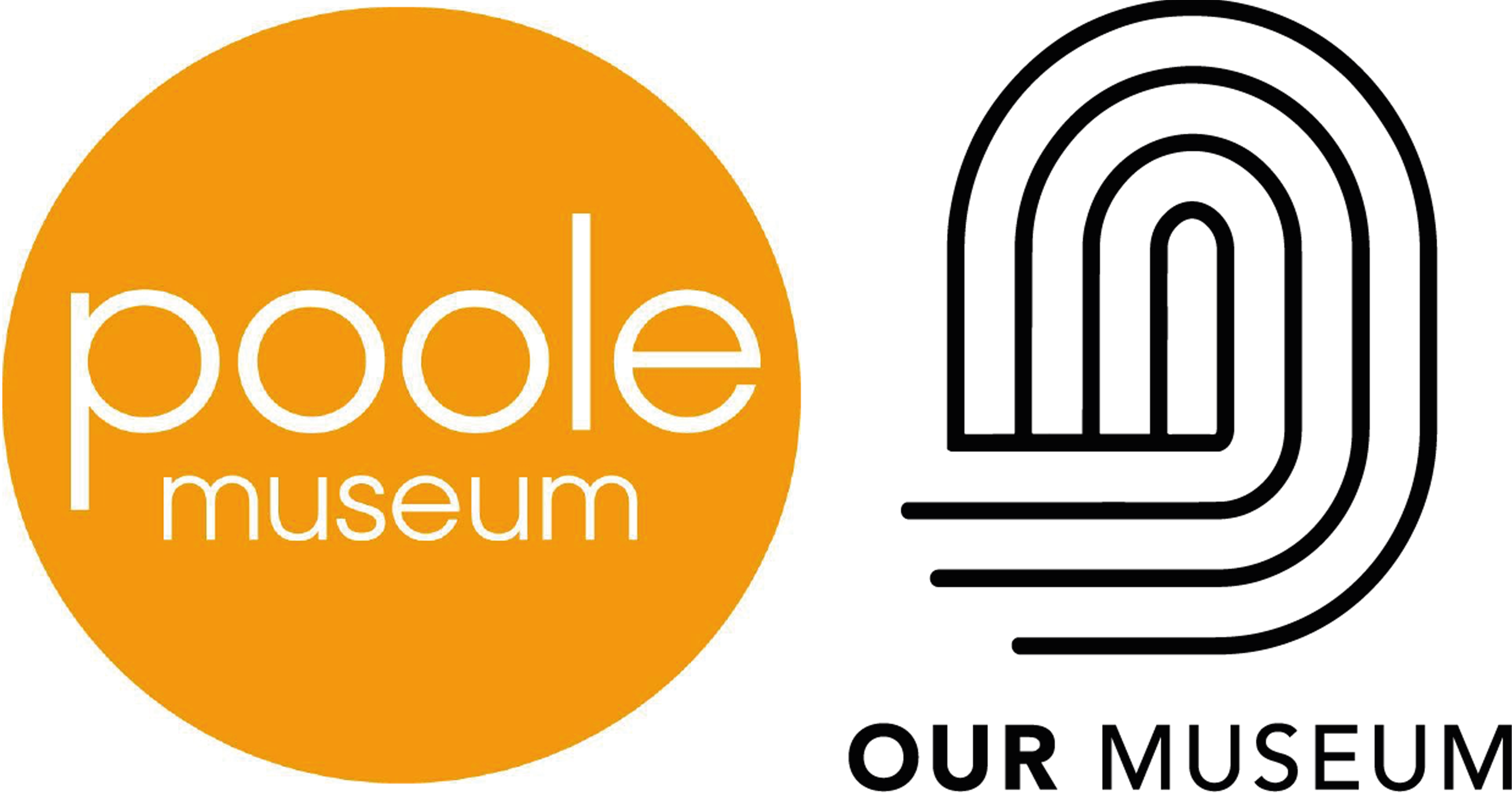
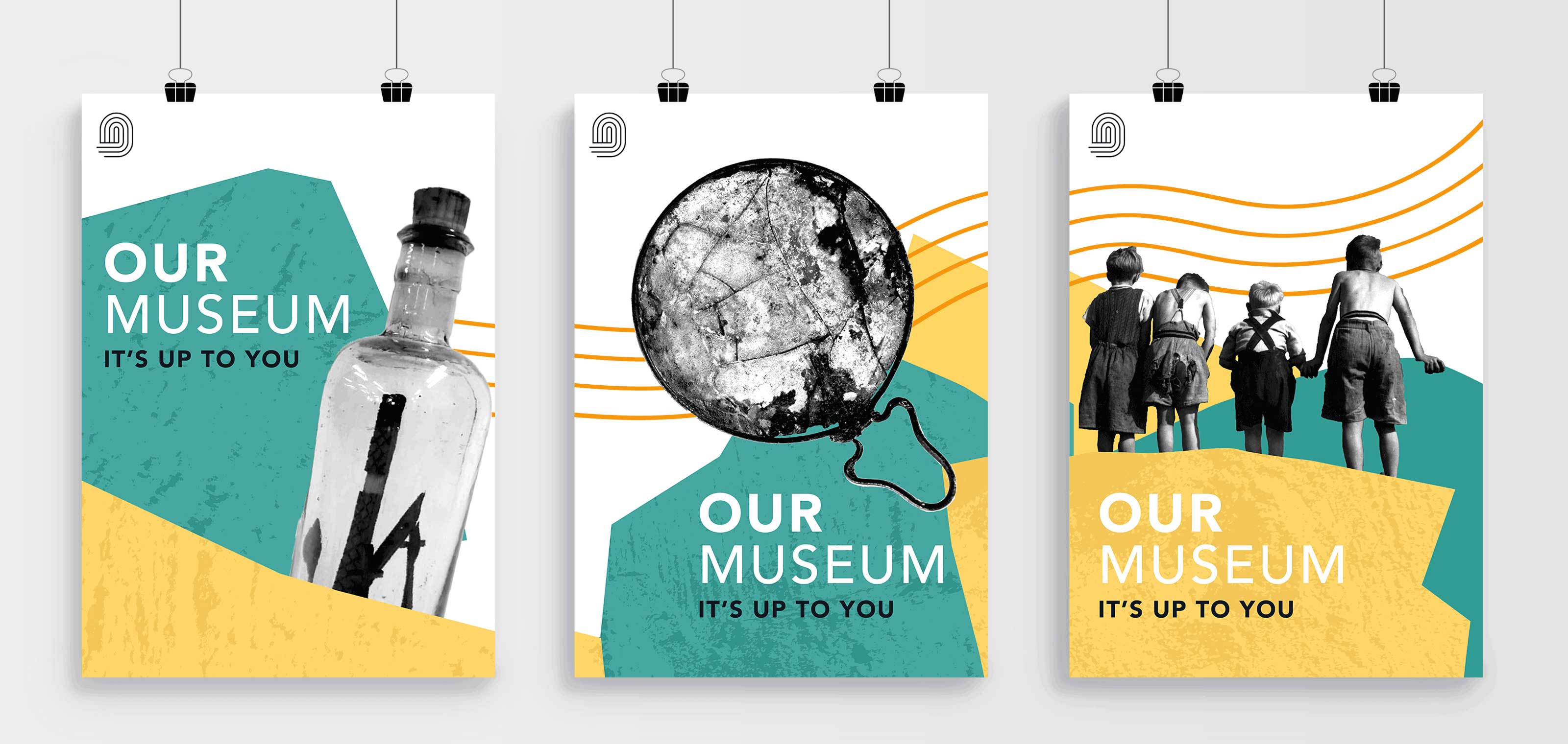
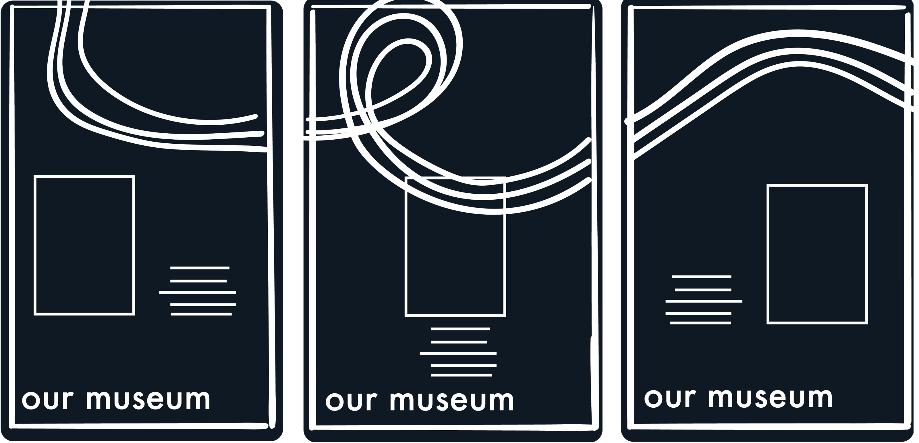
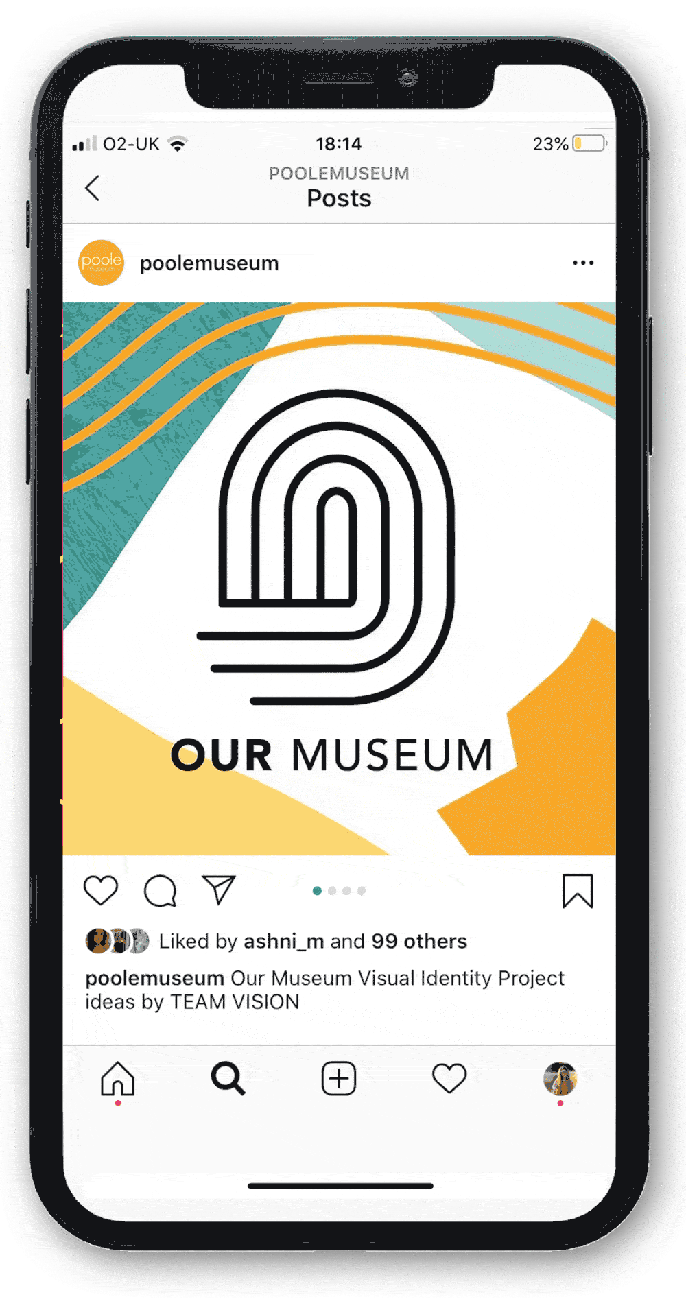
The final logo incorporates the rope imagery inspired by the trip to harbour. Rather than creating a literal knot, we simplified the idea strands symbolised the idea of different communities coming together. The strands also form the shape of a thumbprint to further emphasise the importance of human touch on history. This ‘O’ shape links the logo to the project title, putting emphasis on the word ‘Our’ due to its relevant focus on the project being people-led.
Brand Guidelines
Creating a set of brand guidelines was important as keeping systems consistent allows for the identity to be immediately recognisable. The guidelines contain information on things such as typography, colour and logo positioning. The style of the guidelines incorporates all the different systems we outlined, and demonstrates both the stability and the flexibility of them.
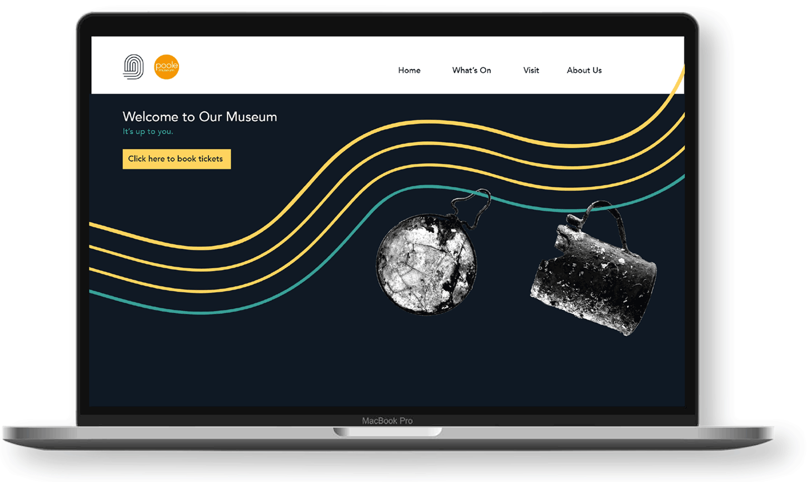
Social Media
It was very important for our brand identity to working digitally, particularly in this day and age. The colours and style are effective on screens and social media, which would help the online community keep up to date with events. Having a strong social media presence would also allow the project to reach people beyond the local community, fulfilling the goal of expanding and diversifying the audience.
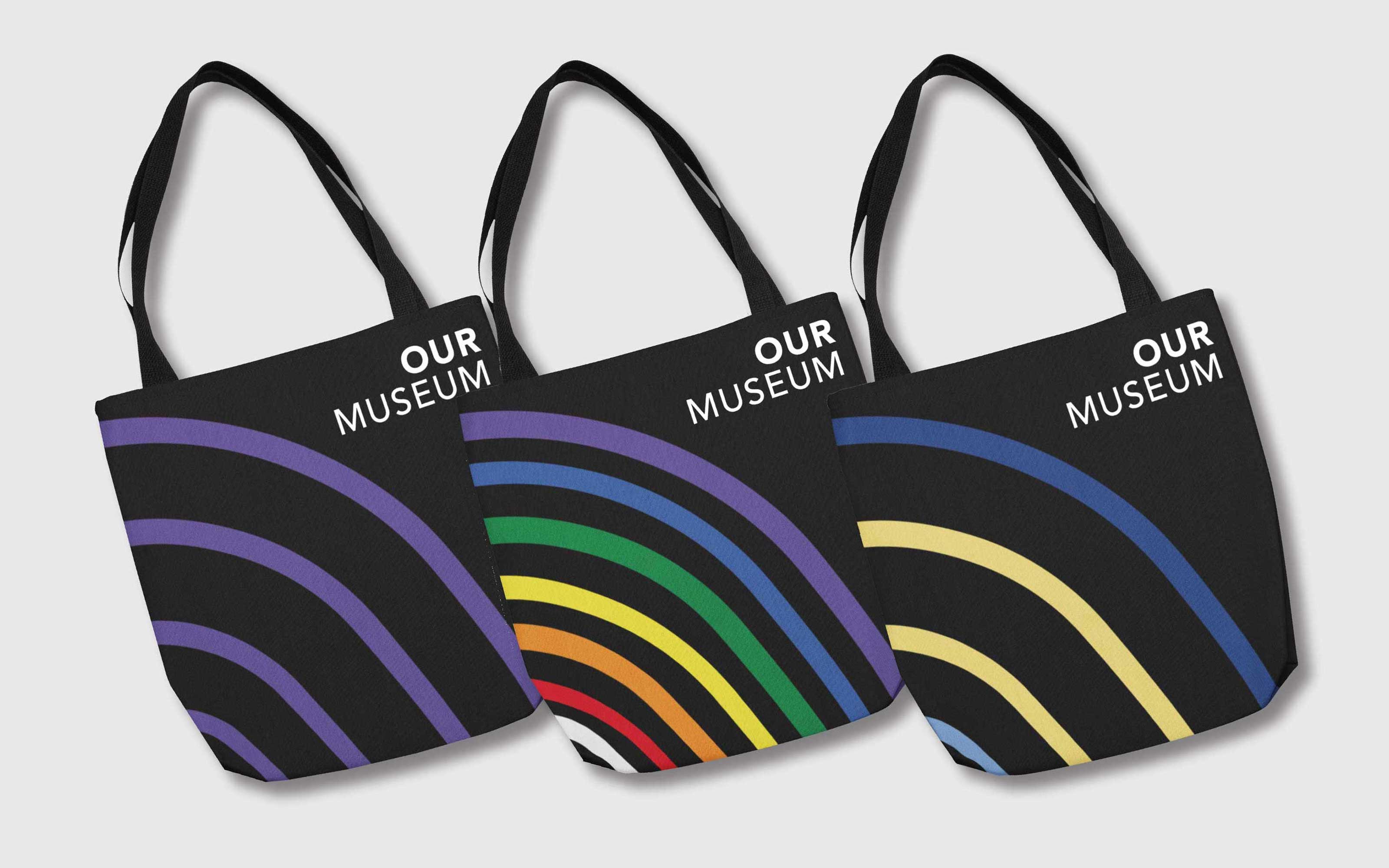

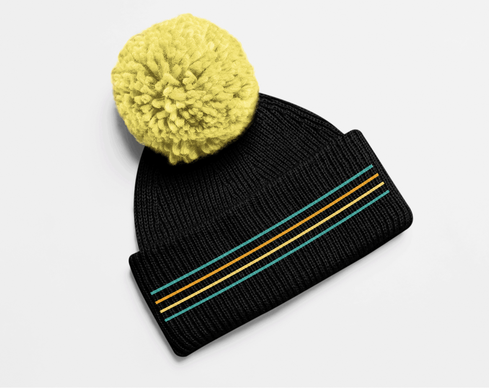
Brand Adaptability
A unique element of the identity is that it can be deconstructed to keep the branding exciting but it remains recognisable by having some visual systems fixed. The logo is adaptable and can be changed for different events; for example, there could be a specific event catered to those with hearing impairments, where support could be offered such as having a sign language interpreter present. The event could be promoted using the logo in the deaf community flag colours, and items such as bags could be available in the colours. This could be applicable to a range of scenarios and communities; another example could be using rainbow colours during Pride months or for LGBTQ+ events.