Brighter Tomorrow
A comprehensive and accessible navigation system for a homeless hostel.
Collaborative project with Gauri Uttam based on interior architecture designs from Beth Clarke.
The Challenge
This project required us to design a wayfinding system for people living in a homeless hostel and rehabilitation centre. The system had to be visually appealing, appropriate for the user and most importantly had to aid navigation. This brief was in collaboration with an interior architecture student, who designed the layout of the building. The building had a very modular style, which is reflected in our wayfinding system, and the architecture student liked the idea of us using a bold colour palette to complement her chosen industrial materials.
I ensured that all of the elements elements worked together and represented one visual identity; this coherent system displays a good balance between attractiveness and legibility. I considered sustainability through our choice in materials, and took into account inclusivity during all stages the design process.
The Journey
Understanding the Space
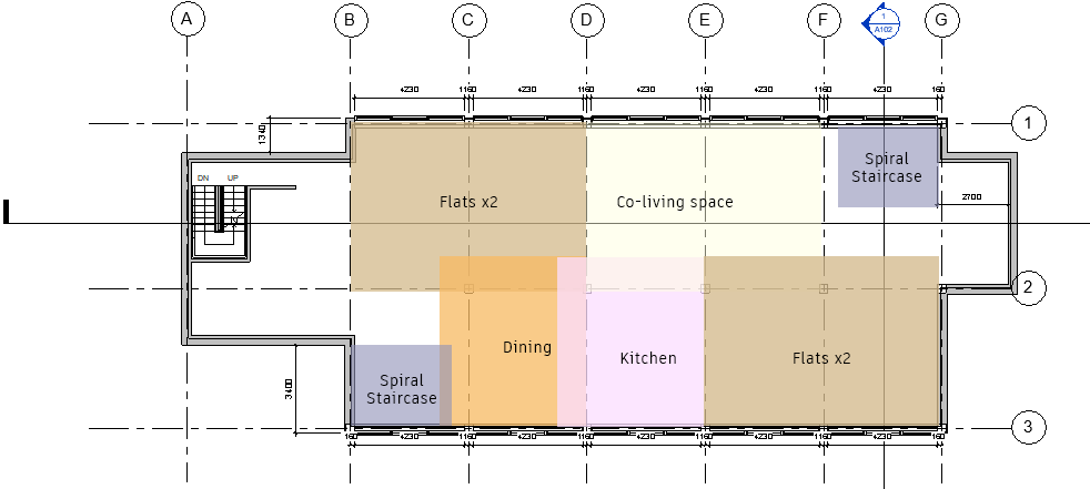
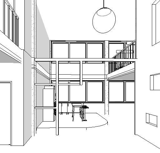
The first step was to get a better understanding of the building's unique selling points. The space offers temporary shelter, with the focus being on providing tools and opportunities to help the residents find employability. As well as a level dedicated to a workspace, there is also a floor specifically for families, which includes a children's space. The style of the building is very modular; the interior architecture features a cage-like structure with lots of square shapes. The materials within the space were very industrial, with exposed brick and the inclusion of steel pillars. We agreed that bright colours for the wayfinding could be a visually appealipng contrast to these materials.
Typography
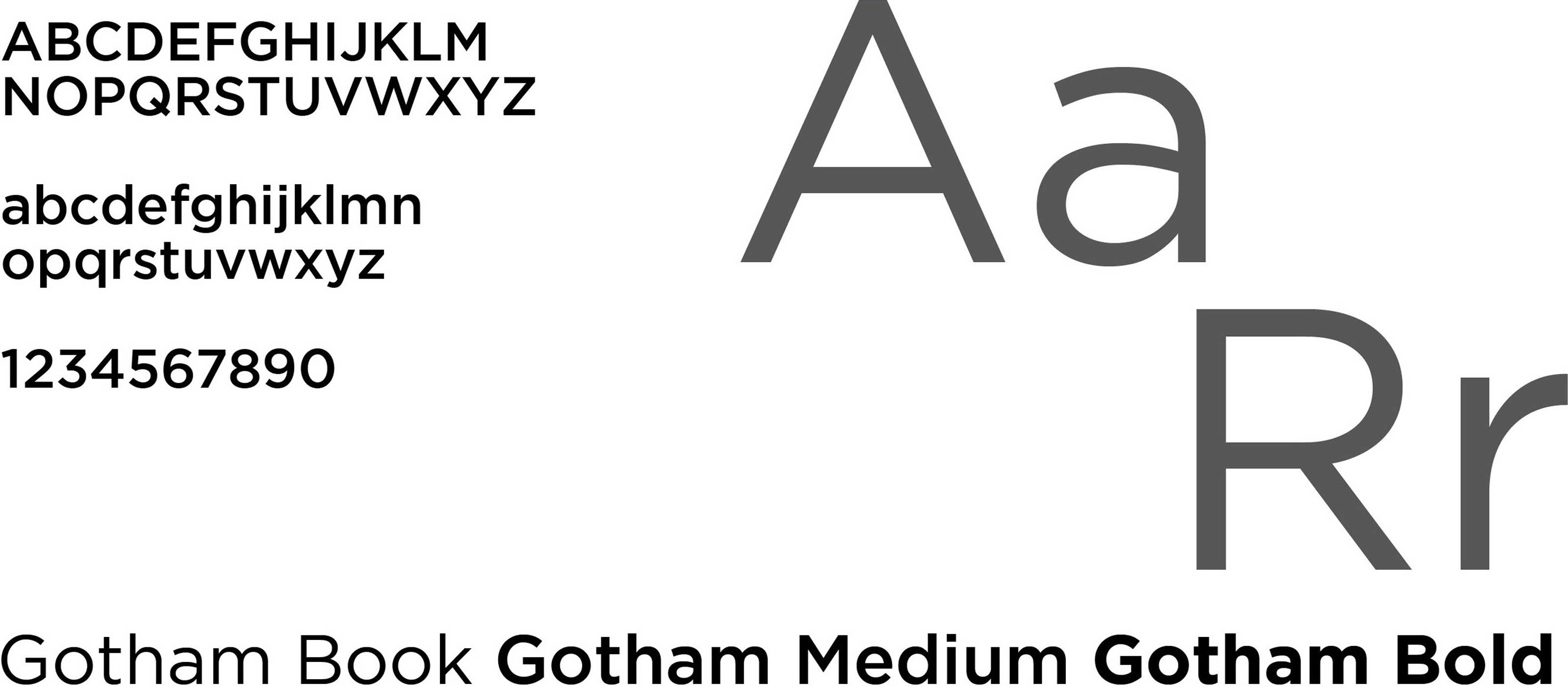
We originally selected Source Sans as our font because of its simplicity and legibility. However, when we began applying it to signage it came across quite harsh. Whilst legibility is important, we wanted to choose a friendlier font with a bit more personality, and eventually settled on Gotham. Gotham was originally inspired by 20th century architectural signage found in New York City. It is a legible sans serif font with round near-circular curves, giving it a friendly feel. It has a high x-height, and the different weights are very distinct from one another. This means that Gotham can be easily read from a distance, making it appropriate for signage.
Colours
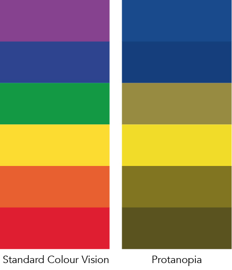
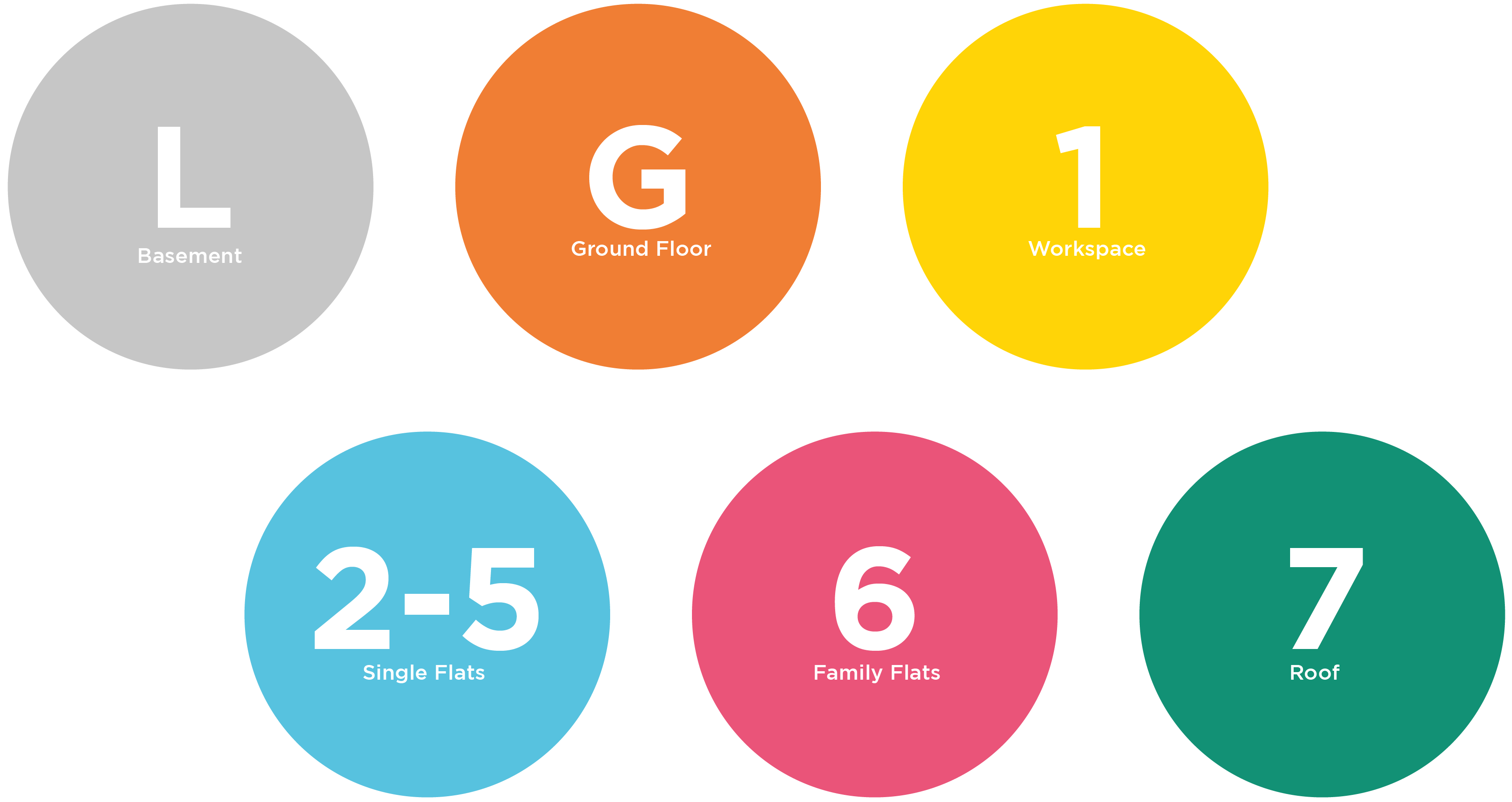
The floors within the building are colour coded, each having a separate colour other than the four levels of single flats, which are all the same blue. It was important to consider the specific needs of potential residents throughout the entire design process. People with protanopia, a common form of colour blindness, tend to confuse browns, oranges, reds and greens due to defective long-wavelength cones in their eyes. For this reason, we decided to not use red and assigned green to the roof level so that it would never be presented next to the orange of the ground floor. This way, the colours would be distinguishable even for those with colour blindness. Having this colour system is an obvious way of aiding navigation, and it also makes the workspace feel separate from the flats to help introduce residents to a working lifestyle.
Materials and Sustainability
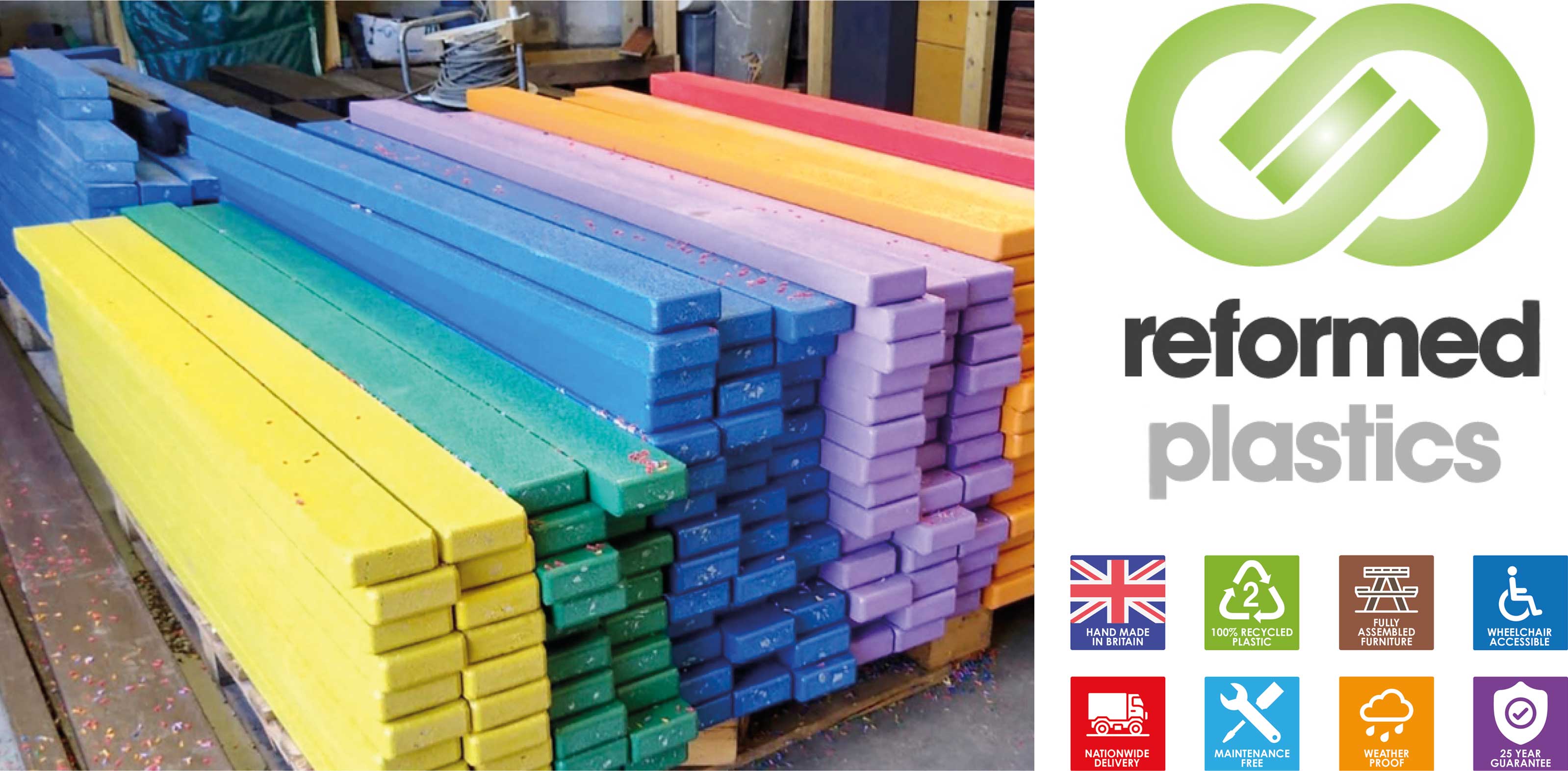
Sustainability was a key focus within this project. After doing some research, I found a company called Reformed Plastics, a manufacturer of 100% recycled plastic sustainable products. Their factory is based in Bournemouth, so using their materials would be supporting a relatively small, local business, sustaining the community and minimising pollution from transportation. The plastic lumber is made from recycled items like plastic bottles. The material is visually appealing, coming in a variety of colours, but is also very durable and eco-friendly. The longevity of the material makes it financially cost-effective in the long term. In terms of legibility, the plastic is a matte material, which reduces glare from indoor lighting making the signage more accessible and easier to read.
Idea Generation
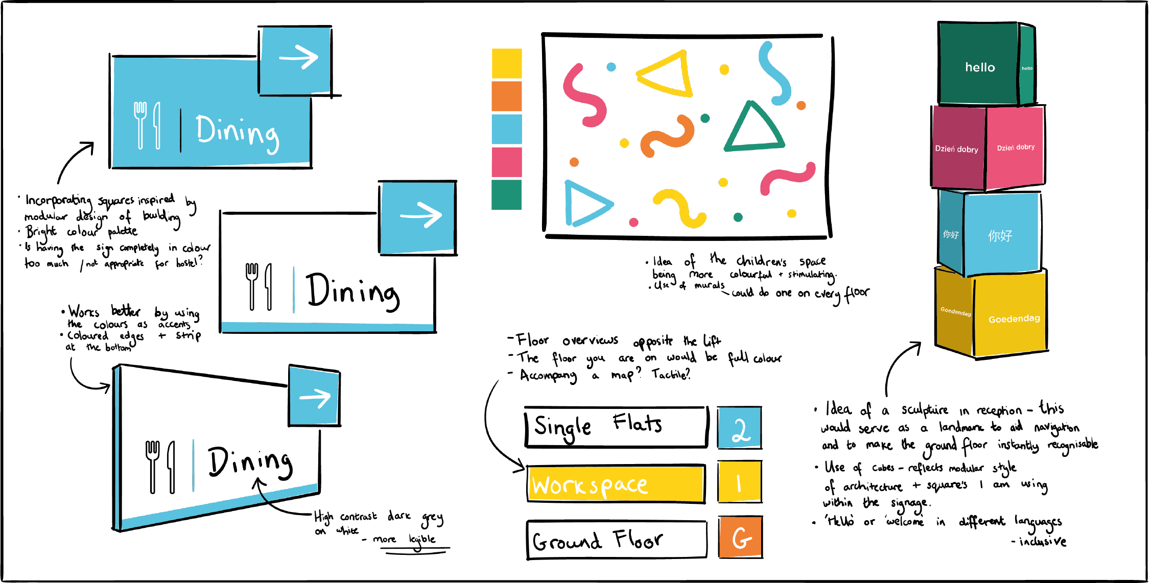
The idea was to incorporate the square shapes within the architecture into our wayfinding. In terms of the colour system, we decided to use the colours as accents and for the edges of the signs rather than having the signs completely in colour as this would have been quite overbearing. Having dark text on a contrasting white background made the type and icons a lot more legible. I also began thinking about other forms of wayfinding other than signage, such as the use of landmarks and murals. These could differ depending on the floor, such as having a colourful wall in the children's space.
The Outcomes
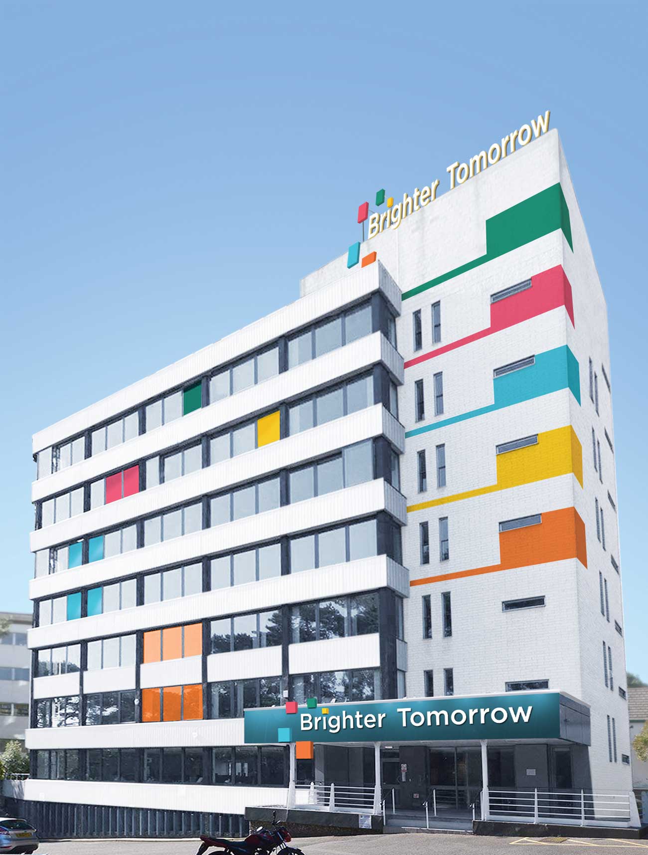
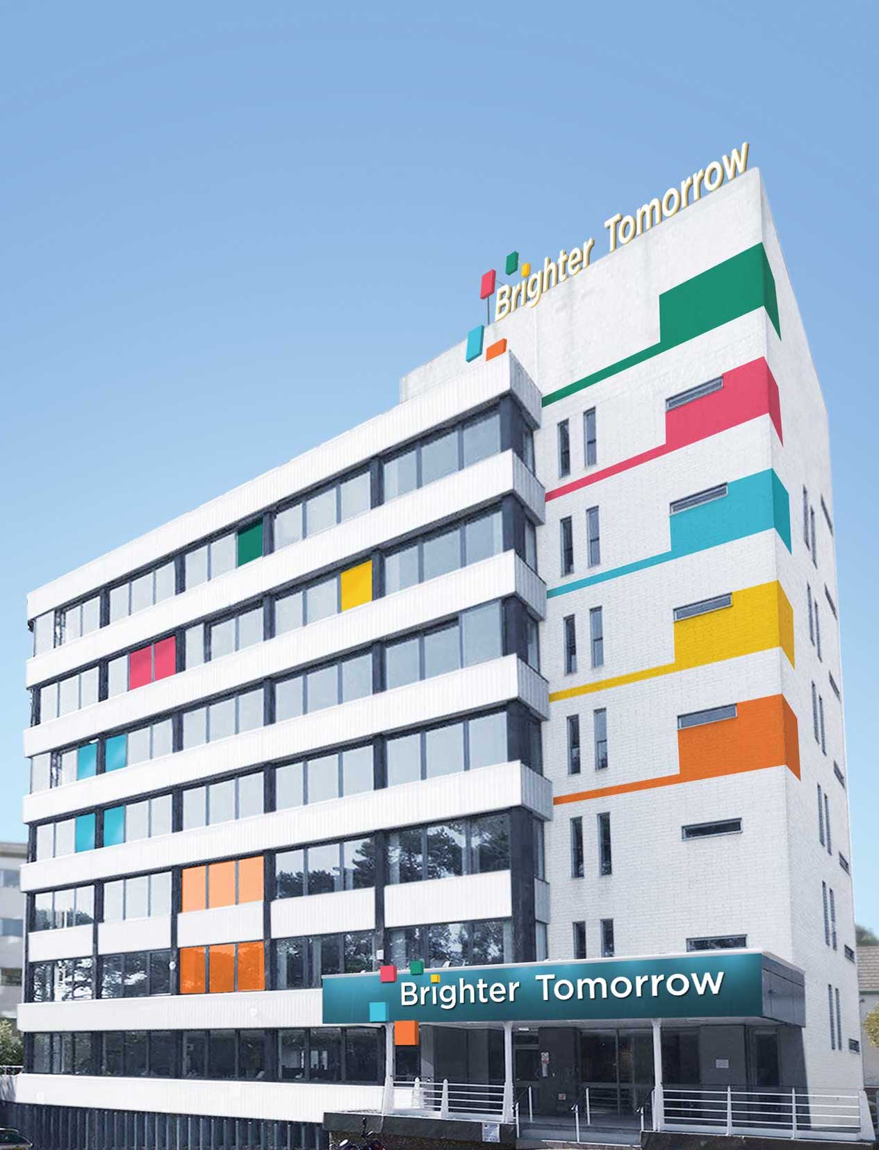
It was important to consider exterior design as well as the interior wayfinding. The logo is placed at the front entrance, with the squares being three-dimensional to add a playful, inviting element. Each colour from the palette wraps around the side of the building, and the logo also stands at the very top so that it could be clearly visible from a distance.
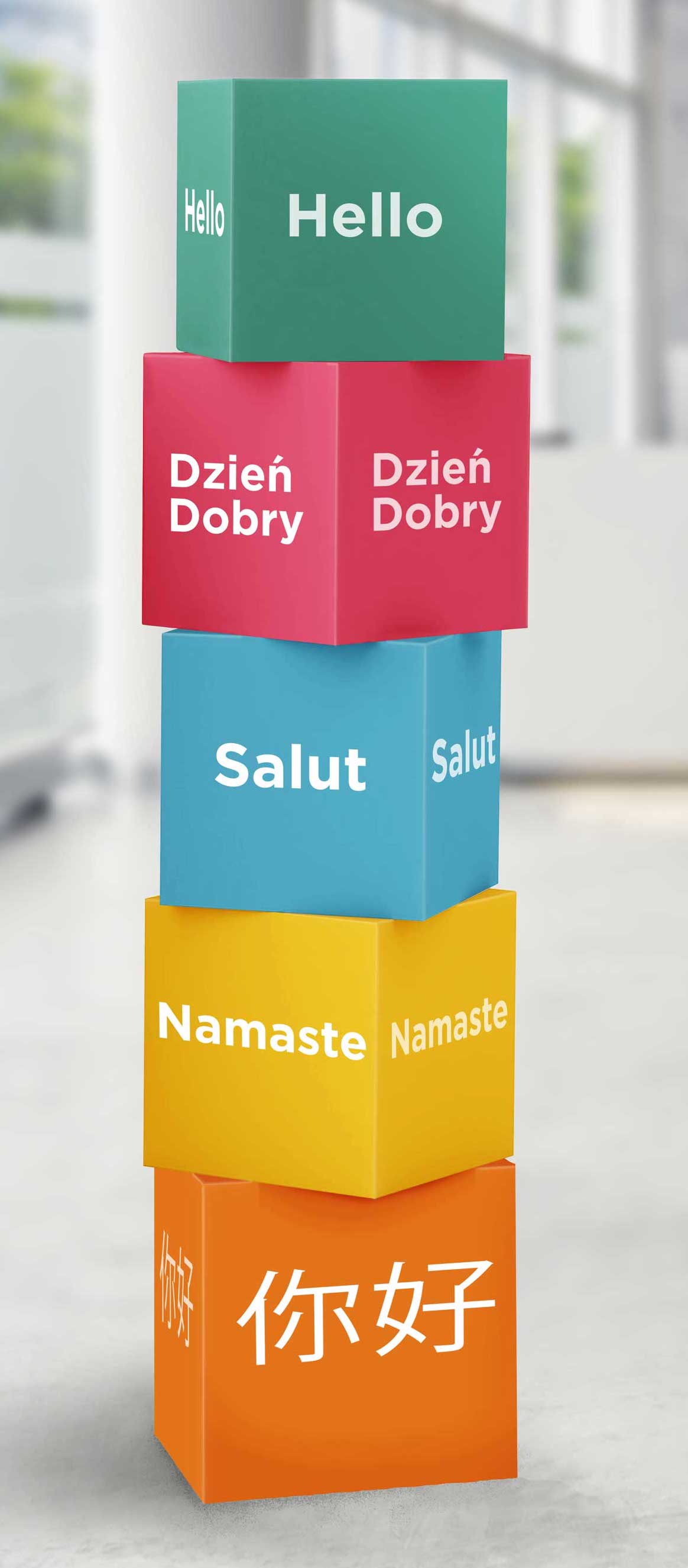
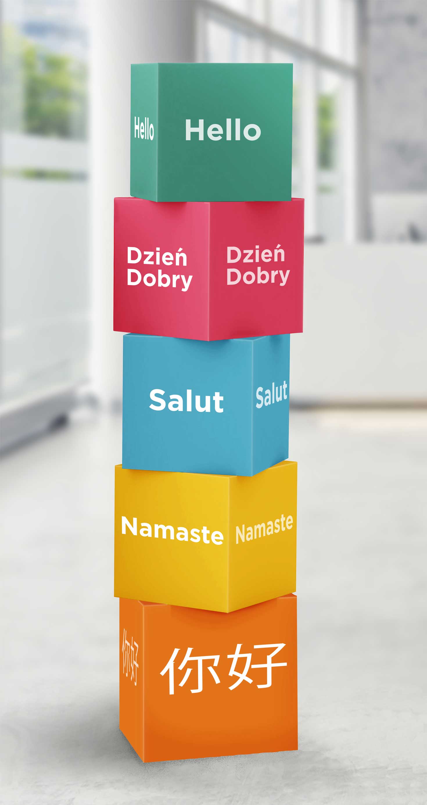
The system includes other forms of wayfinding beyond signage. A sculpture would sit in reception to serve as a landmark which would aid navigation and the cubes embody the style of the wayfinding system as a whole. The stack of blocks feature ‘hello’ in different languages, reinforcing the idea of inclusivity.
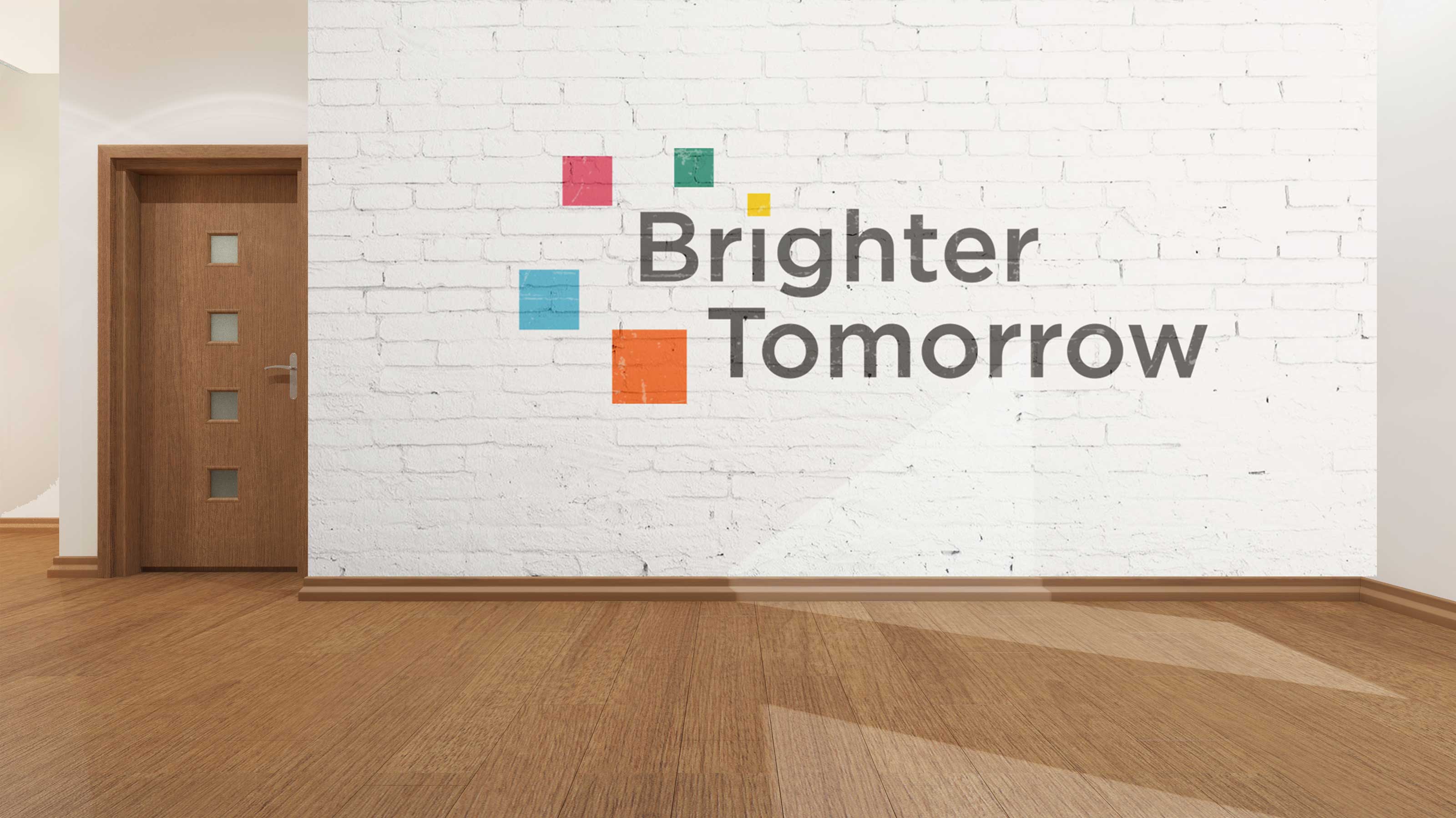
The visual identity was inspired by the modular style of the building; we wanted to keep the concept of the squares prominent in our logo, and liked the idea of the squares representing building blocks, both literally and figuratively. We developed the logo to have 5 different squares, going from small to big. The smallest square is yellow- the colour of the workspace. This is to represent that growth begins in the workspace, which is the main feature of the building.
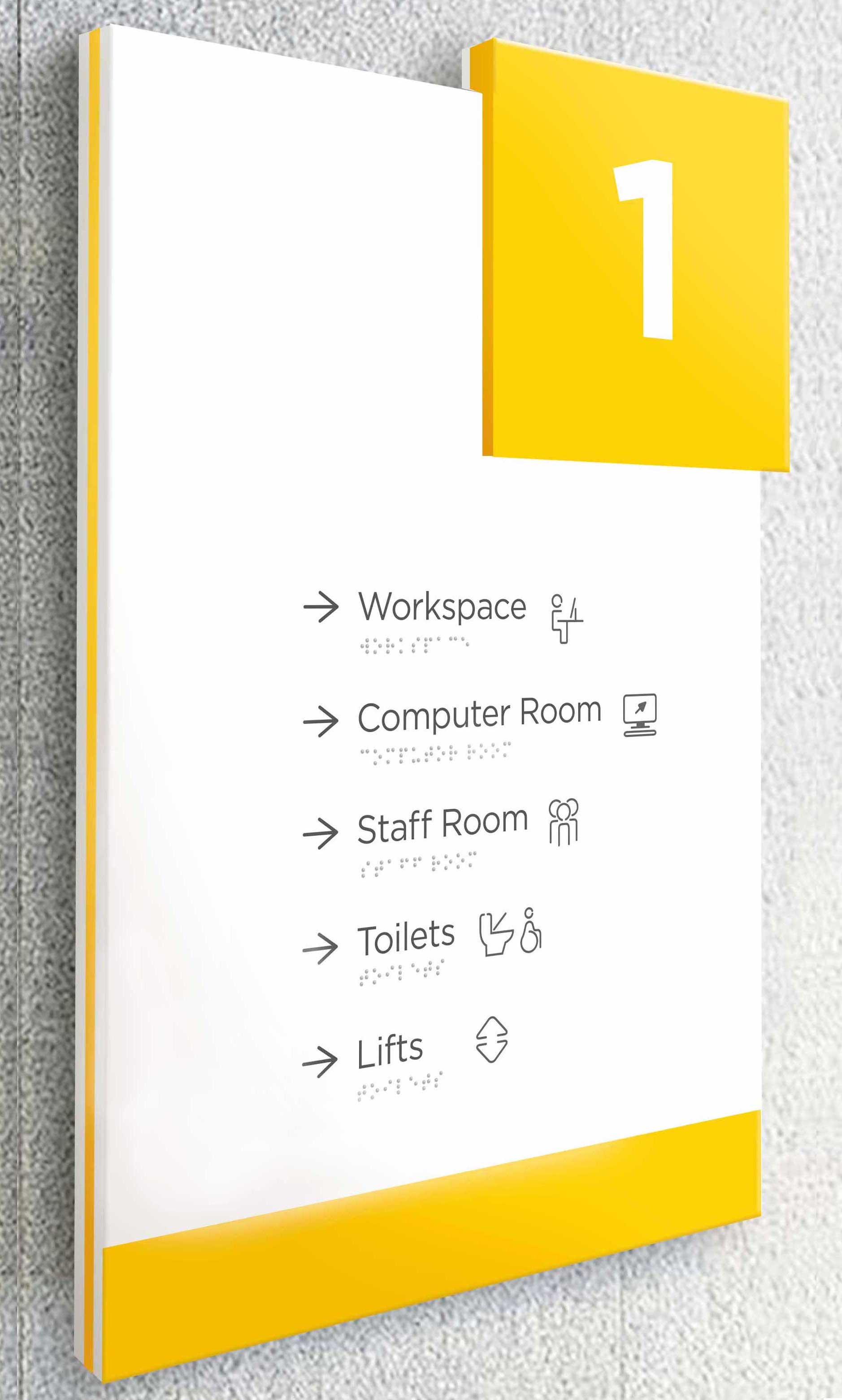
Creating a comprehensive set of icons was important, as they are a way to communicate directions without the issue of a language or literacy level barrier. The final icons are soft to contrast to the sharp square shapes of the signage. The aim was to make them as understandable as possible but with a bit of personality and consistent stroke widths.
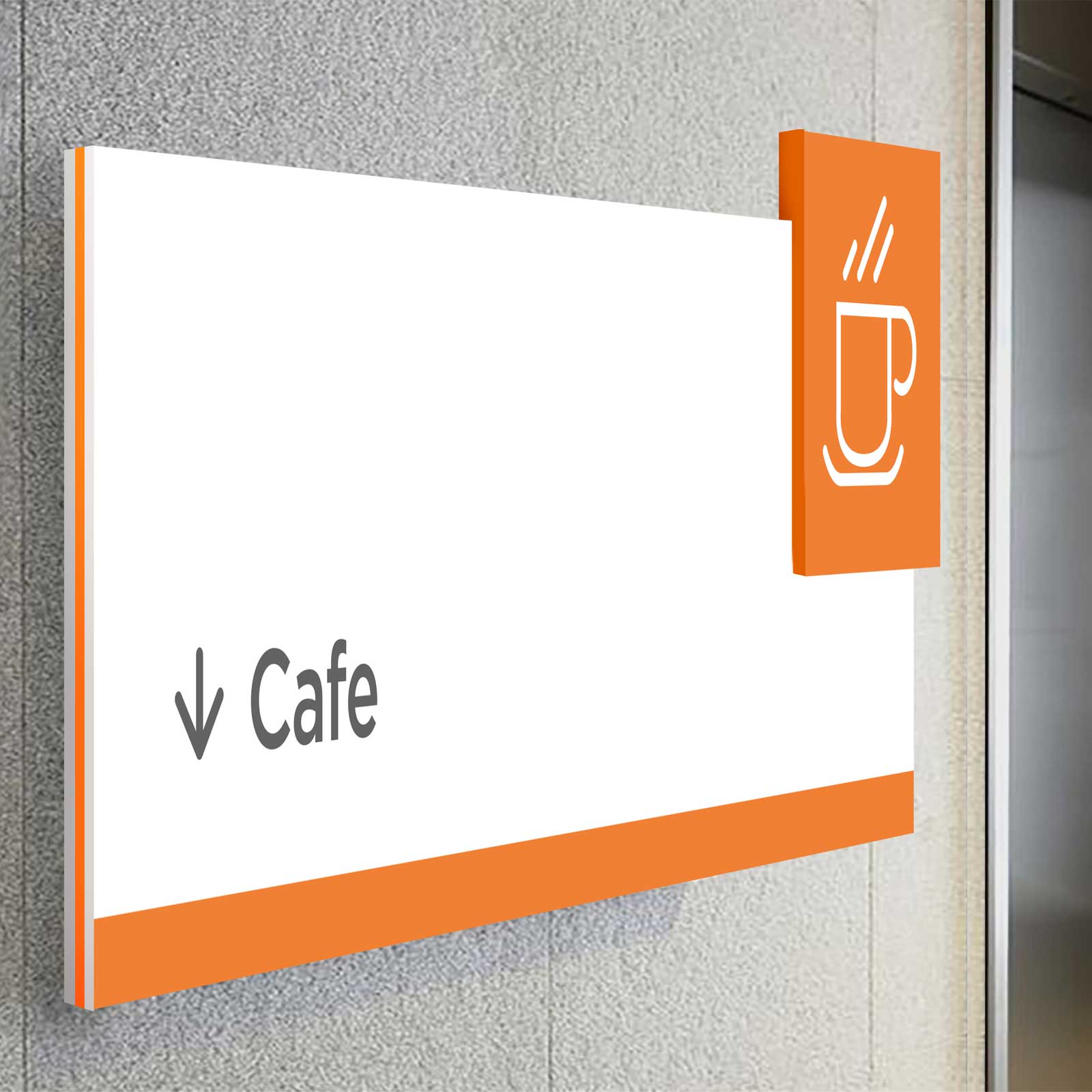
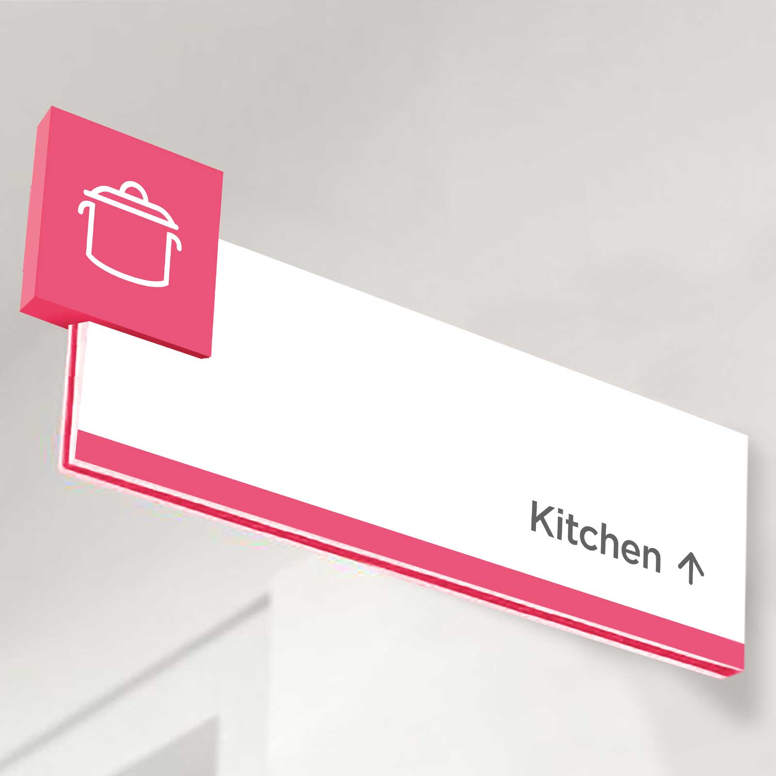
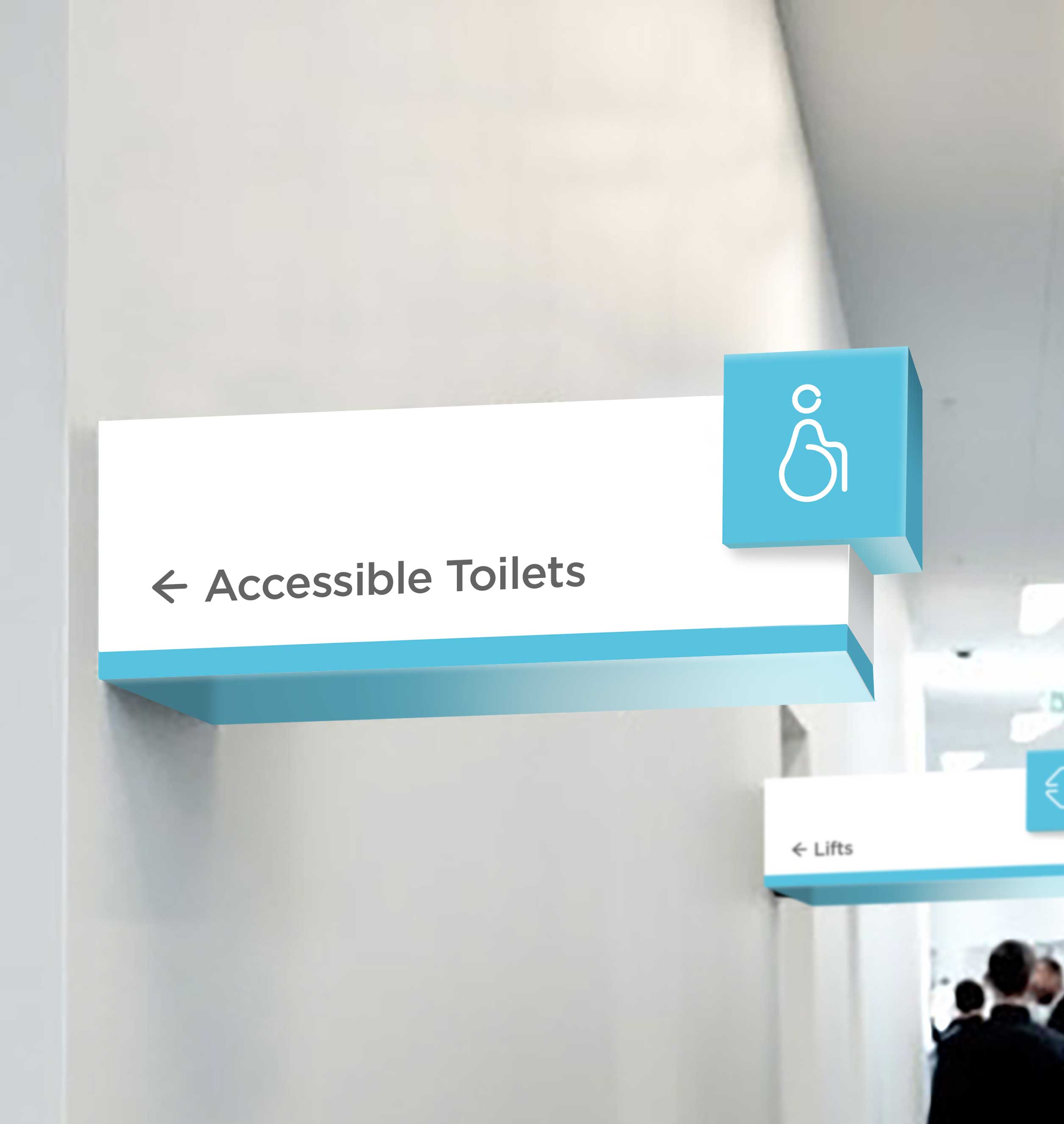
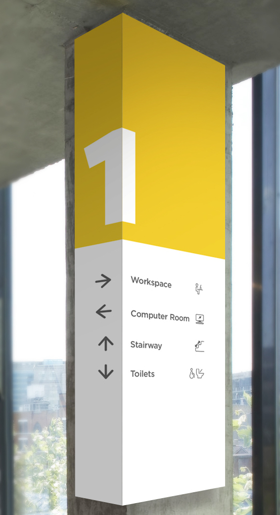
The signage follows the same modular theme as the architecture, with the icons being positioned in coloured squares. The colour is also used around the sign, with the type being dark grey on a contrasting white background for legibility. The arrows are the same x-height as the type, making the elements work together to be as simple to comprehend as possible. The signage could also wrap around columns within the columns in the workspace and on the ground floor.
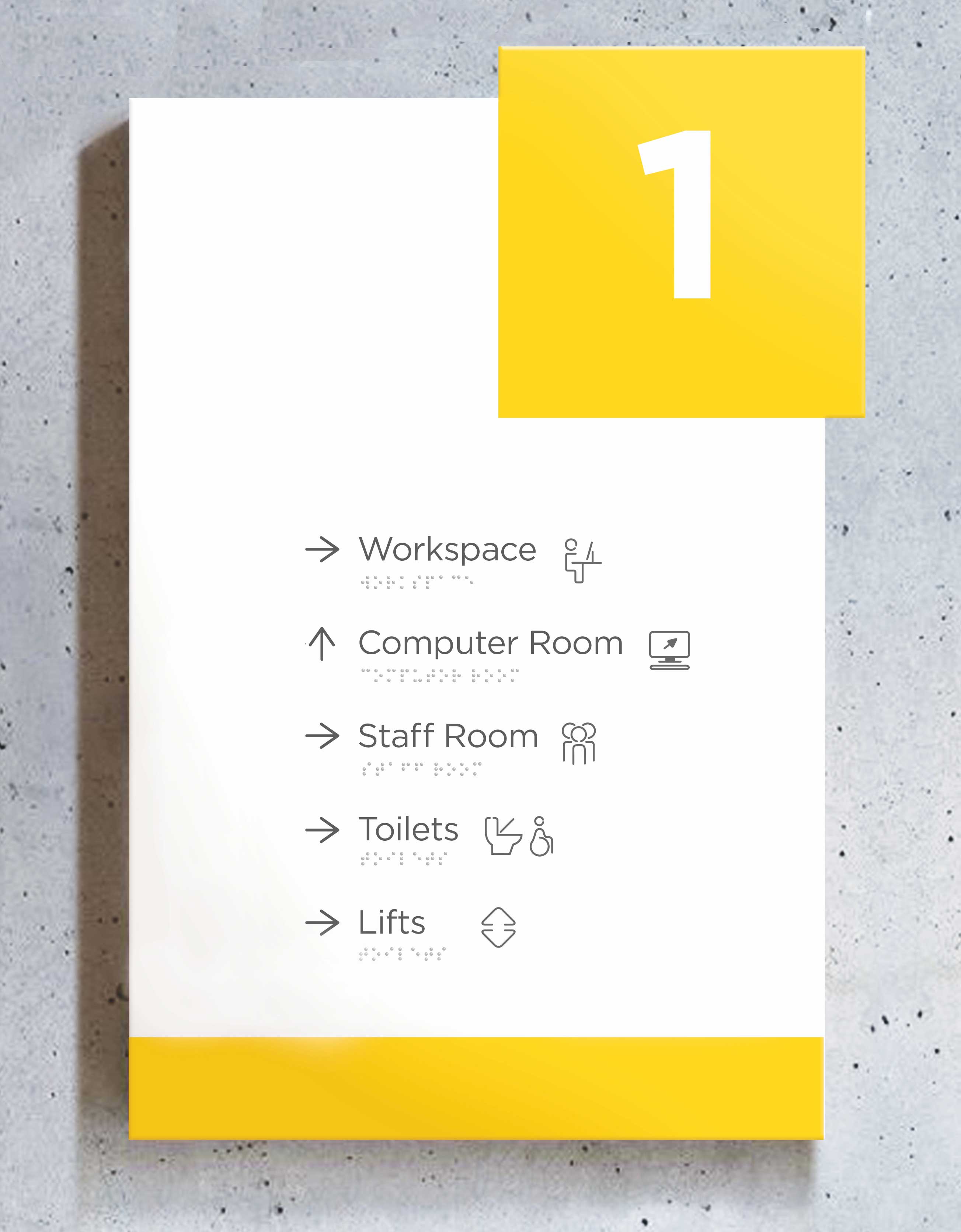
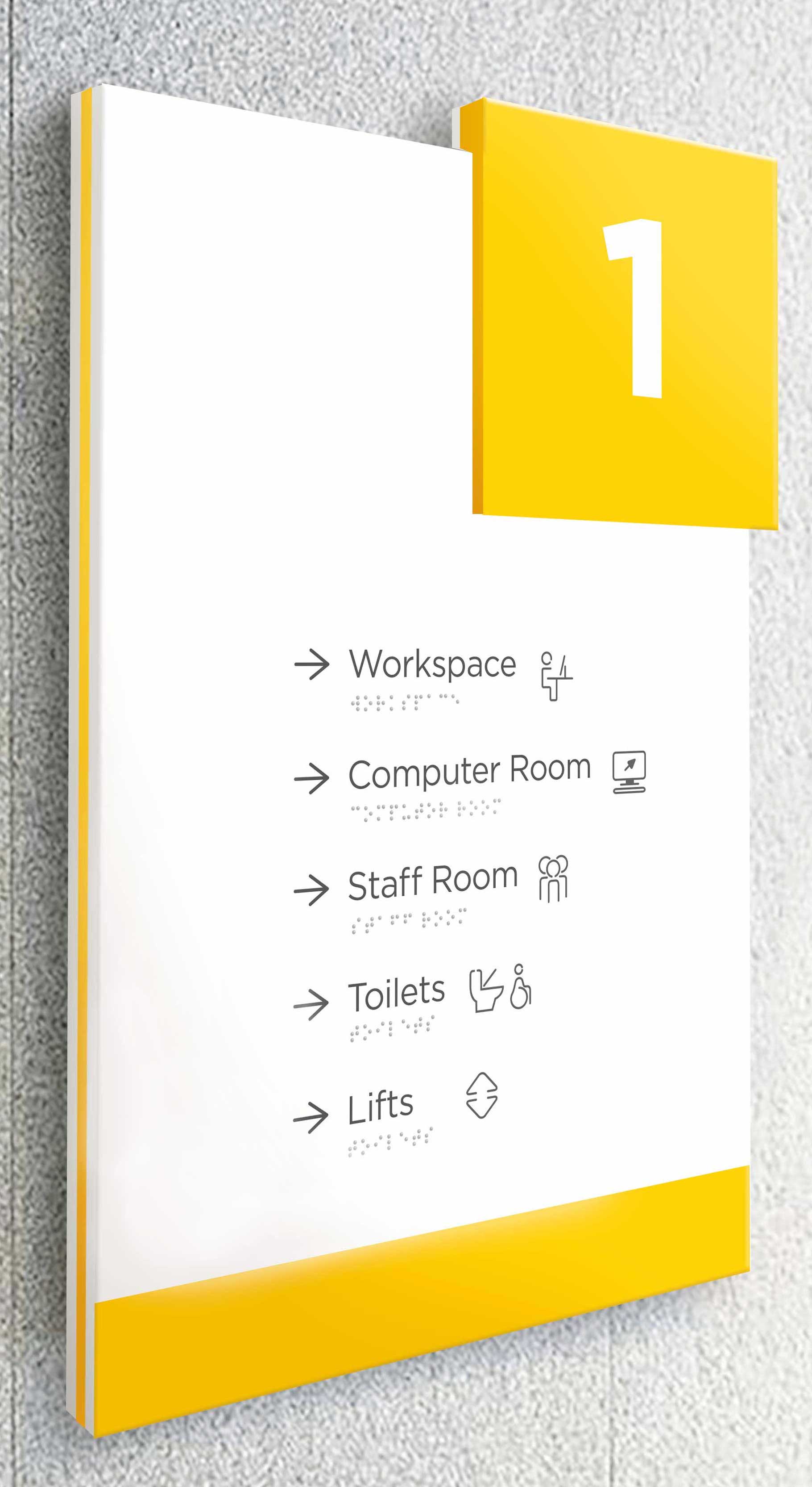
These floor descriptions would be on each level to depict the rooms alongside arrows for directions. I placed braille onto these signs as they would be at height level, facilitating understanding for visually impaired people, and the arrows would be embossed to go along with this.
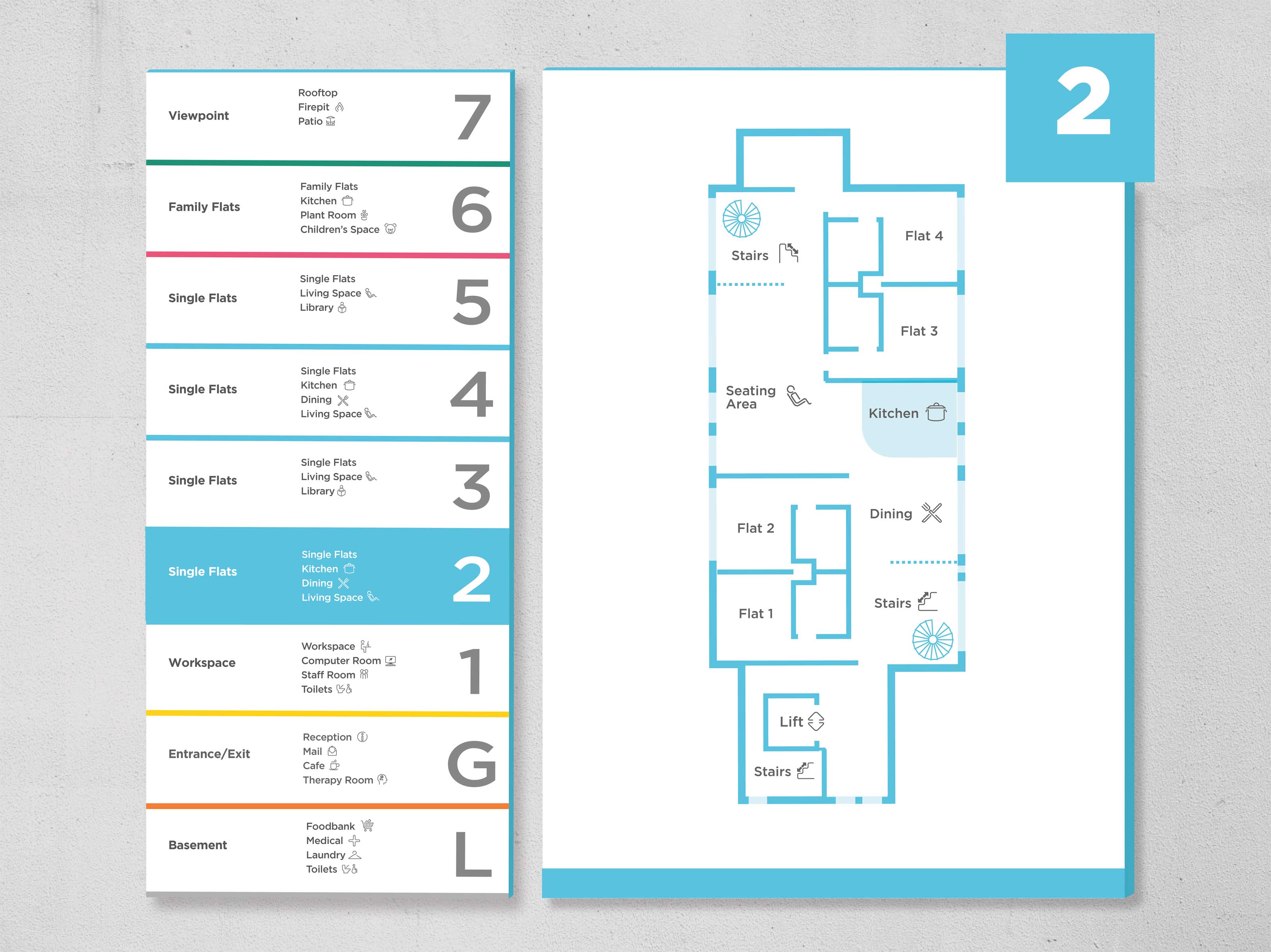
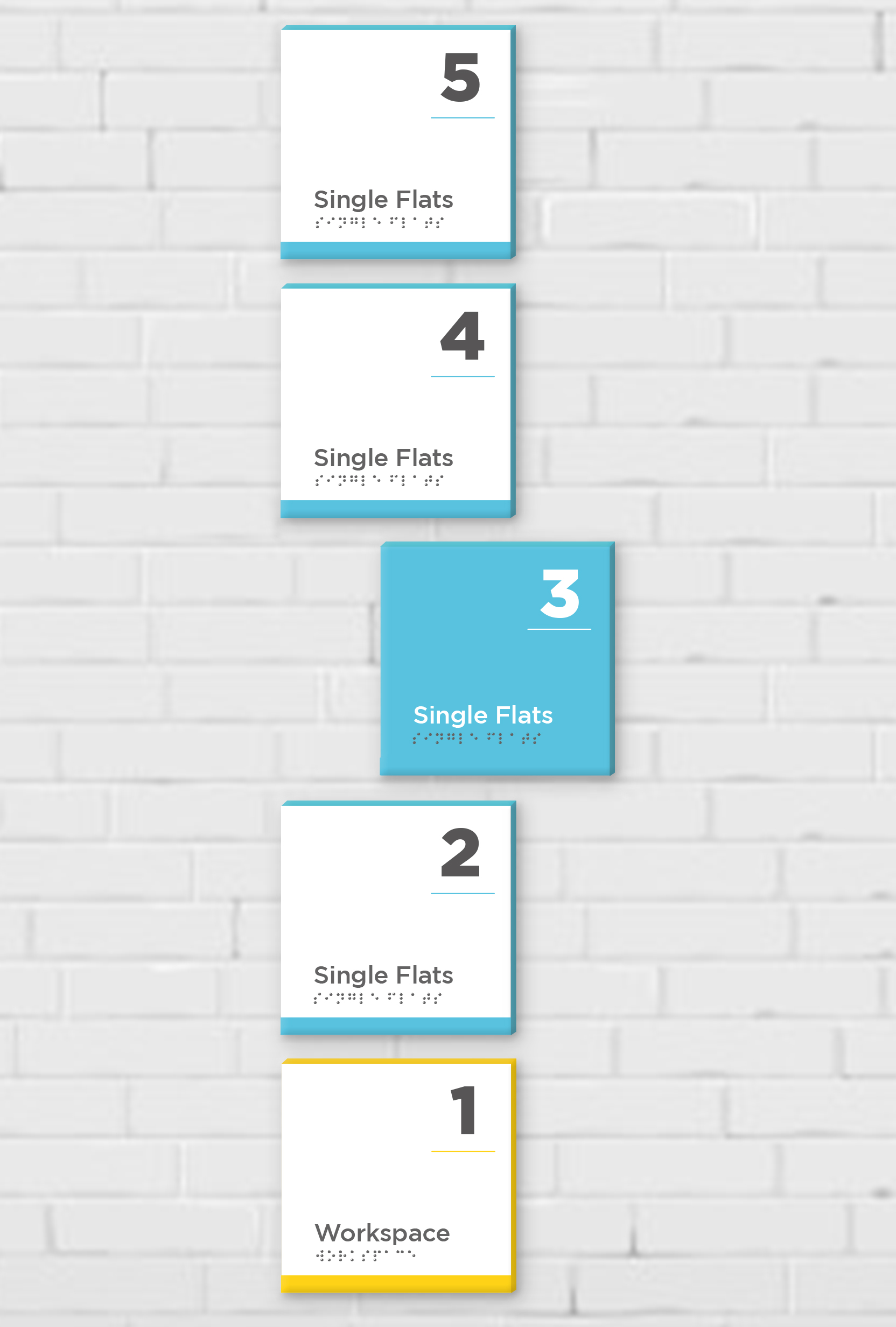
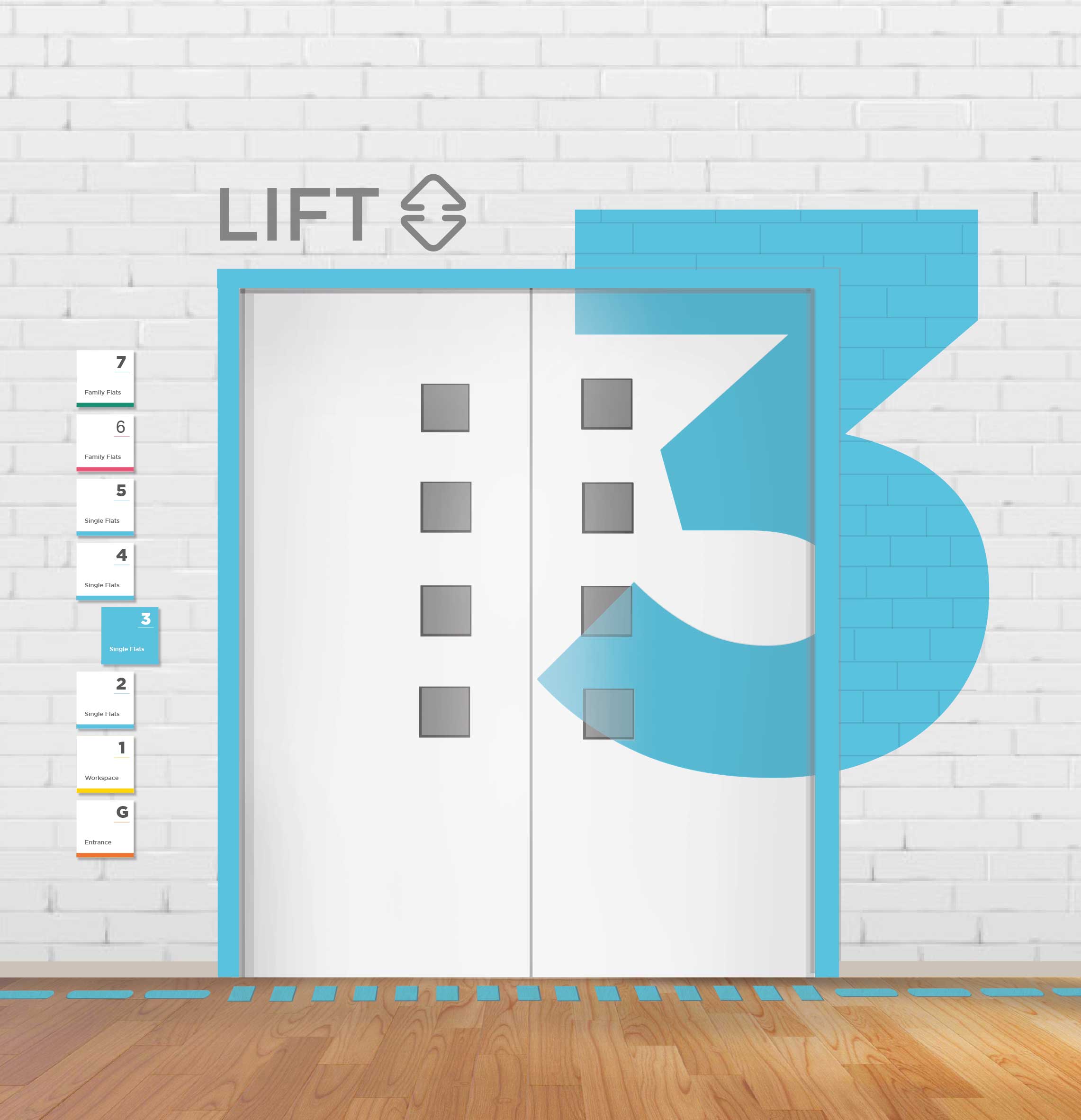
A floor overview would be placed opposite the lift at each level, with the current floor you are on in full colour to make it clear where you are when exiting the lift. This sits next to a map of the floor which demonstrates the location of each room in both words and icons. The lift signage follows the same concept as the floor overview for consistency, with the current floor in full colour. There’s a large, bold decal of the floor number on the lift doors extending onto the wall.
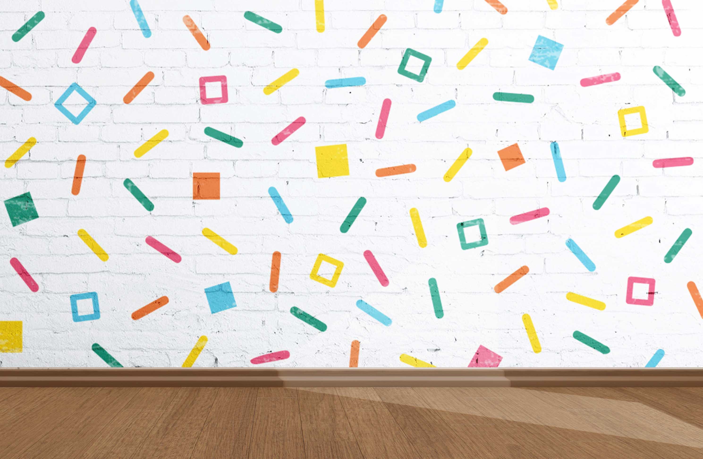
It was important to consider the younger residents within the space and ensure that the system was appropriate for them. This colourful mural for the children’s space, which is where the whole colour palette is put together. It incorporates square shapes within the pattern, linking it to the rest of the wayfinding system. The aim is to create a fun, stimulating environment for the children to spend time in, hopefully improving their quality of life within the shelter.
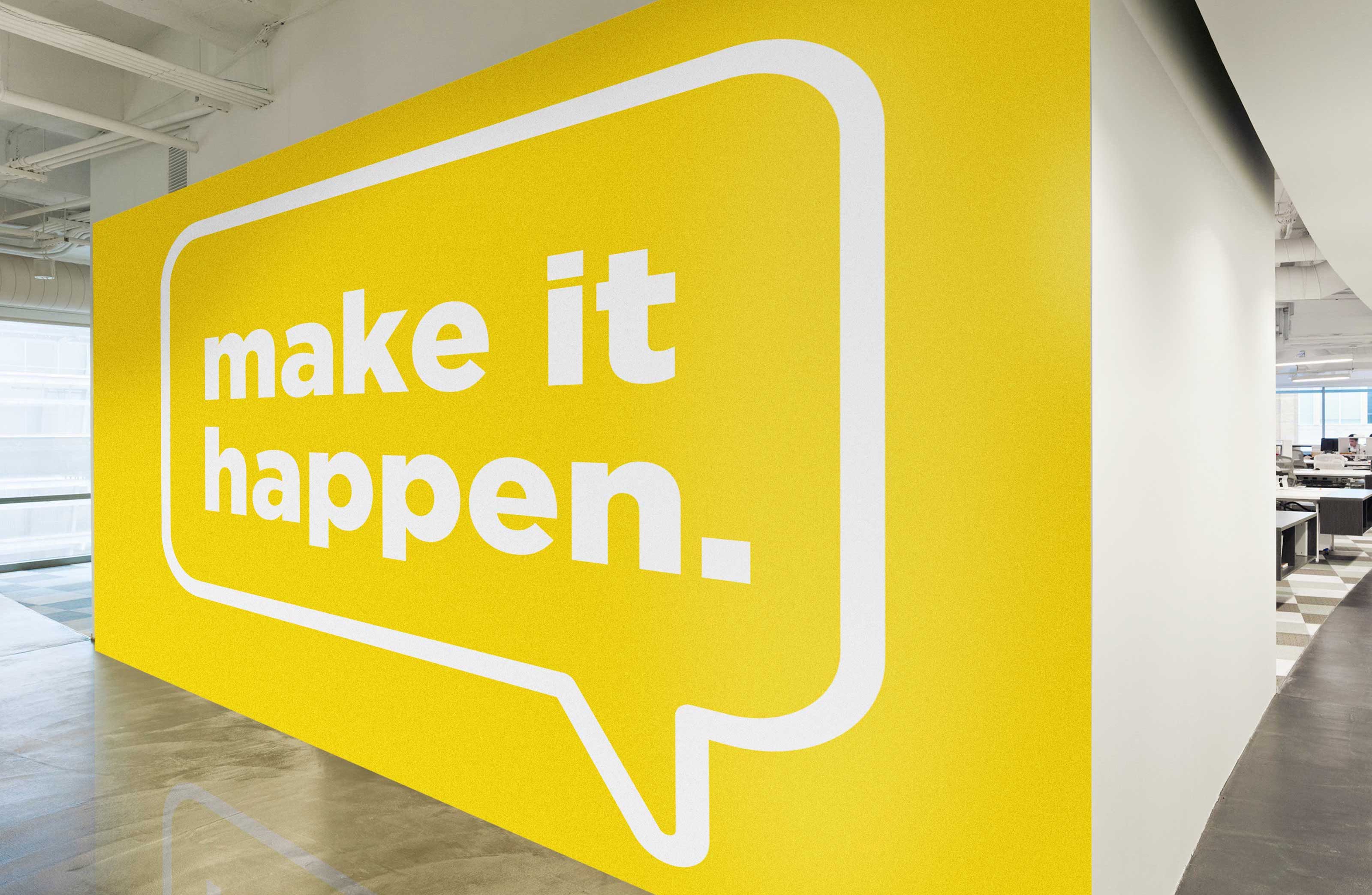
The second yellow mural would be for the workspace with the purpose to aid navigation and inspire productivity. The bold splash of colour brightens up the area and makes it feel more like an office, introducing the residents to the idea of employment and working life.