Kieka Marketing
Live brief with Kieka to create a marketing campaign to make the app explode.
The Challenge
This was an exciting live brief opportunity with Kieka, a London Underground navigation app that allows the user to see how busy stations are before leaving. The idea was to create a bold marketing campaign to increase the usage of the app, specifically aimed towards 22-34 year olds. Similar existing apps mainly focus on getting you from one place to the next, but what makes Kieka unique is that it collects active data about each station and how busy it is in order to provide the user with the best possible route they could take.
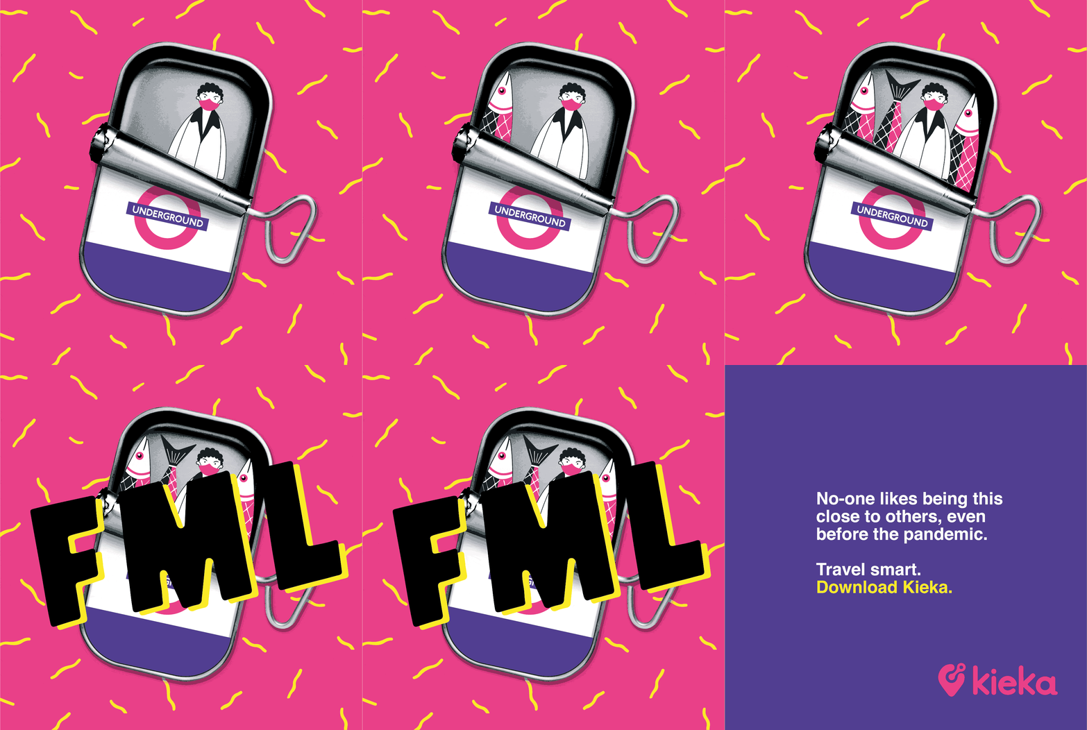
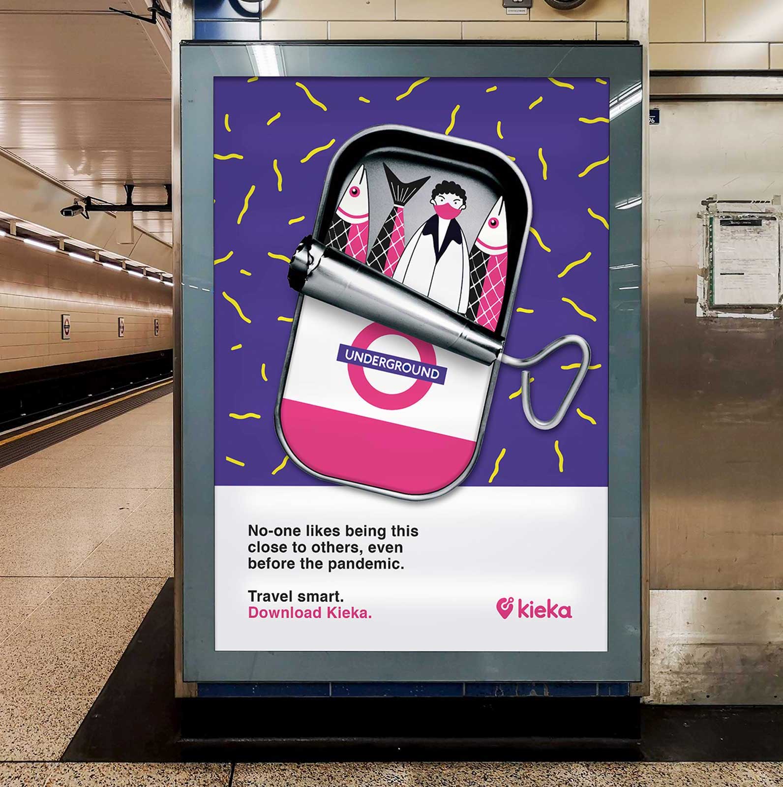
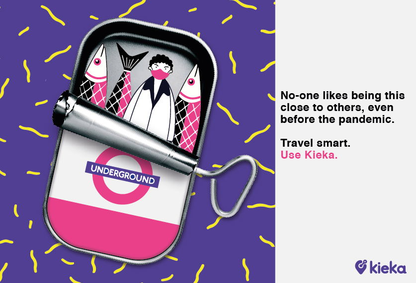
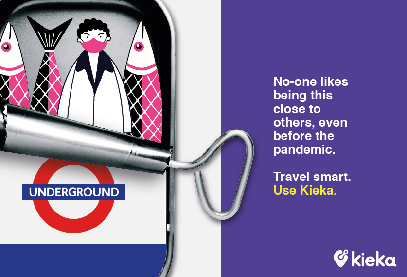
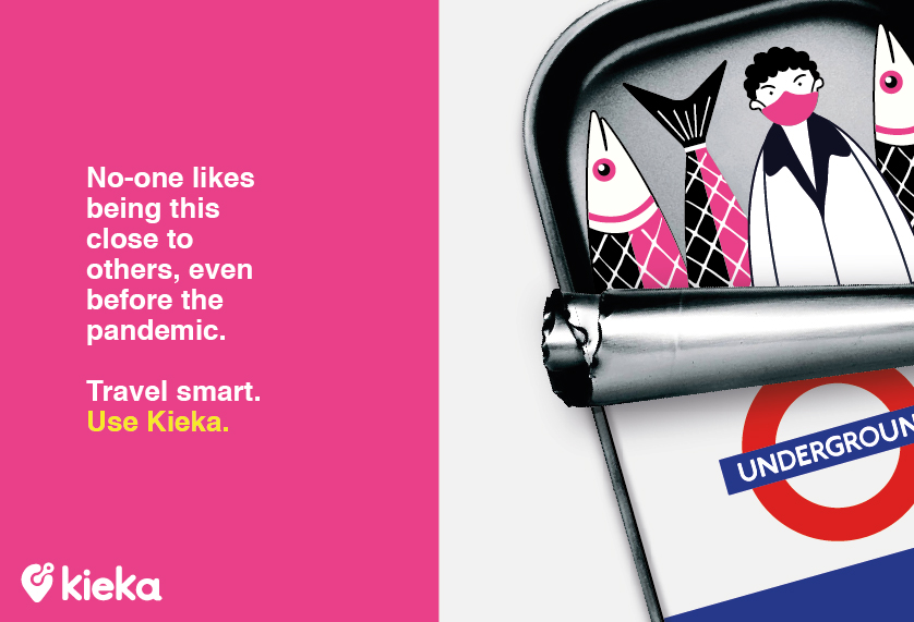
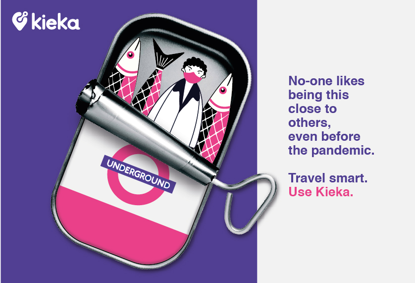
My marketing campaign visualises the issue of crowded tube stations in a humorous way that the audience can relate to. The response to the design was very positive, and led on to further collaboration with the company.
The Journey
The Concept
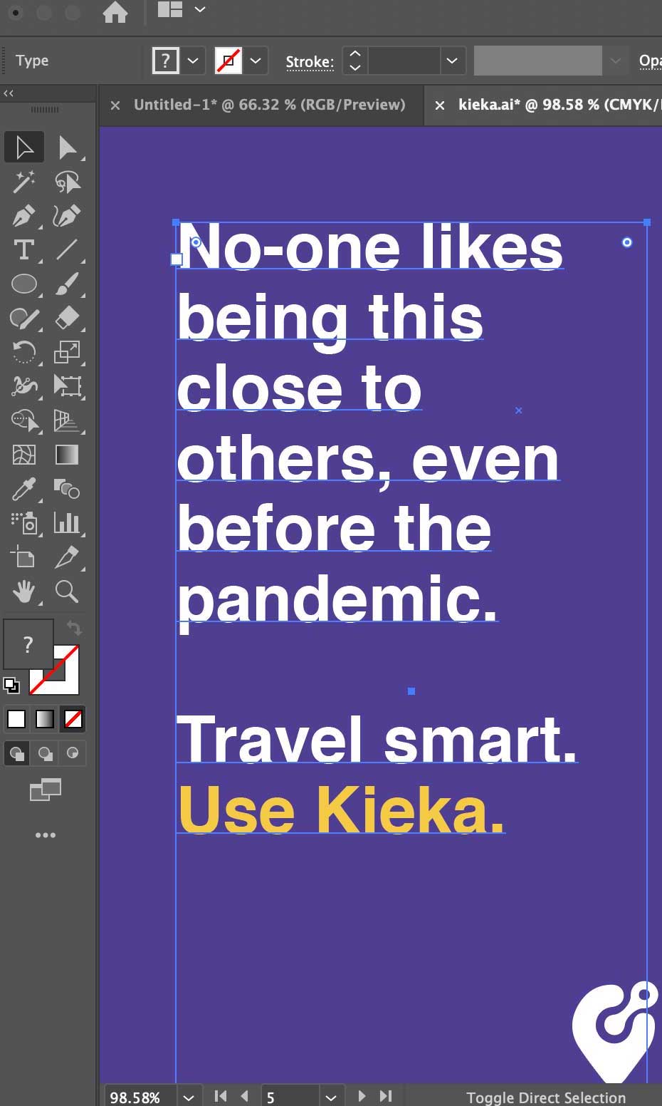
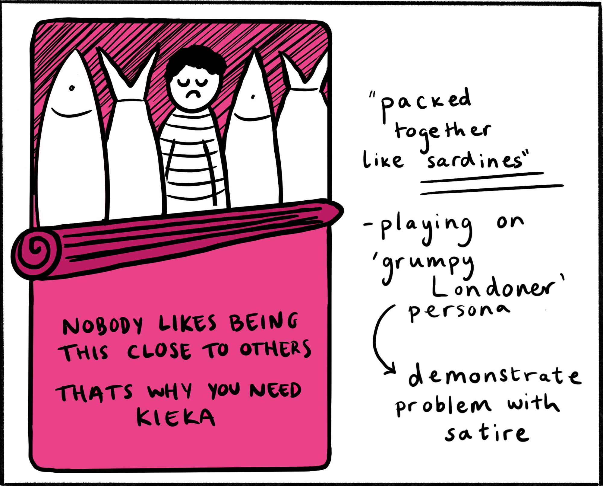
The strategy was to demonstrate the issue of busy tube stations, but in a satirical and memorable way. The design visualises the stereotypically grumpy Londoner, but in a tone that is light-hearted and relatable. I also wanted to appeal to the younger audience of 18-25 year olds, who view knowledge as power and like to be right. This is where the slogan ‘Travel smart. Use Kieka’ comes in.
The concept that I chose to develop to was the idea of tube passengers being packed together like sardines. I experimented with how to visualise this in a simple but effective way and considered how imagery and a slogan could work together.
Development
Once I had created the design, I was able to experiment with different colour combinations and layouts. I played around with various compositions, and felt that the design was most effective and recognisable when the whole thing was visible, rather than being cropped off.
The Outcomes
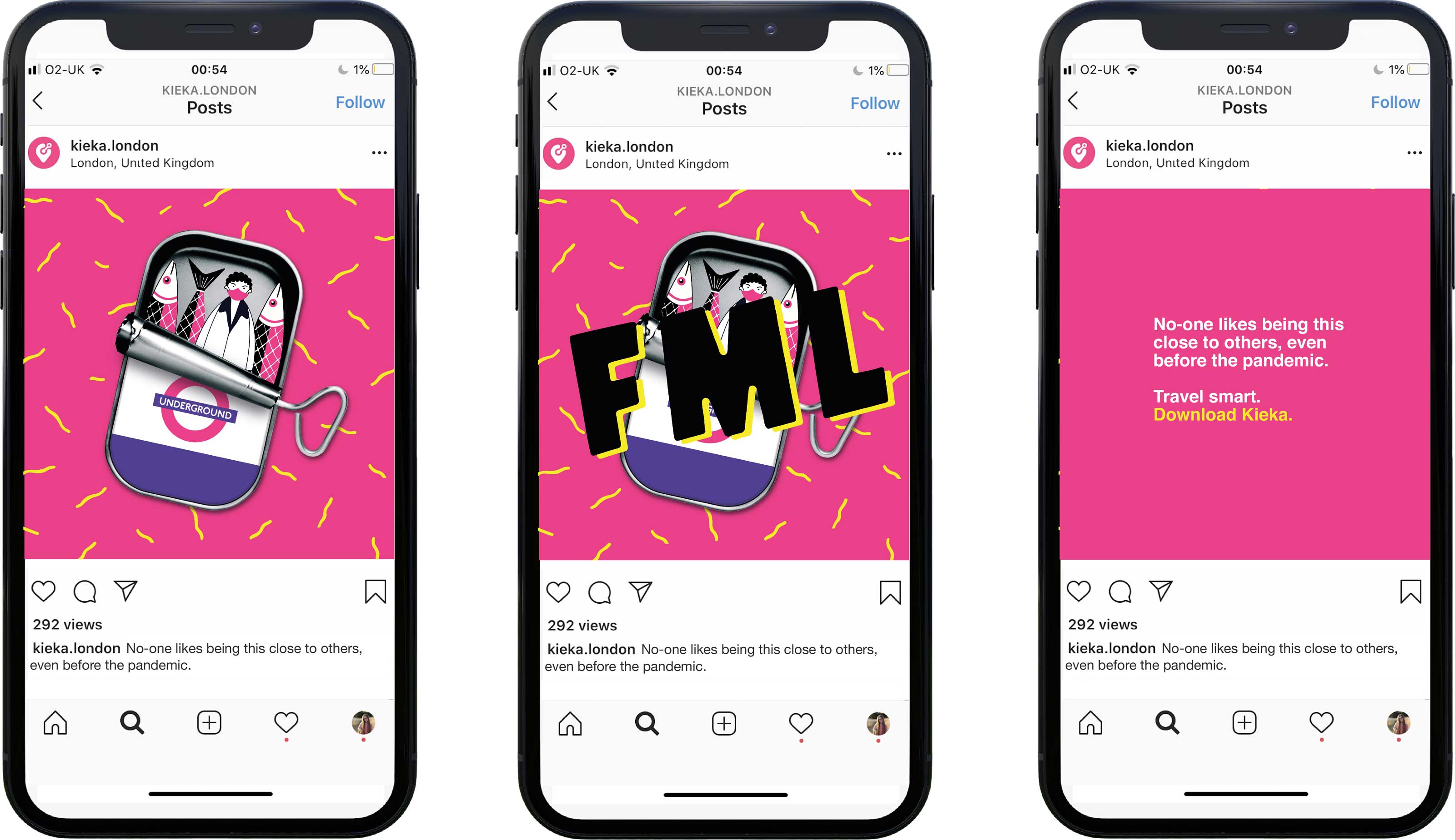
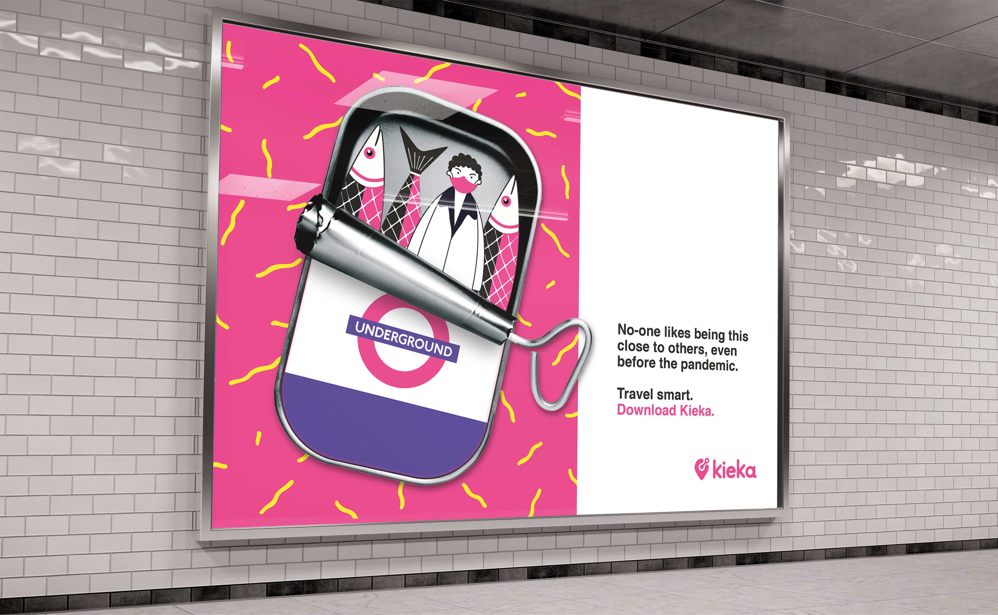
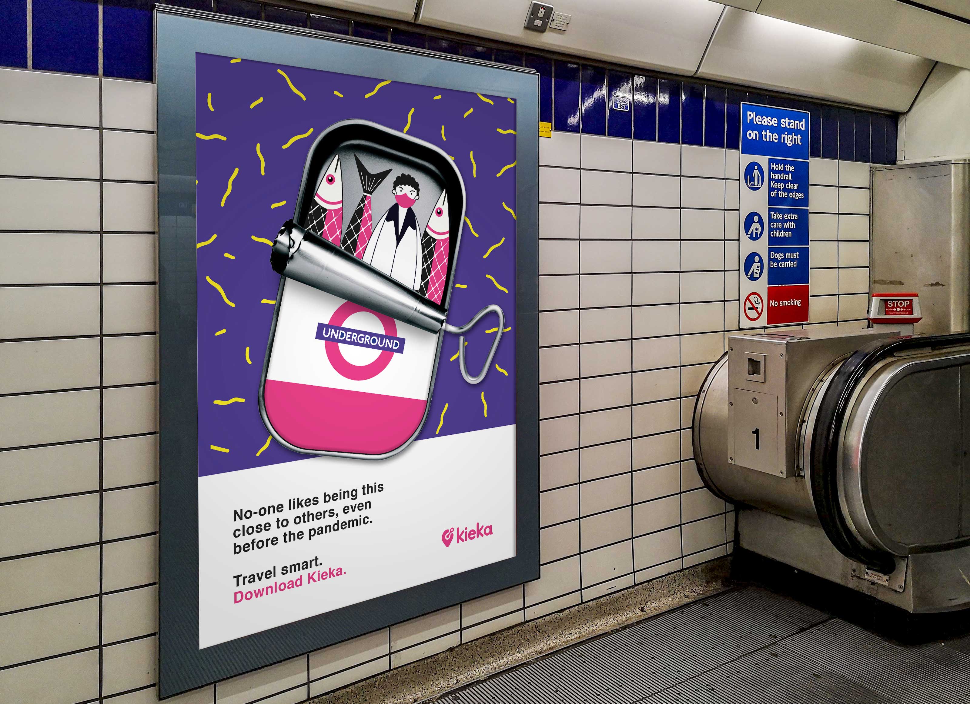
The design has flexibility, working well on social media but also as a bold, physical piece of advertising.