
Future Forest
Exhibition identity project in association with AUB Human x Inside Out Dorset.
Collaboration with Grace Reeves, Toby Rivett and Mia Erwig.
← Back to Future Forest
The Challenge
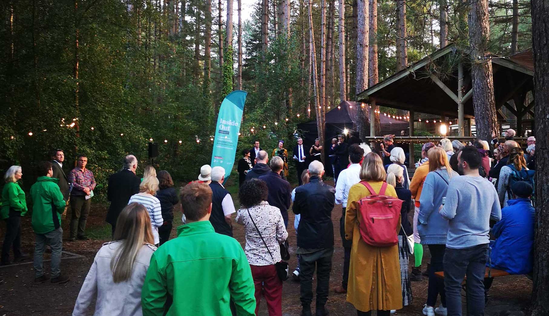
Myself and fellow designers Grace, Toby and Mia were approached to create the identity and graphic elements of Future Forest. The exhibition, held in Moors Valley as part of the Inside Out Dorset Festival, would feature our work from 'the Annotated Environment' project. This project challenged AUB Graphic Design and Interior Architecture students to explore ways of enhancing the experience of Moors Valley, inspired by Luke Jerram's 'Gaia' installation.
The Journey
Exhibition Container
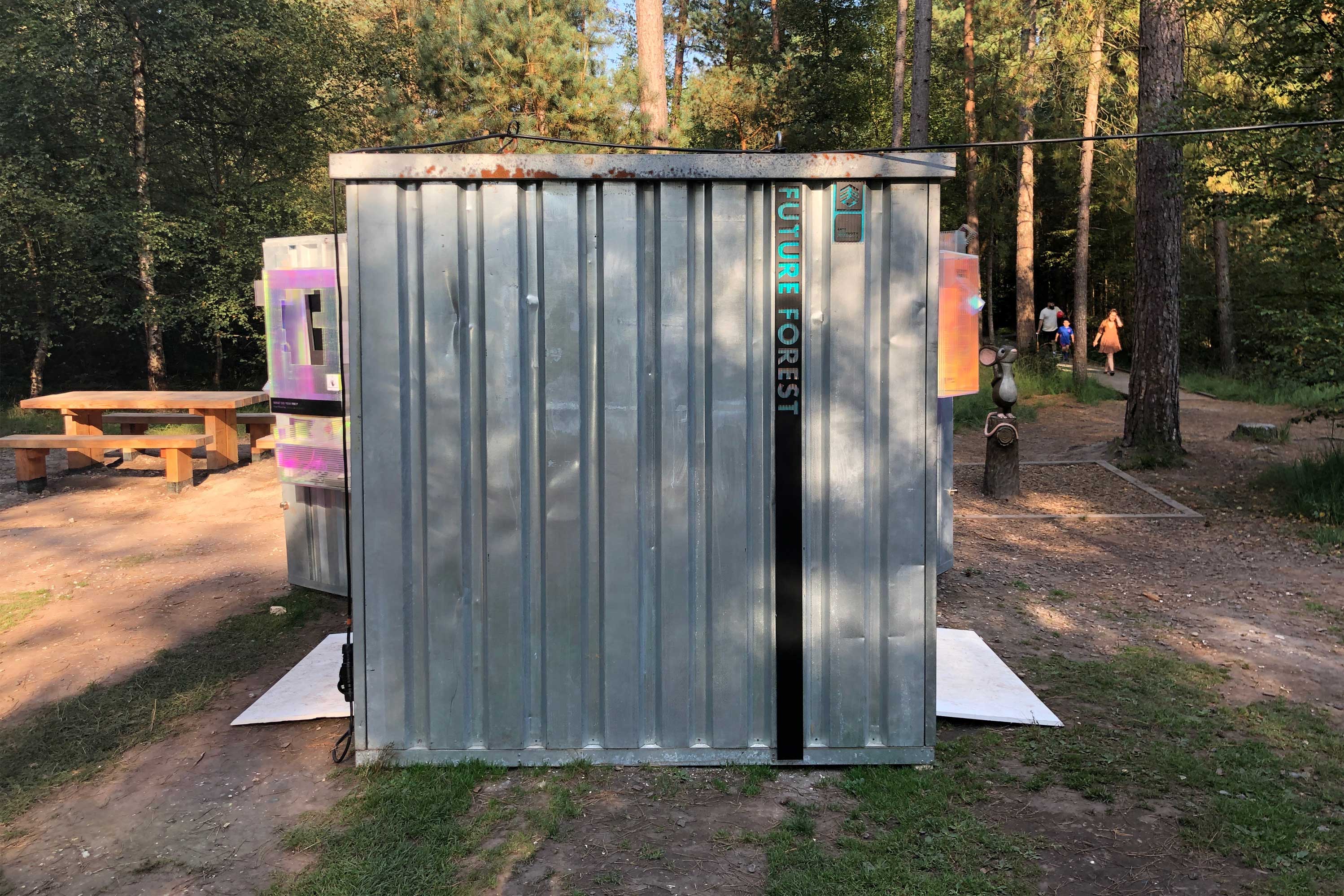
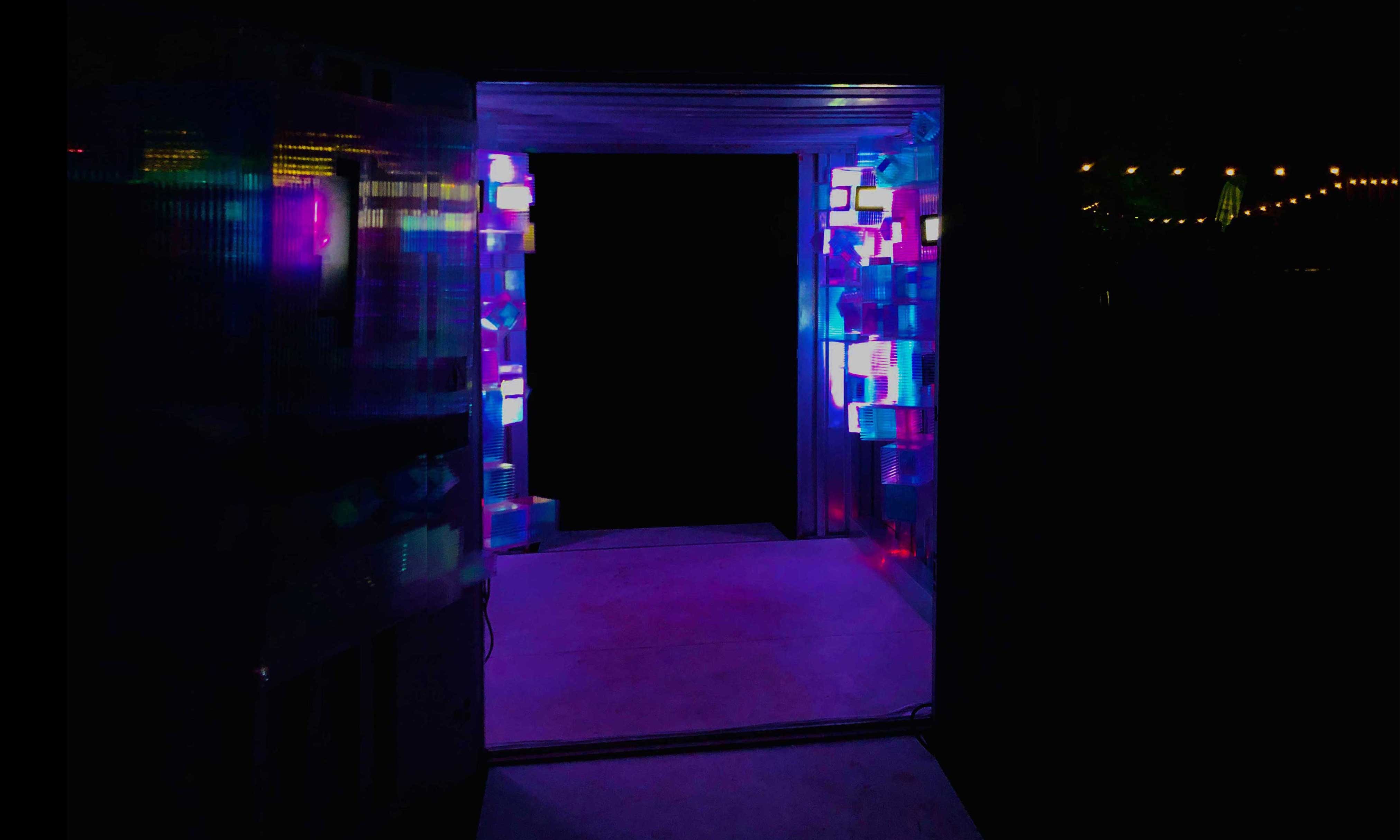
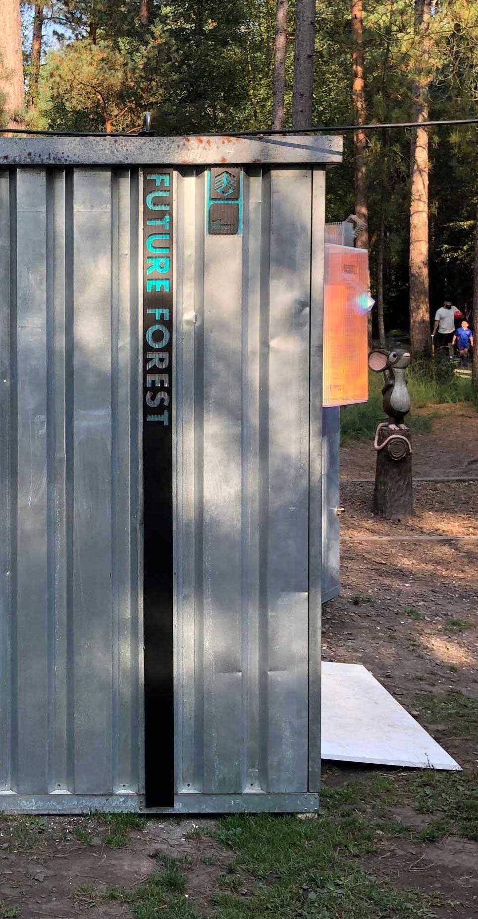
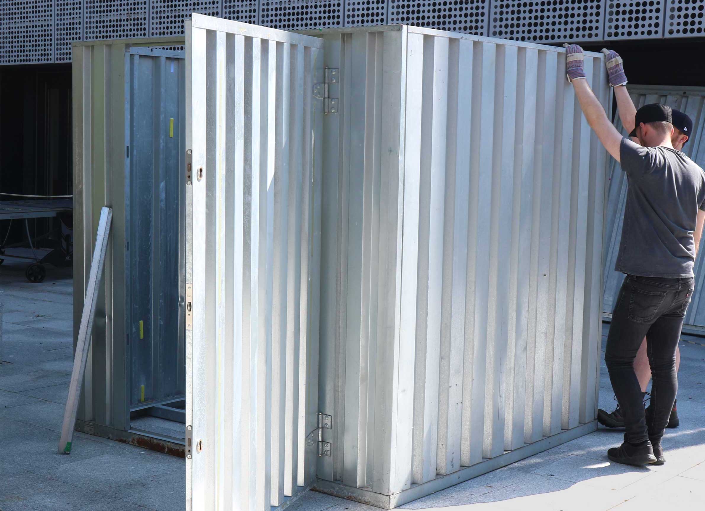
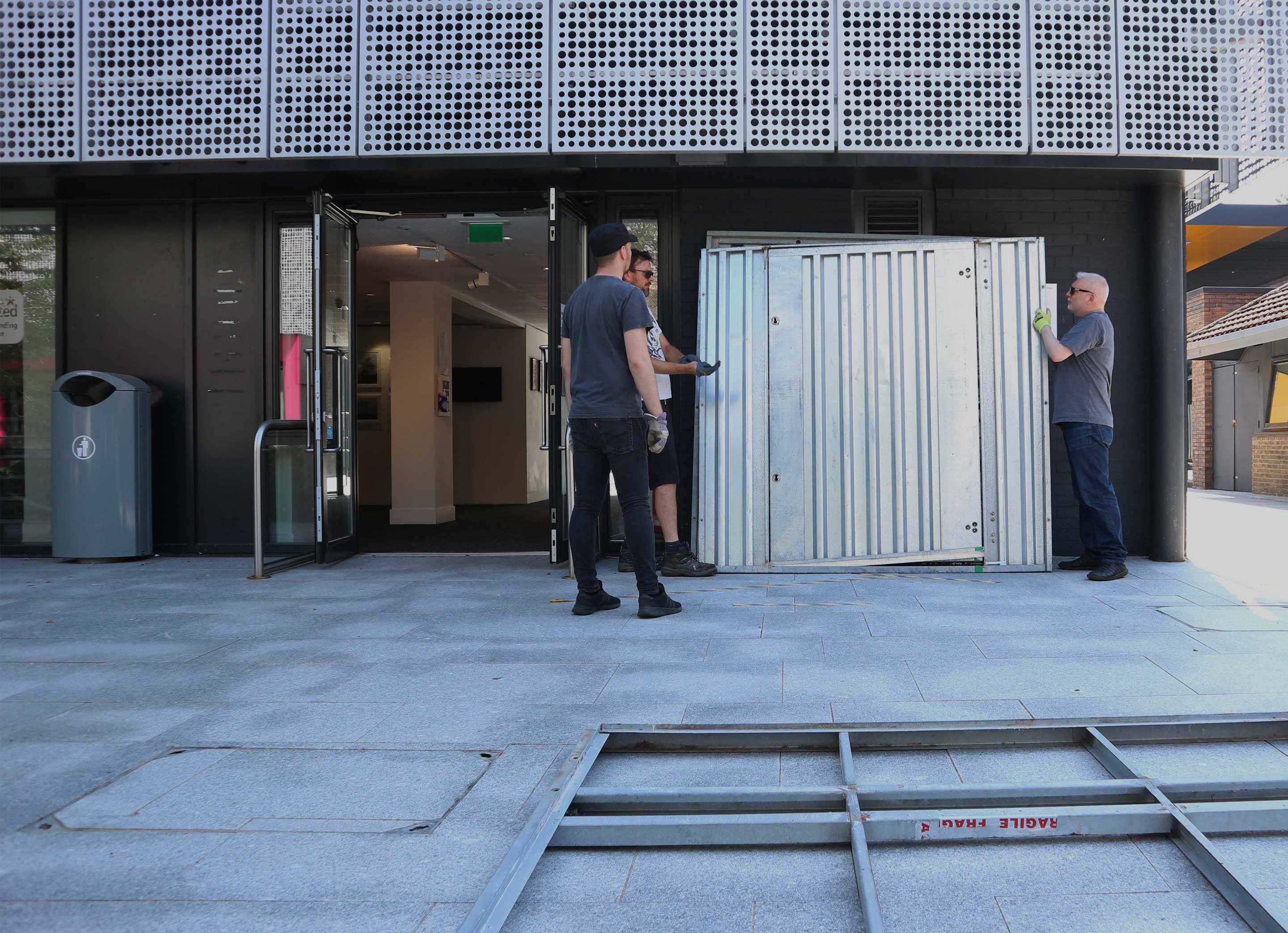
The exhibition itself would take place within a large metal shipping container which would be transported to Moors Valley. We would be working alongside a team from the Interior Architecture department who focussed on making alterations and additions to the container, creating a unique exhibition space.
Architecture and Materials
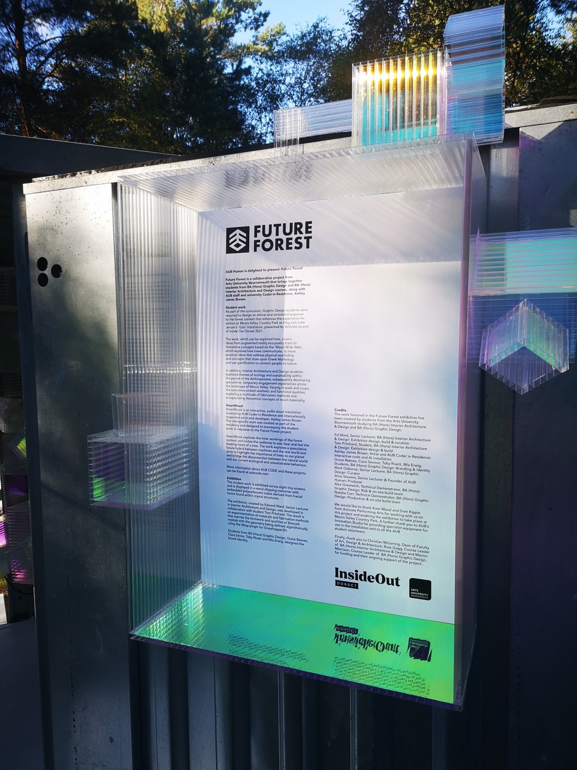
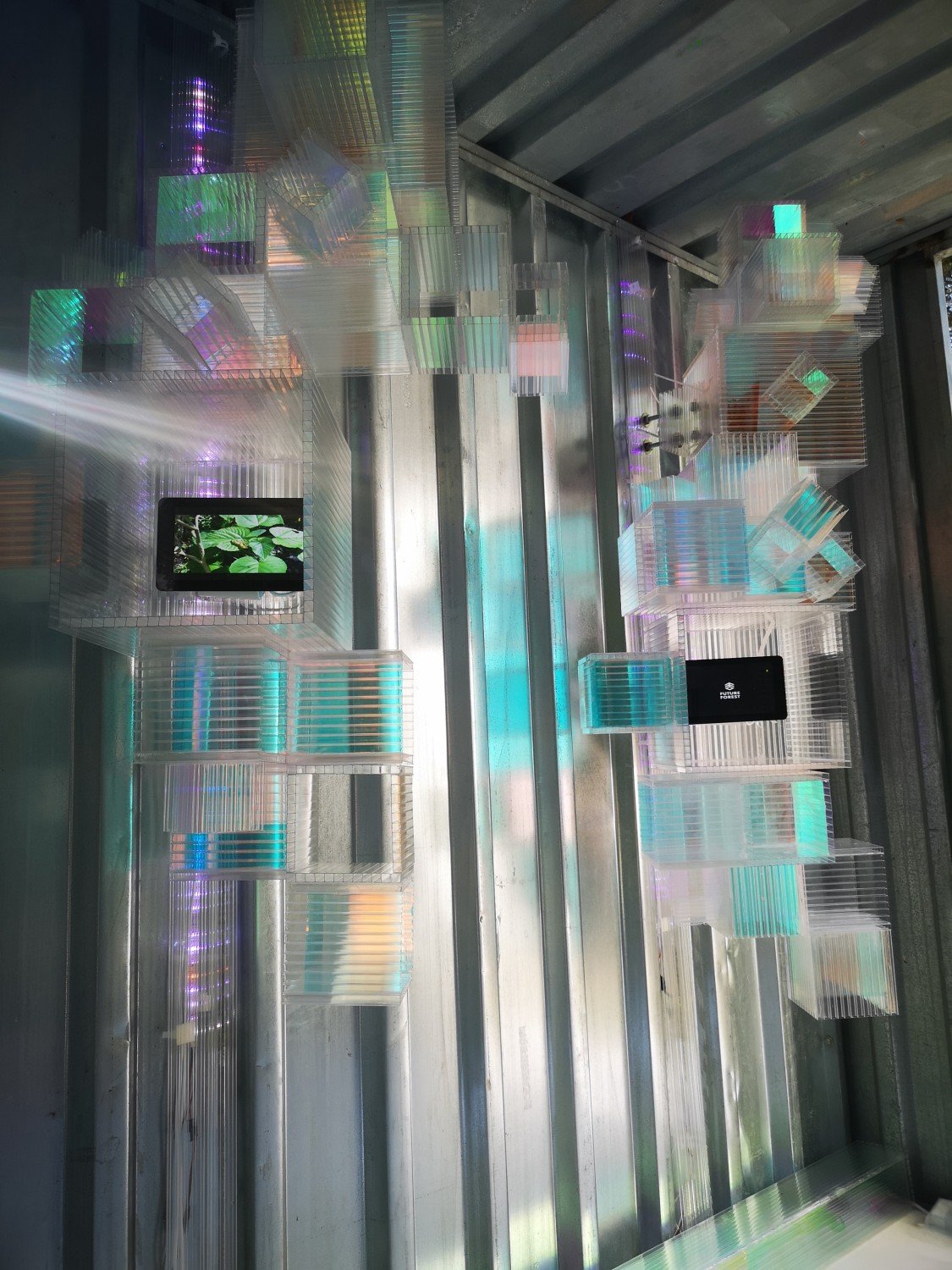
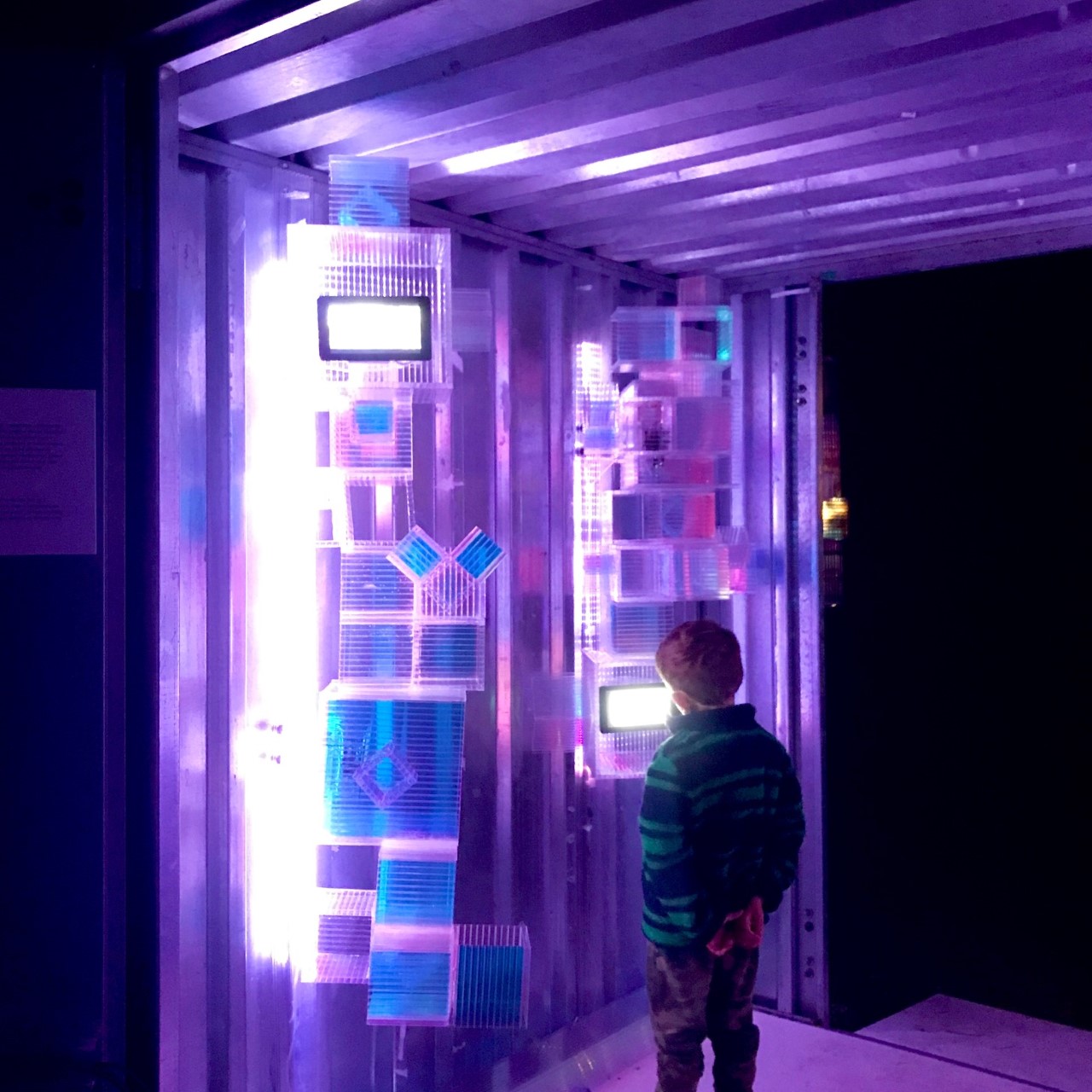
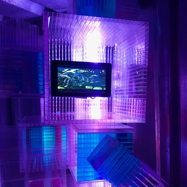
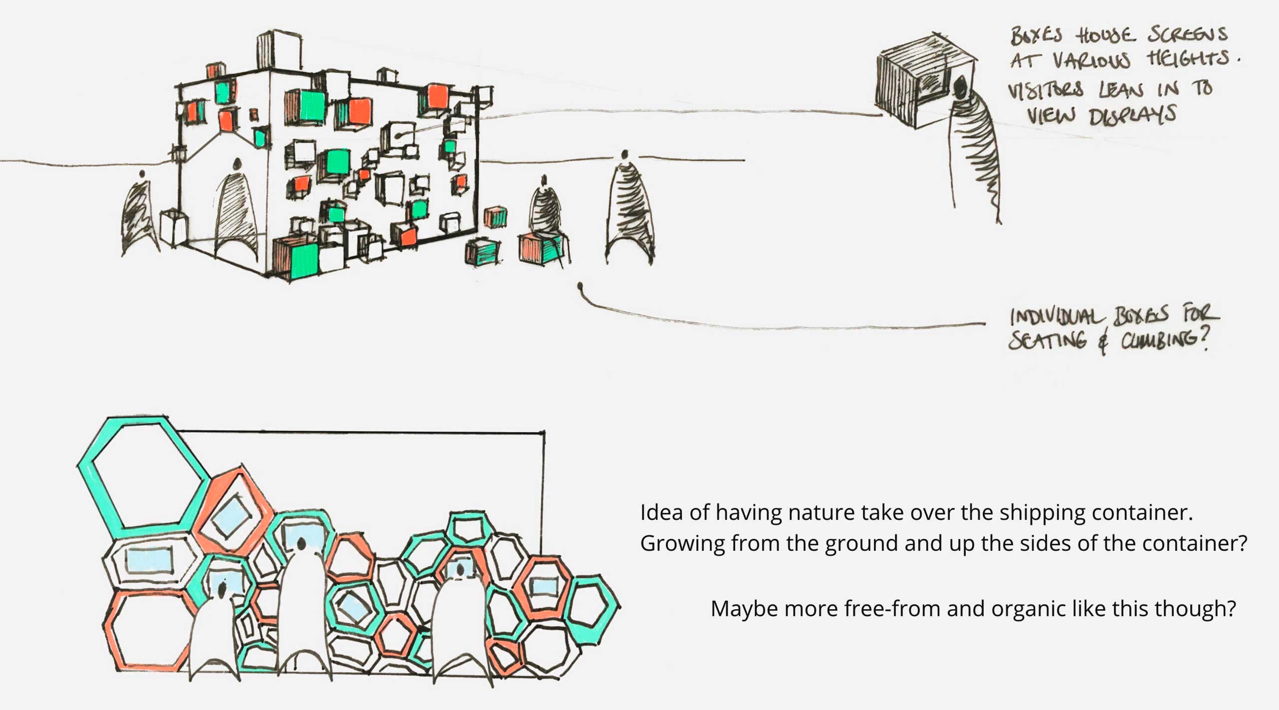
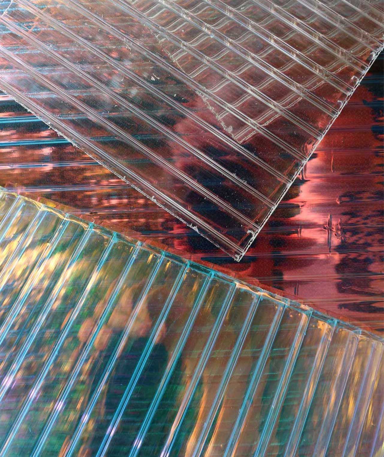
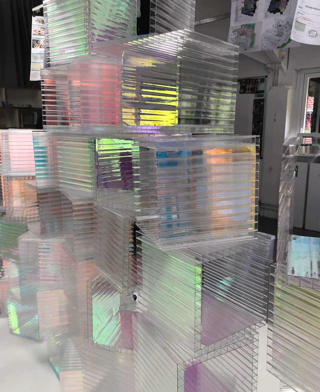
The first stage of the process was to get to grips with the architecture of the container. The Interior Architecture team came up with a design which incorporated cubes at various heights on the container, with some of the cubes housing the screens which would display the exhibition work.
Iridescent vinyl would be used to create the cubes, a material which reflects different colours when the light hits it.
Logo Concept Deliberation
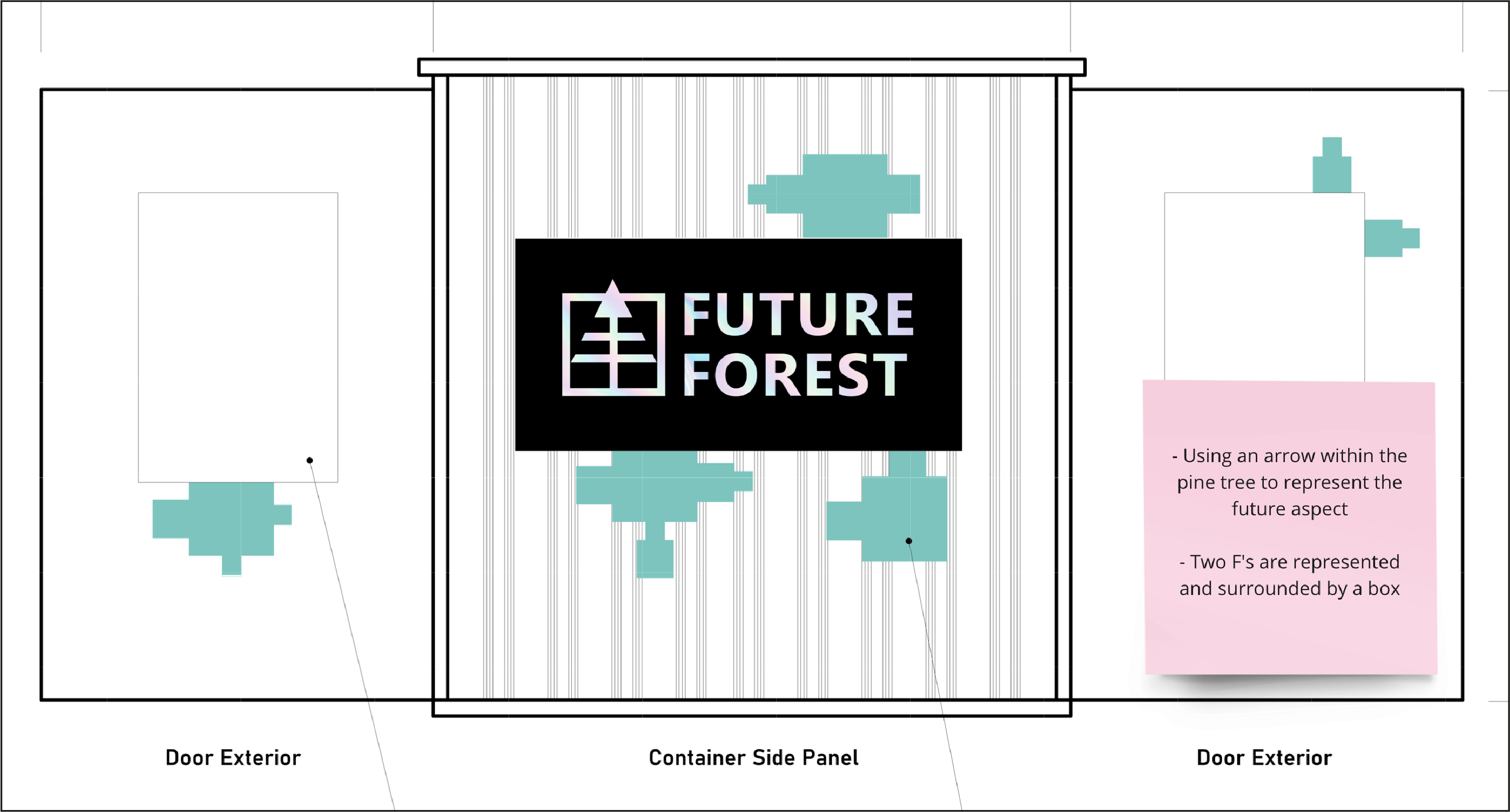
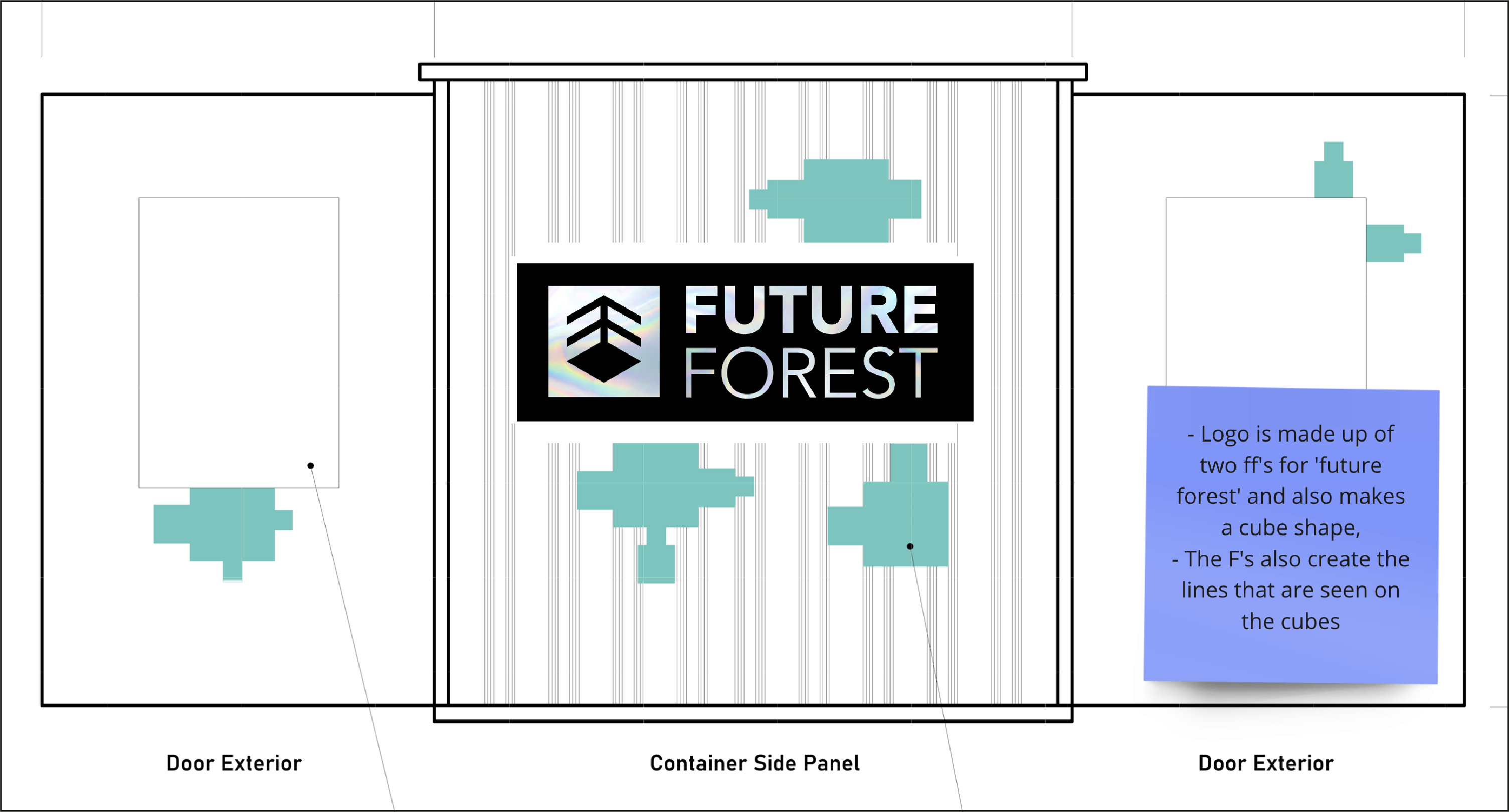
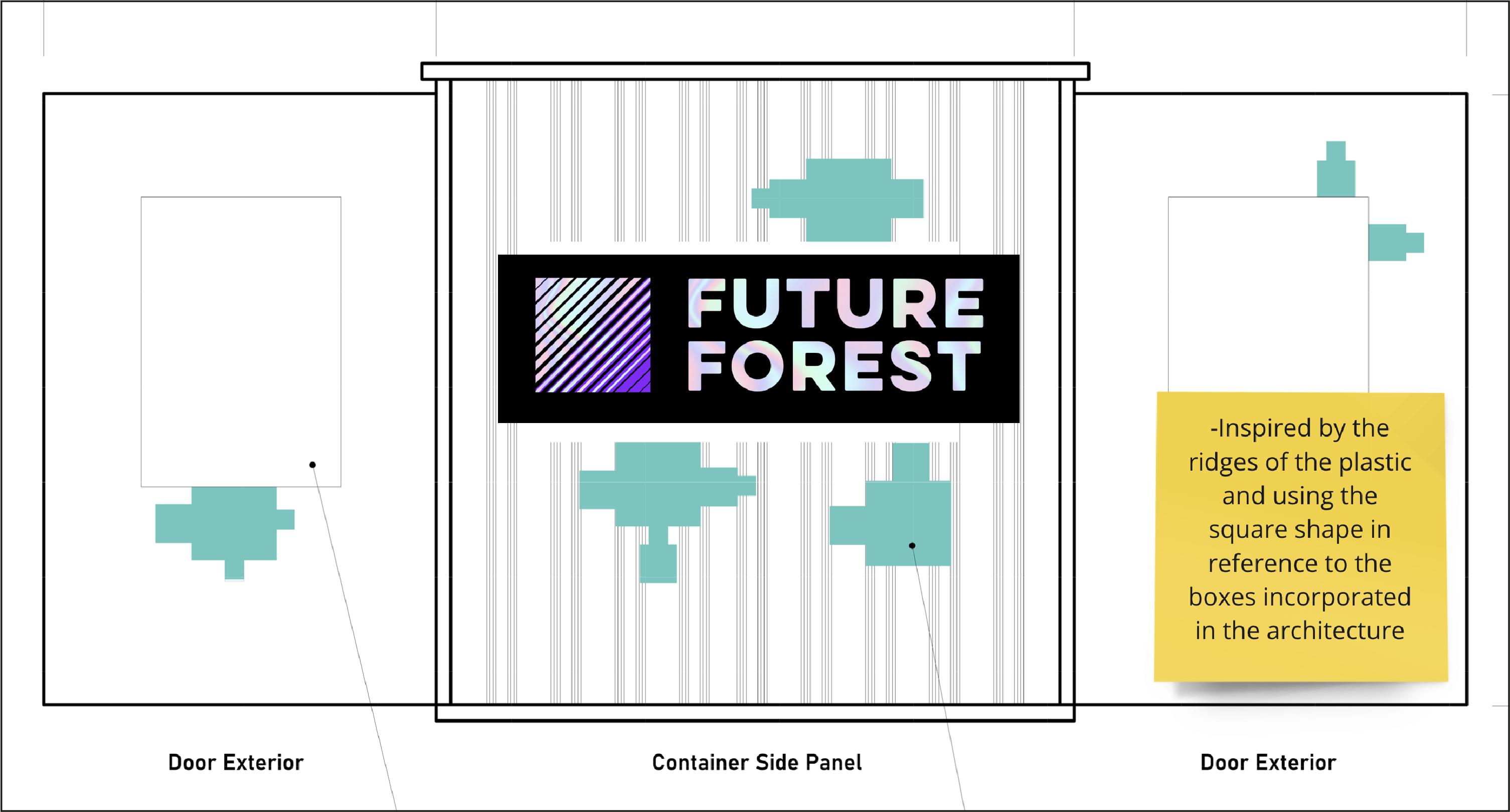
We worked individually to come up with different routes for the identity of the Future Forest exhibition. After meeting together and going through all of our initial ideas, we narrowed down our options to a few favourites. I felt that my own strongest concept was based on the ridges of the plastic material used within the architecture. I created an icon with diagonal lines contained within a square and then put together a version which utilised the iridescent vinyl.
Final Logo
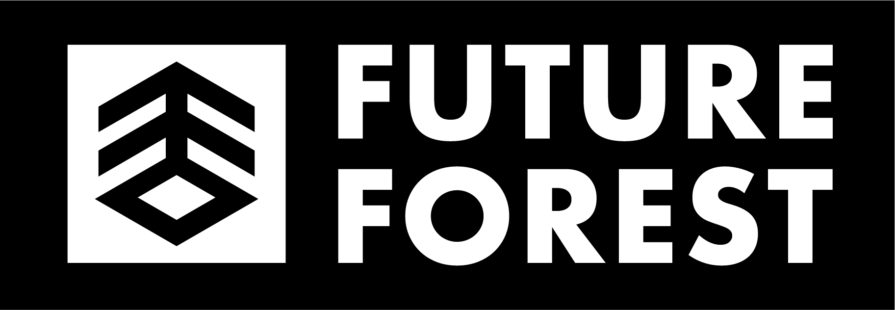
We decided to further develop this logo concept: the two 'F' letters back to back form a tree shape which sits within a three-dimensional cube inspired by the architecture of the container. As a team, we refined this logo further to get to the final result, which included thickening the lines of the logo to match the weight of the text. We also made both of the words bold and used the Futura font for its legibility and sharp lines which complimented the icon.

Curation of Exhibition Displays
Another element of this project was curating all of the work to be displayed on several small screens inside the container. This process started with gathering work from different Graphic Design students, collecting a variety of images and videos from the Annotated Environment project which revolved around creating systems to complement the experience of Moors Valley.
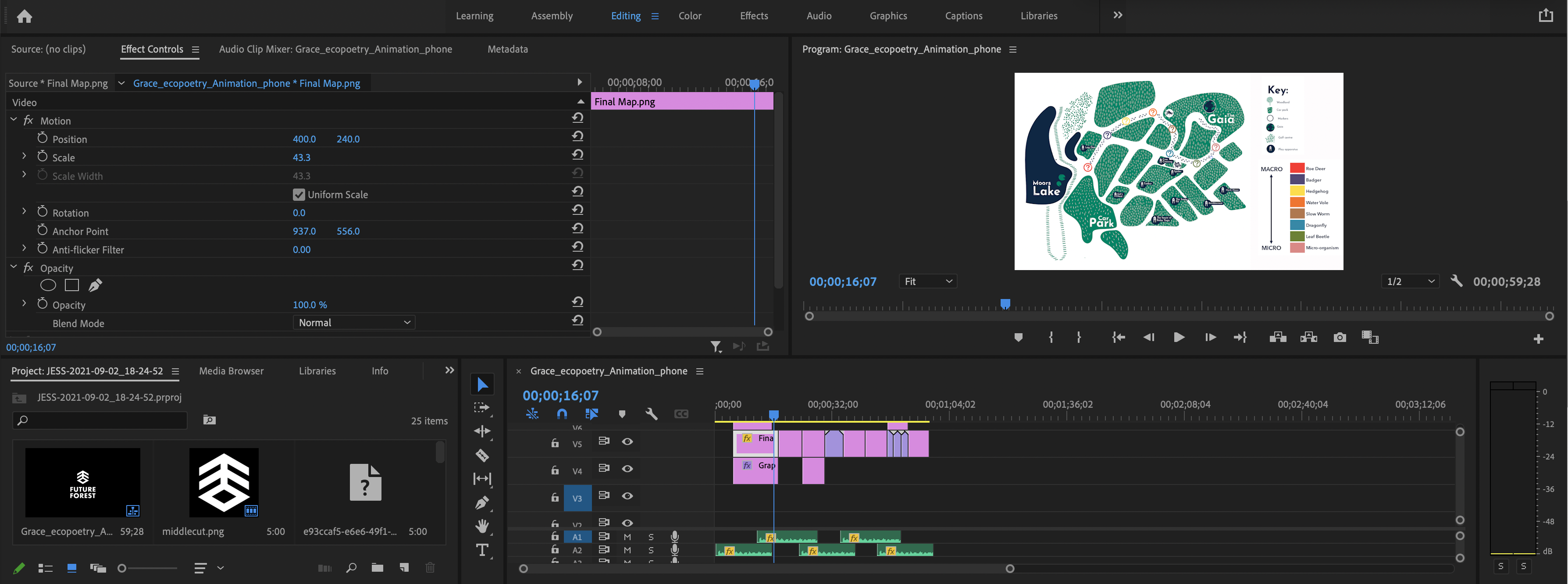
Next, we collated the projects into videos using Adobe Premiere, each beginning with the Future Forest logo followed by student names, their proposition and a brief description of their project.
Creation of Exhibition Structure
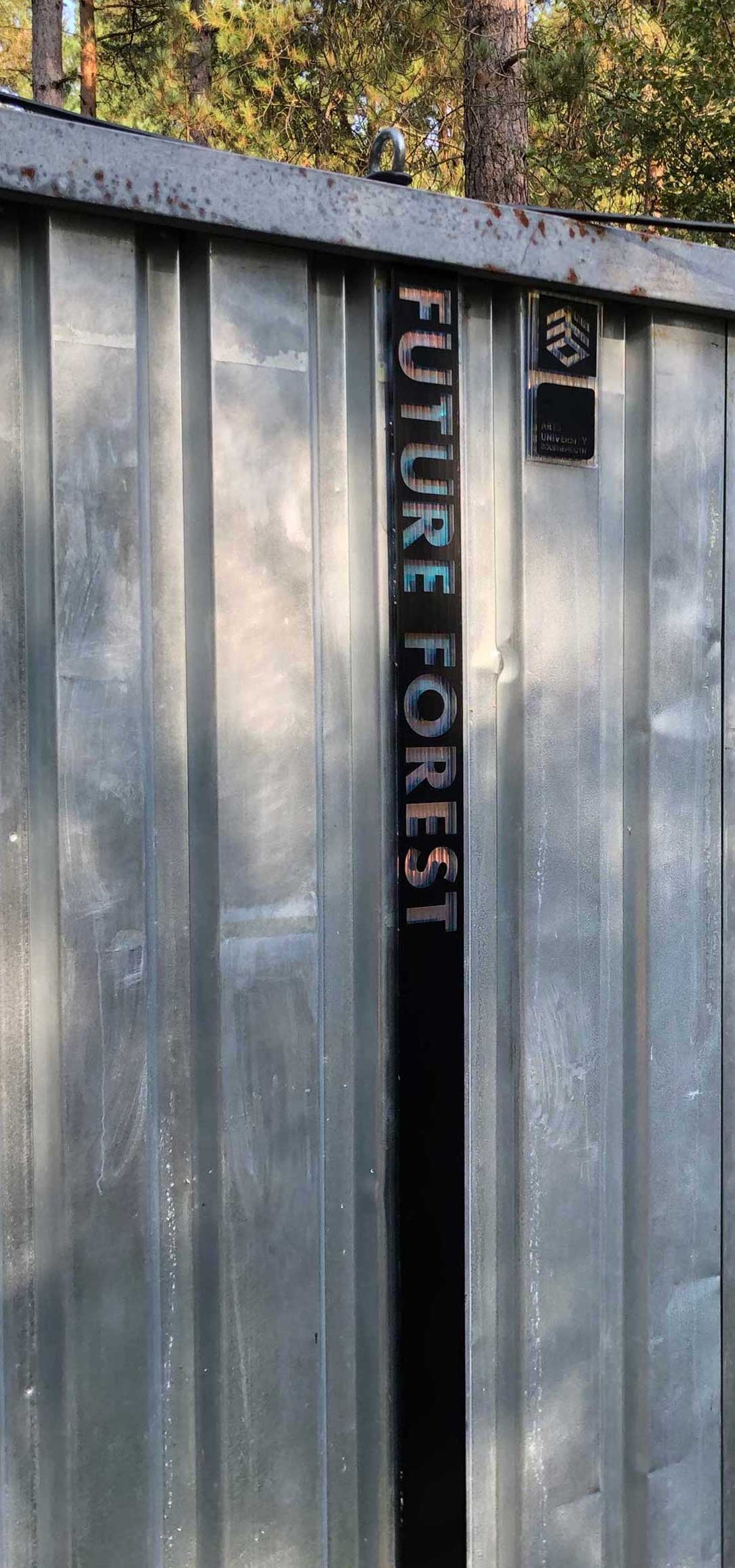
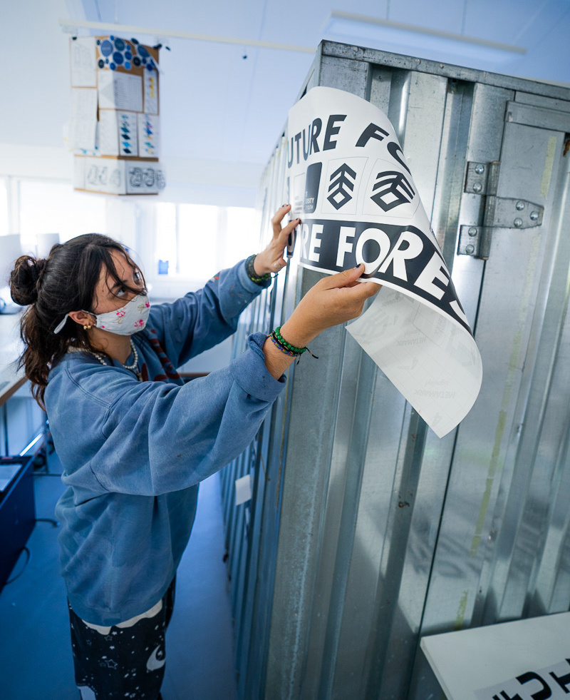
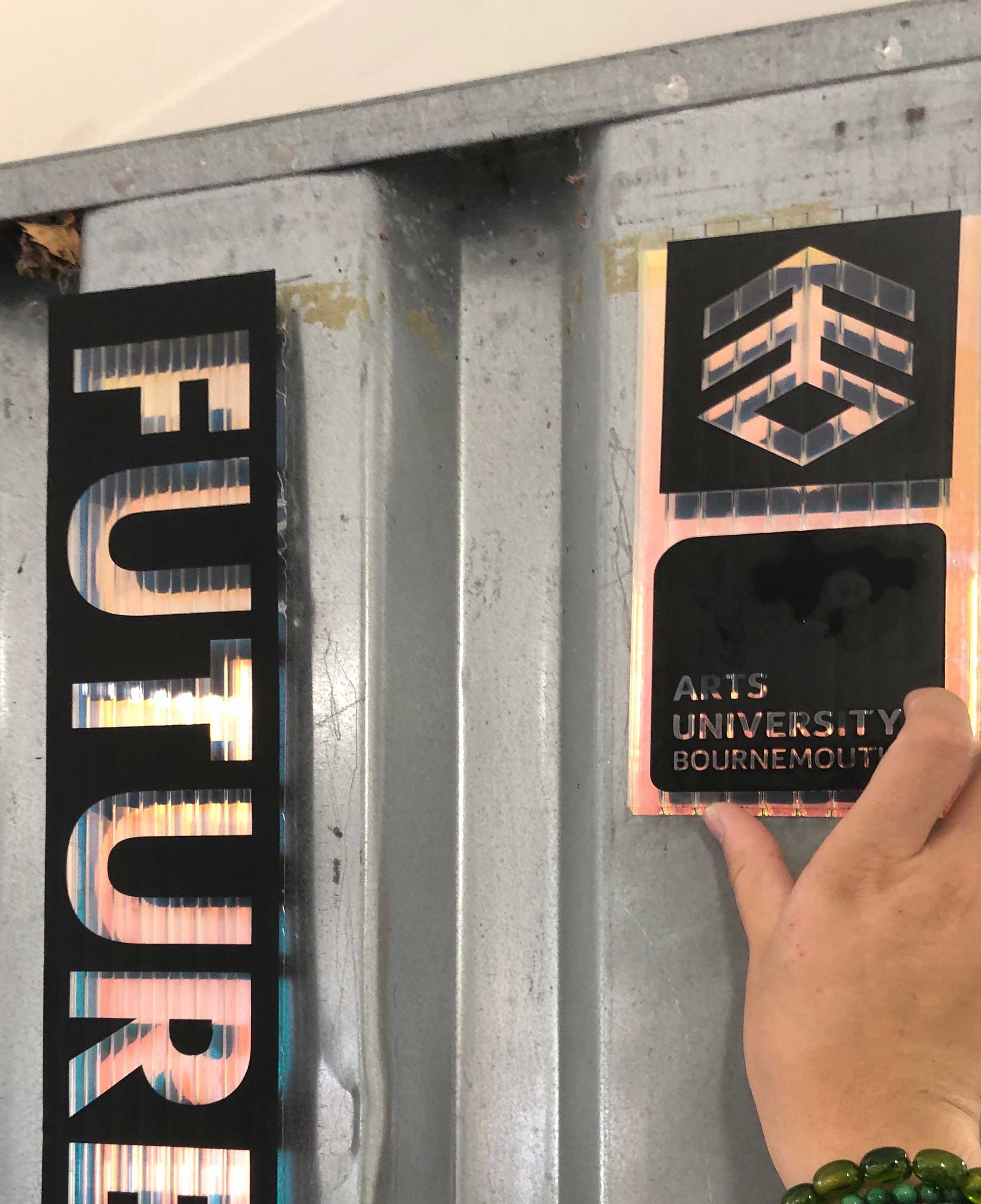
The final stage was to put together the container with the identity. We decided to use black vinyl with the logos and text cut out to reveal the iridescent vinyl underneath; this tied the identity in with the cubes featured on the container. Grace and the architecture team carried out paper prototyping to determine a suitable size for the vinyl. These elements would then be attached to the container once it was set up in Moors Valley.
The Outcomes
