Identity for Ellie Leadley
Live brief with Superpeople, Disability Rights UK and AUB Human.
Brand identity for a client who identifies as having additional needs.
← Back to Bits and Bobs
The Challenge
This project was in collaboration with Superpeople, a charity focussed on creating social change for disabled people, primarily through helping them find employment. Our challenge was to create a personal brand identity/self-promotion products for a client with additional needs, aiming to help them introduce themselves to potential employers. The design needed to reflect the client's individual character, including their skills, interests and ambitions. I worked on a visual identity for Ellie Leadley, whose dream job is to become an author.
The Journey
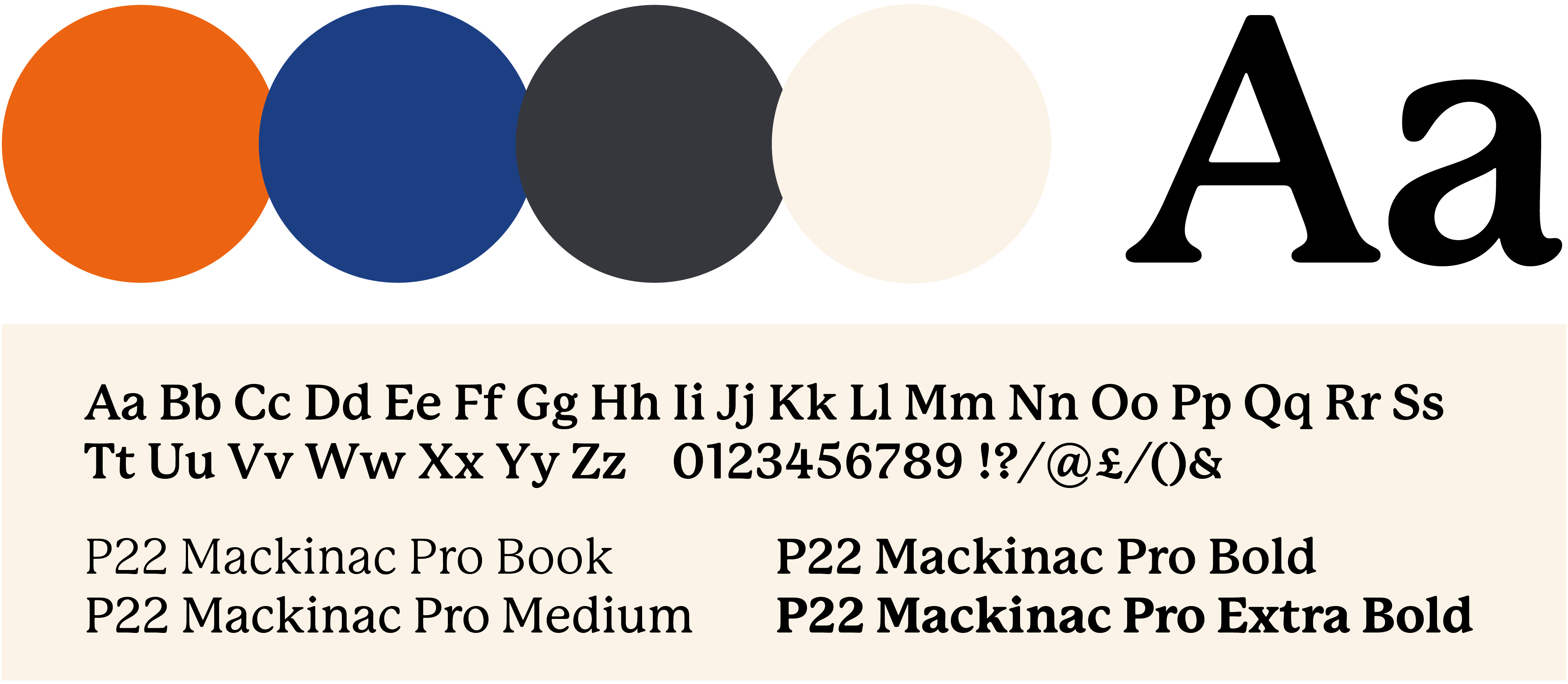
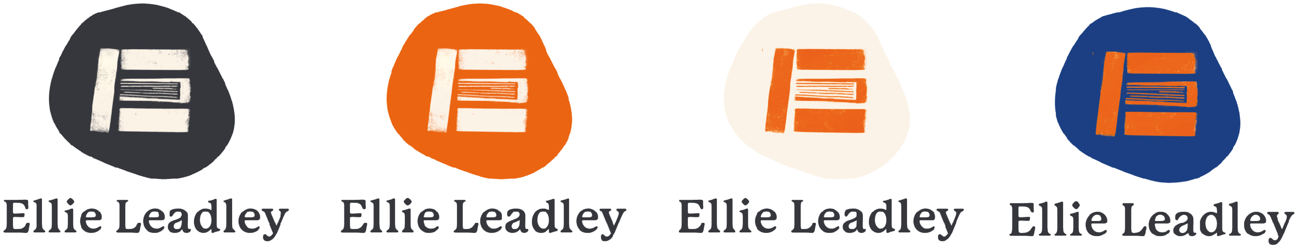
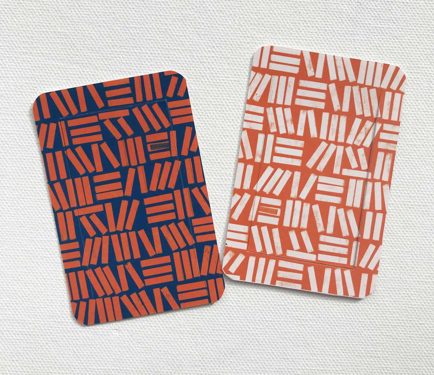
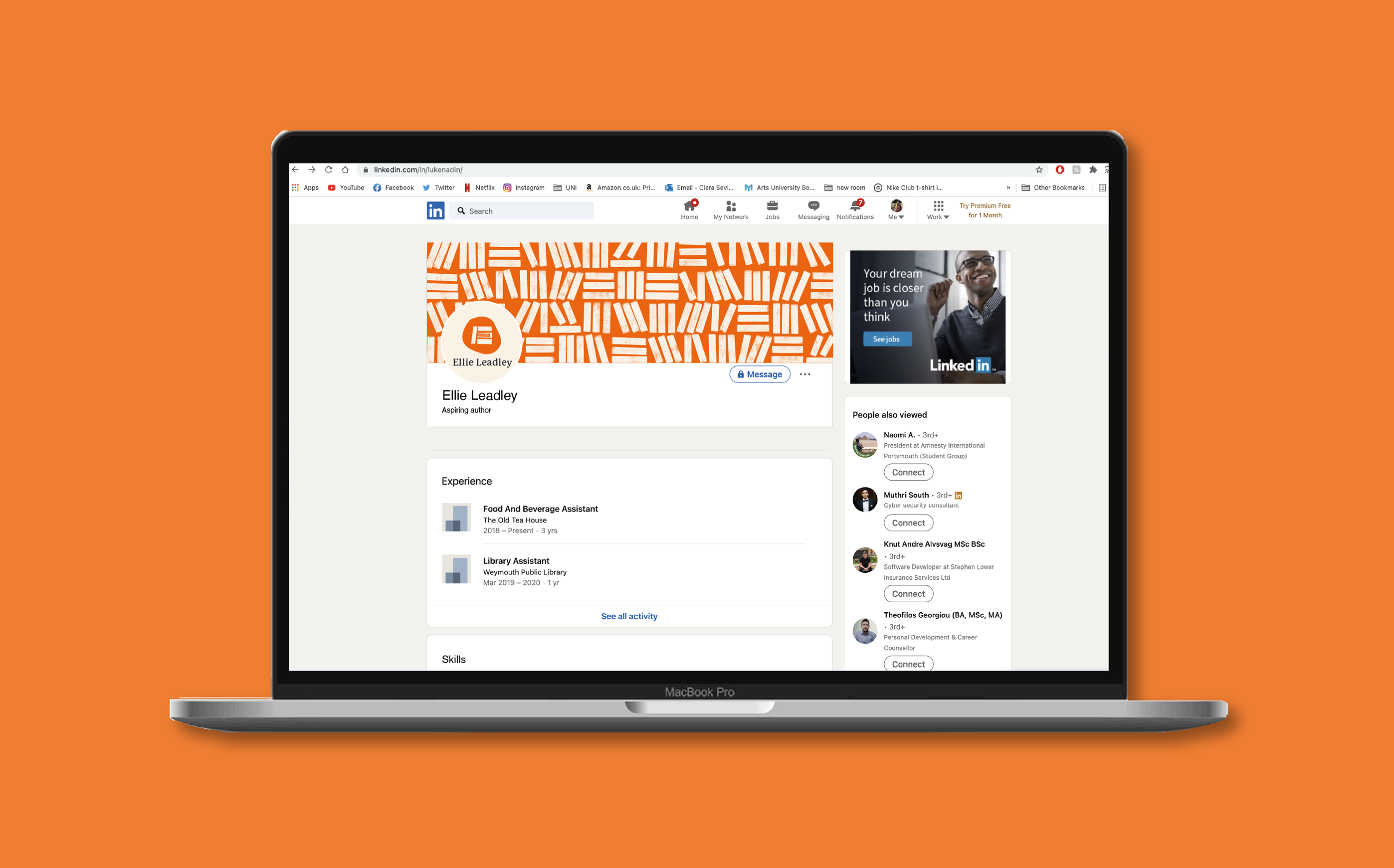
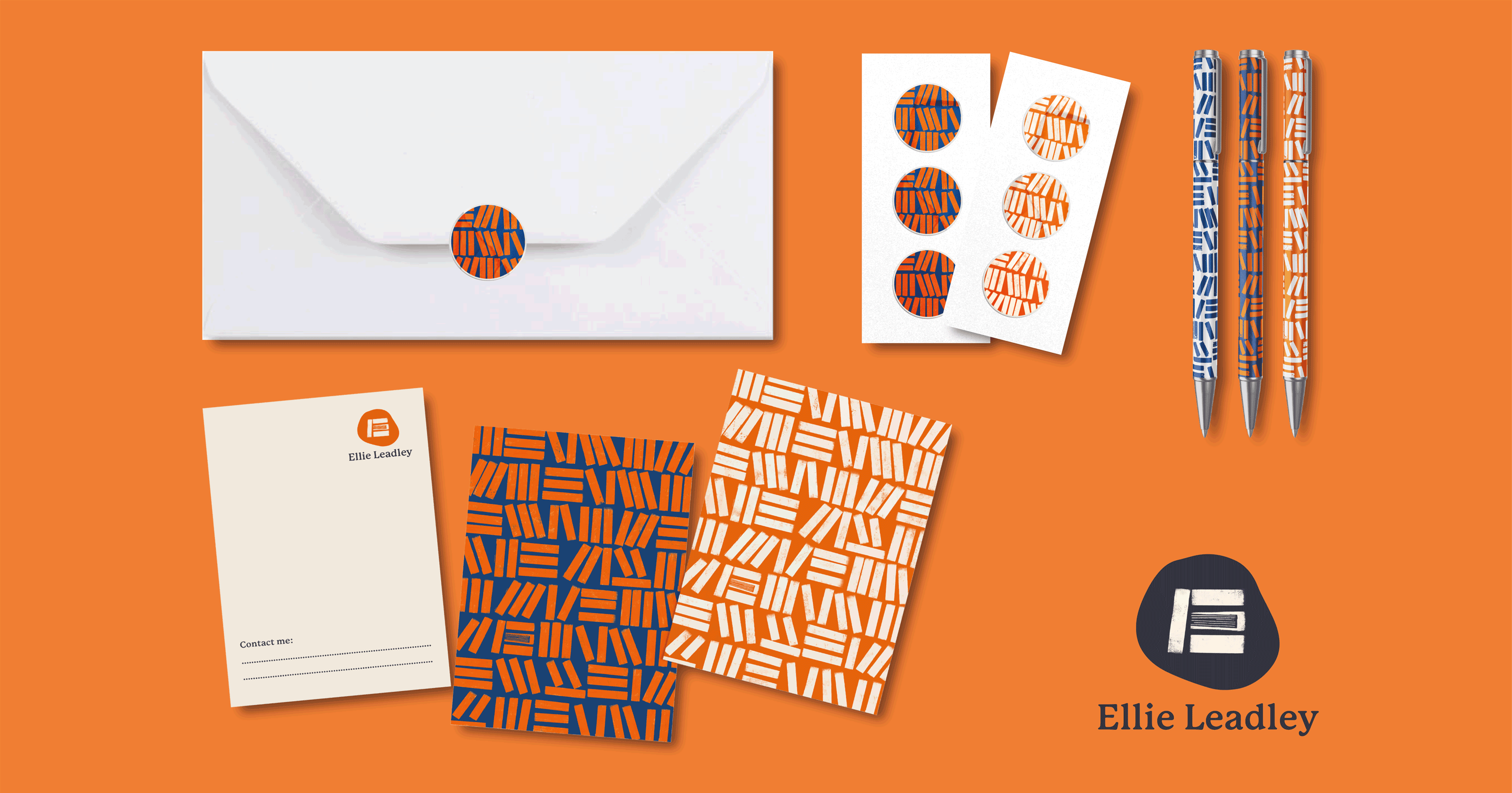
Ellie provided information on her colour preferences, stating that she particularly likes blue/orange/red and dislikes pink. The palette includes a bold orange as the primary colour, complimented by a subdued blue. For the typeface, Ellie said she prefered a serif style; I opted for P22 Mackinac Pro, a soft rounded serif which presents as approachable and friendly. The style is reminscent of a typewriter typeface but with a modern feel and distinct personality.
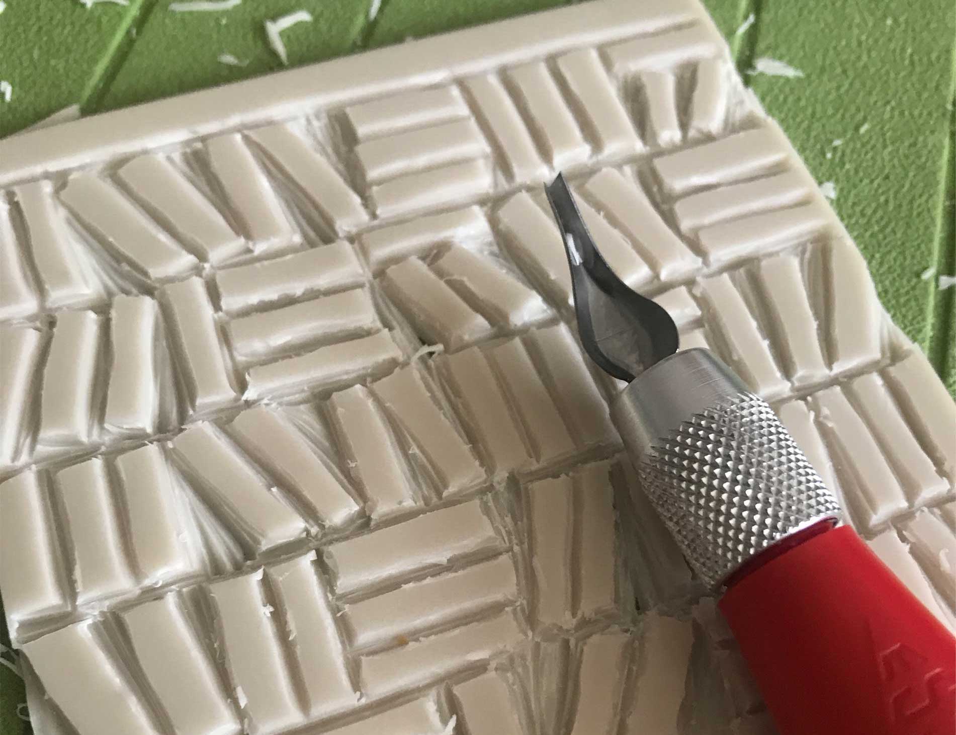
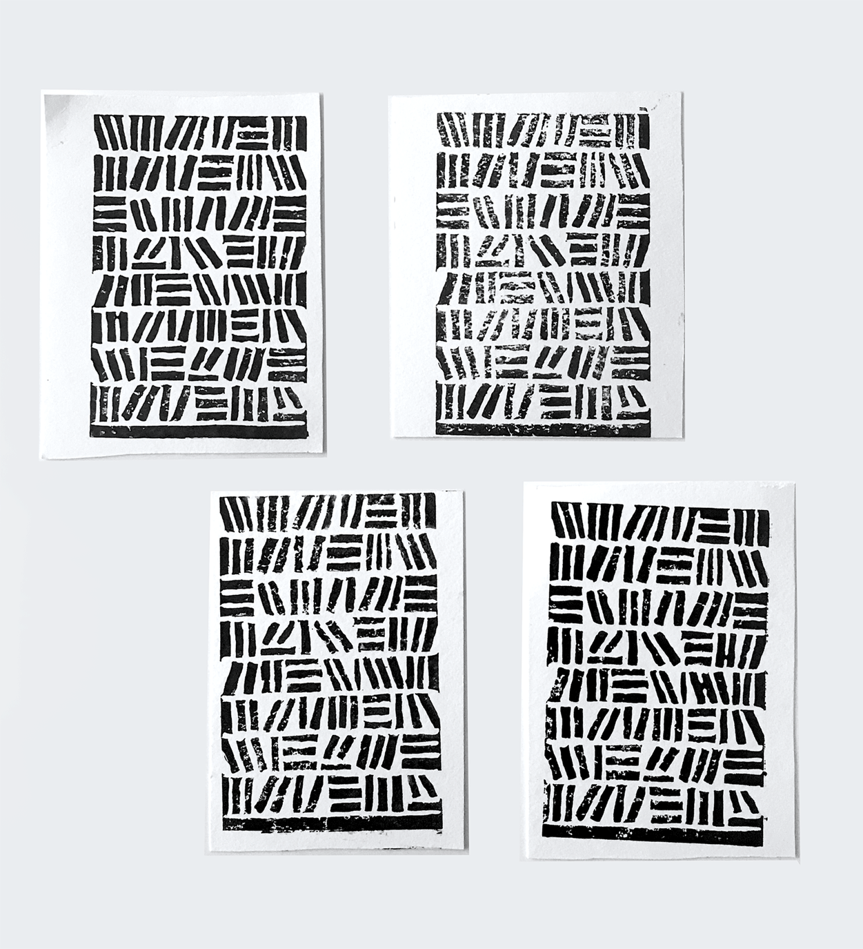
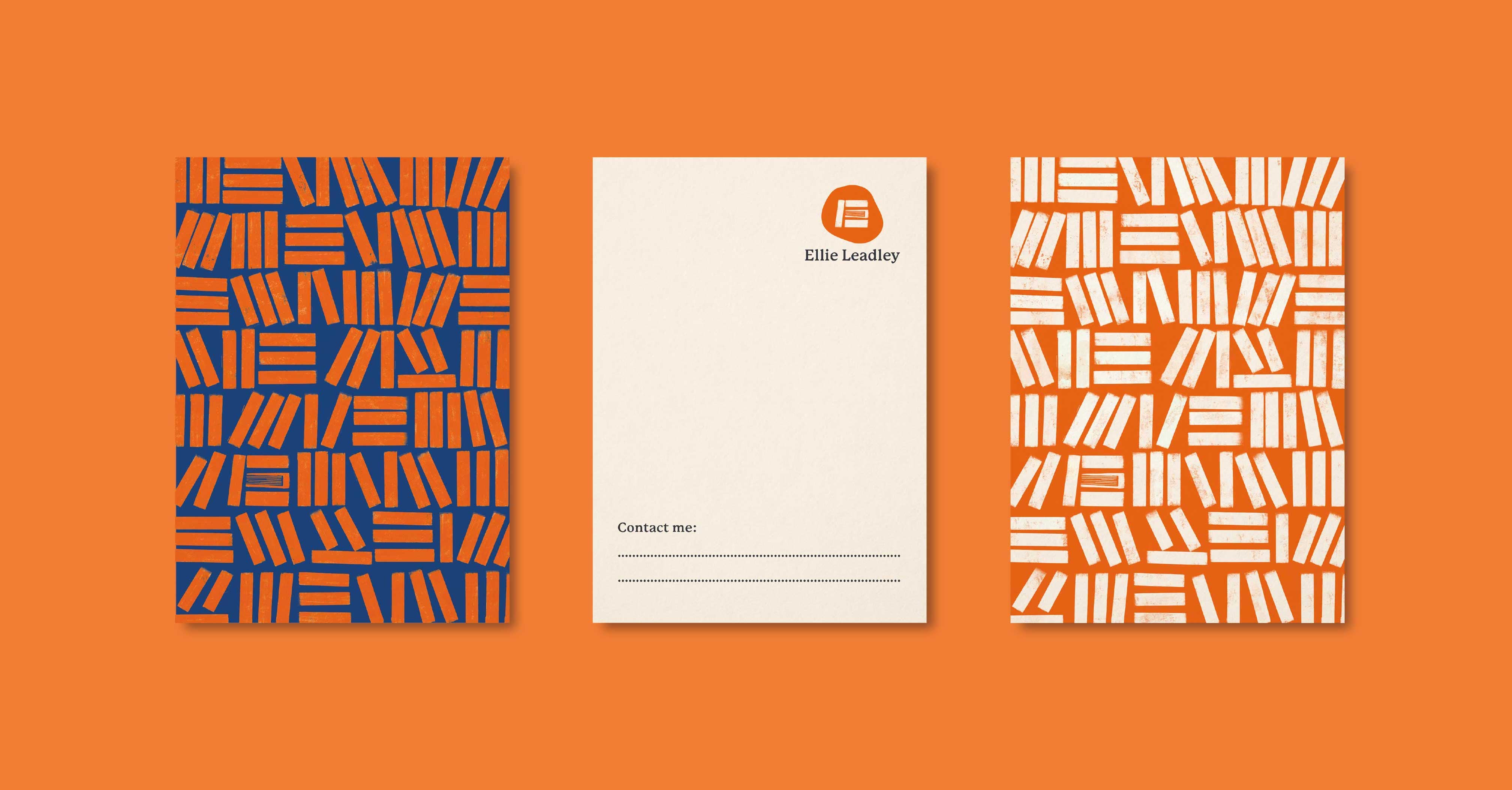
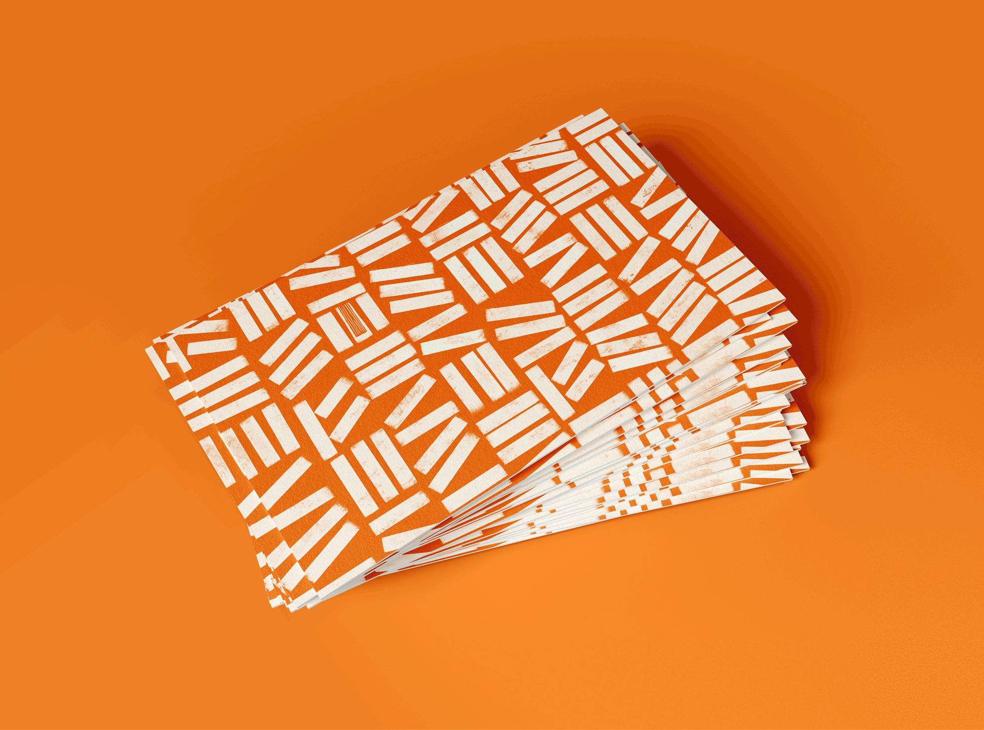
The concept I chose to develop was a bold and slightly abstract pattern of a bookshelf. This design would be appreciated by potential employers who share Ellie’s interest in books, but isn’t obvious enough that it would limit Ellie from applying to different jobs as she wants to keep her options open. To make the design feel more hand-crafted in recognition of Ellie’s hobbies and love for writing stories on paper, I used linoprinting to create the pattern. This gave it a less flat, textured quality that feels like an appropriate balance between modern and classic.
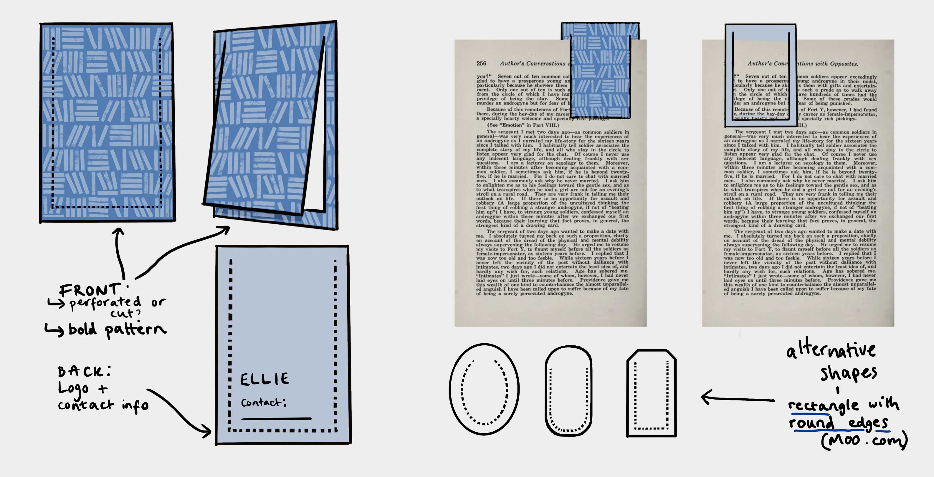
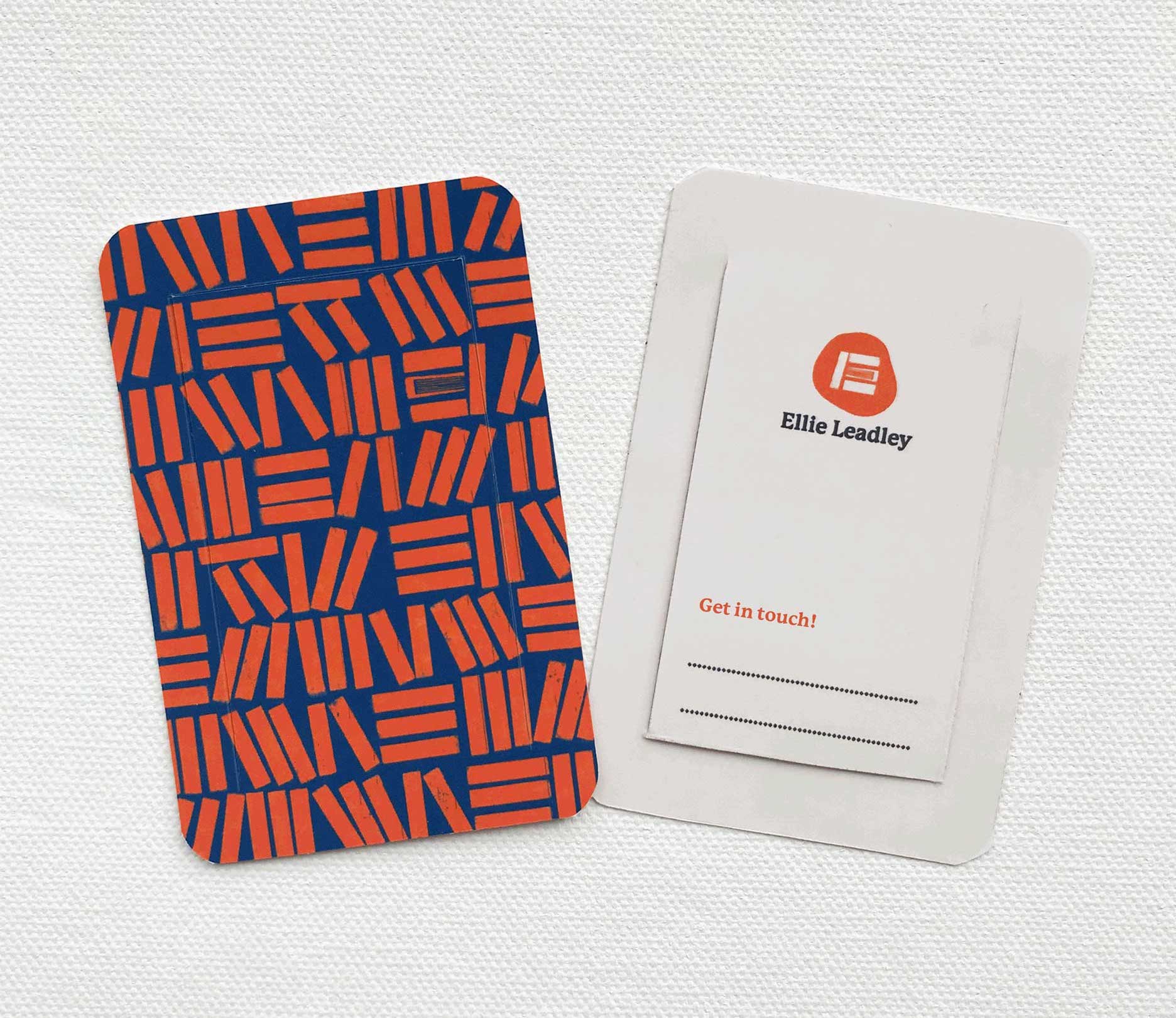
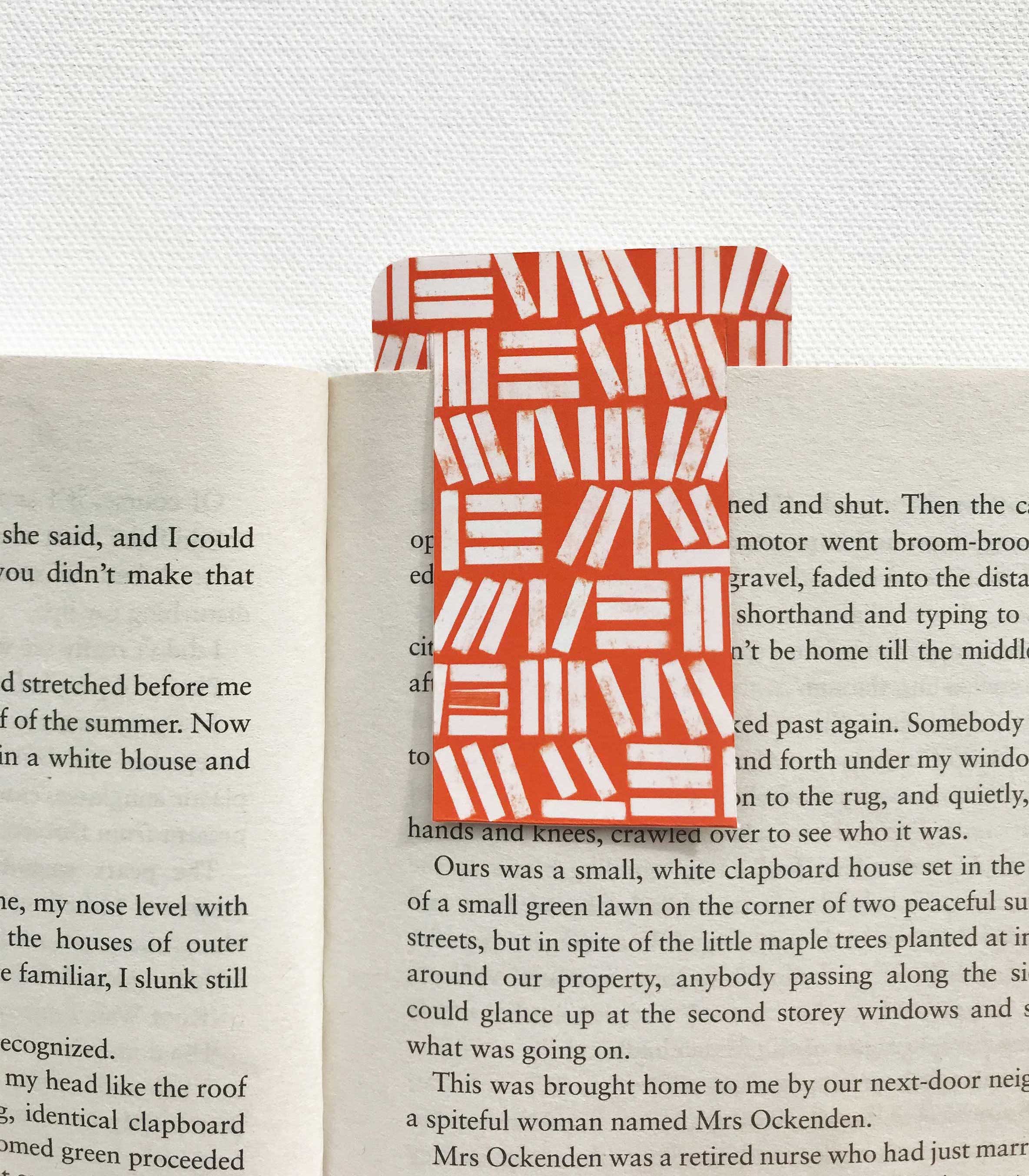
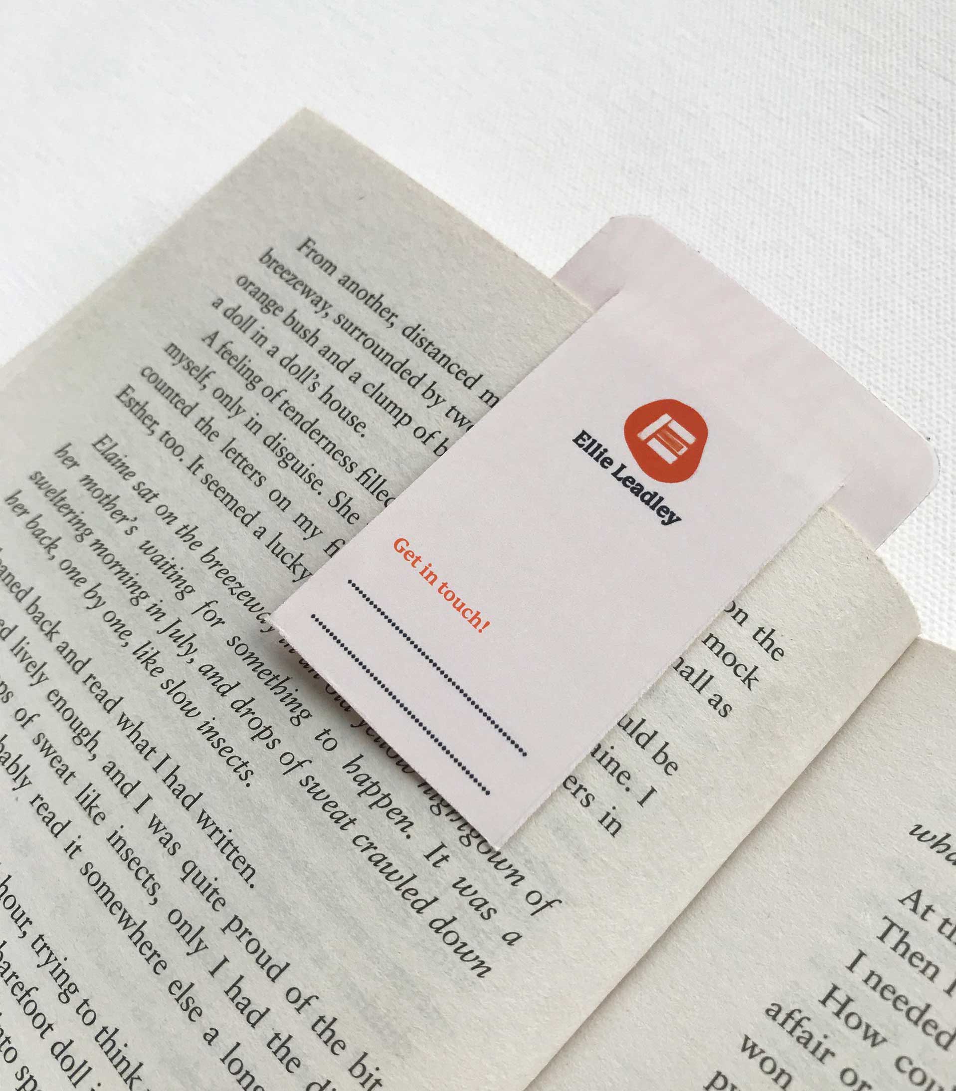
I wanted to create a brand asset that an employer would be inclined to keep and use, making Ellie’s identity more memorable. As Ellie is hoping to apply for jobs in book shops or libraries, it’s likely that her potential employers will share her interest in books. Taking this into consideration, I came up with the idea of a business card which would be cut to function as a bookmark. On the front of the bookmark is the bold, colourful pattern of books and the back features Ellie’s contact information. Keeping in mind sustainability, the bookmark would be made from thick paper in the standard size of 55mm x 84mm, with round edges to reduce scuffing. This bookmark touchpoint is interactive but remains simple to mass produce.
The Outcomes